H4. Chart Controls — Zooming, Comparing, Exporting
Diátaxis: How-to · Audience: operators ← Back to contents
Most charts support the same set of controls -- zooming into the interval of interest, overlaying yesterday or last week, exporting the data to a file, and seeing the metric's description on the spot. This document sets out those four.
For choosing what (the target), see H1. Narrowing the Monitored Target; for when (the period), see H2. Changing the Period. This document is about handling the chart you have chosen.
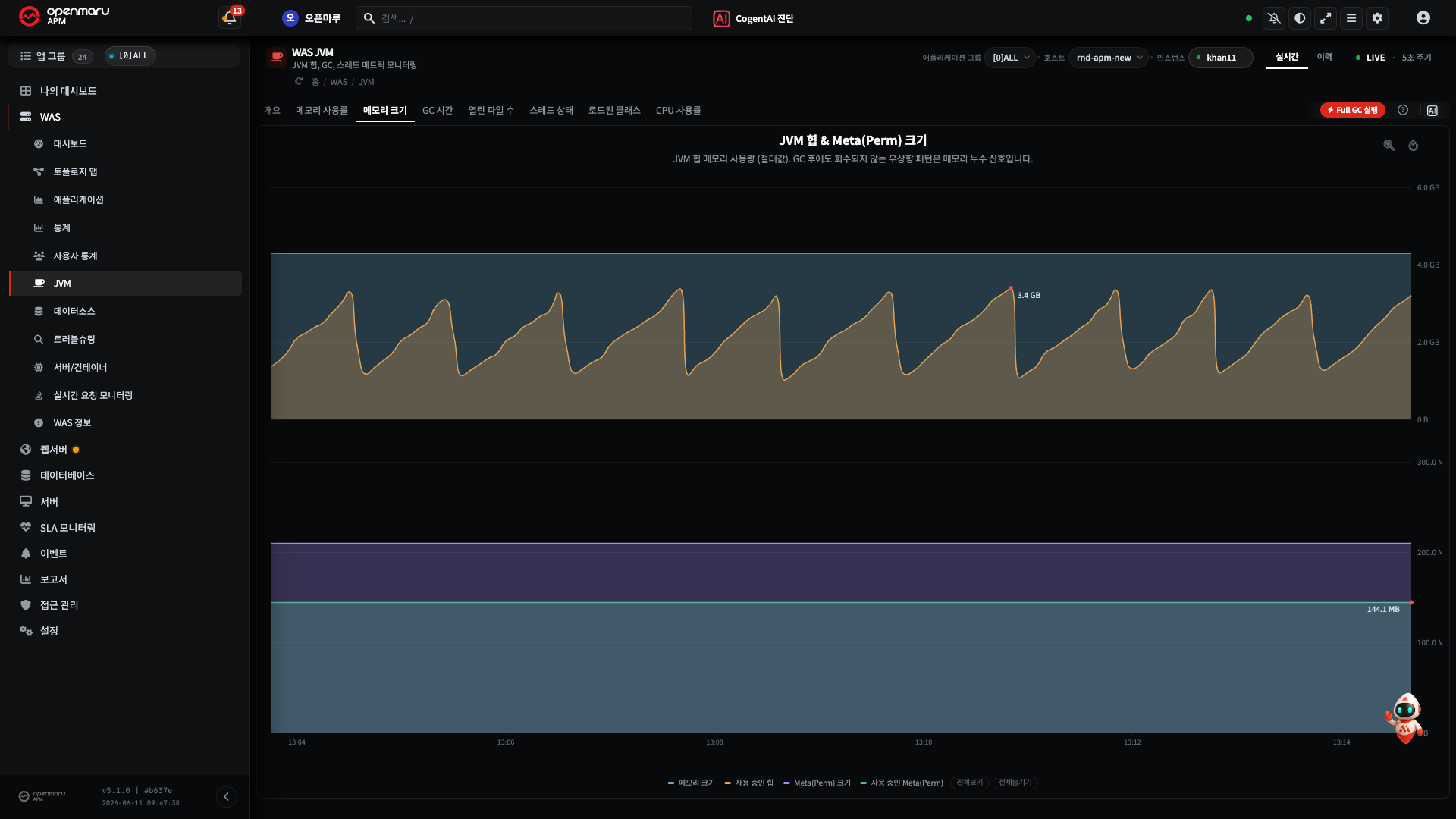
Each chart is a card, supporting the ? icon beside the title and drag and comparison controls
over the card. Below is the WAS › JVM › Memory Size screen as an example, with the ? icon and
the zoom (magnifier) and reset icons at the top right.
Zooming In and Out by Dragging
Use this when you want a closer look at one interval of a chart.
- Press the magnifier icon ("drag to zoom") at the top right of the chart.

- Drag horizontally across the chart over the interval you want. (Pull from the start point to the end point with the mouse.)
- That interval is zoomed and redrawn. The start and end time currently in view appear at the top left.
- To go back to the previous zoom level press Back to last zoom, and to return to the original state press Reset to default range.
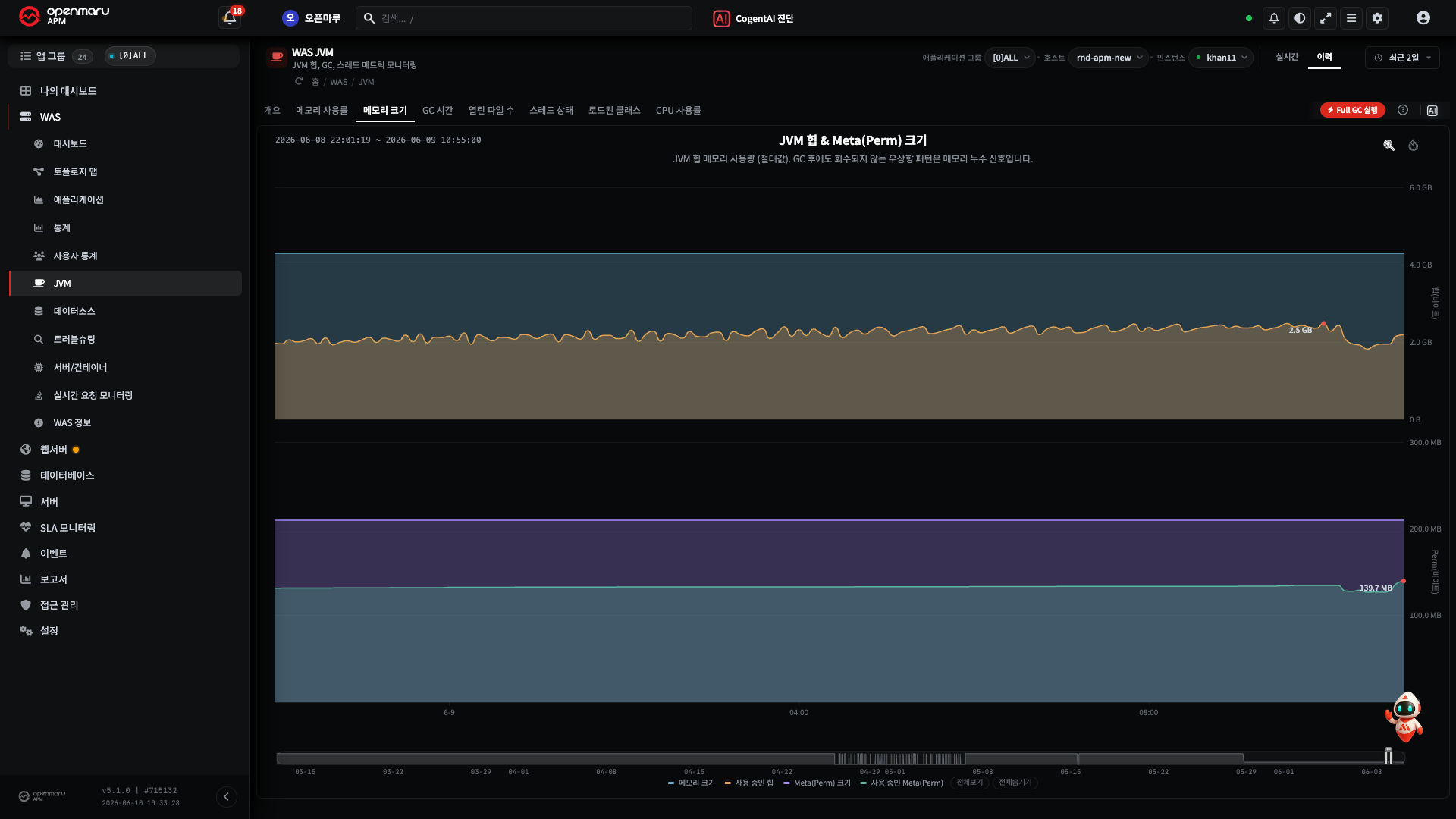
Note When one spike (a brief surge) flattens the whole graph and the usual flow is squashed along the bottom, dragging over an interval that excludes it makes the everyday pattern clear.
Comparing with Yesterday or Last Week
Use this to tell whether the current value "has always been like this, or is only unusual today". It is provided on the TPS, active users, request count, error rate, APDEX, and average response time widgets of the WAS › Dashboard.
- Press the line chart icon (compare with yesterday or last week) at the top right of the widget.
- Choose Compare with yesterday or Compare with last week. (Choosing Real time returns it.)
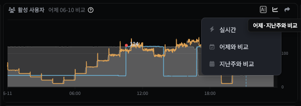
- The values from the same time of day yesterday (or last week) are overlaid across the whole
day on top of the current line, and a badge such as
Compared with yesterday 06-09appears beside the title. The current time is marked with a Now vertical line.
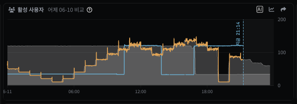
Result -- with the same time of day in the past side by side, how much higher or lower it is against usual is clear at a glance.
Note Comparison is most useful on metrics with a day-of-week or time-of-day pattern -- "the TPS at 10 am today is lower than usual" (TPS, response time, error rate, active users, and so on).
Exporting Chart Data (CSV)
The values seen on a chart can be received as a file for analysis in Excel, reports, or sharing.
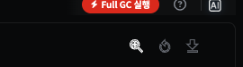
Charts in history mode provide a download icon (CSV export) at the top right -- beside the
magnifier (zoom) and reset icons, just below the ? icon.
- View the chart in history mode. (H2. Changing the Period)
- Press the download icon (CSV export) at the top right of the chart.
- Exactly the data currently on the screen is downloaded as a CSV file.
- If you have zoomed in by dragging, only that zoomed interval is exported.
- Series turned off in the legend at the bottom are excluded.
- The file is saved as
chart title_start time_end time.csv, with the first column the time and the following columns the values per series as on the screen. It opens directly in Excel without corrupted characters.
Note "I only want the 9 to 10 am surge in Excel" -- zoom into that interval by dragging first, then press the download icon. The export range always matches the screen, so you get what you see.
Other ways to receive data files:
- Excel Download -- table-based screens such as statistics and reports are received with the Export to Excel button above the table. Below is the WAS › Statistics screen as an example.

- Report files -- download the daily, weekly, and monthly reports as files → R5. Kinds of Report.
Note Having a chart screen analysed by the AI passes the chart image along automatically (H14. Getting AI Analysis of Charts and Events). Use the CSV and Excel downloads above when you need the data file, and AI analysis when you need an interpretation of the cause.
Seeing the Metric Description with the ? Icon
When you do not know what a chart you are seeing for the first time means, there is no need to go looking through the manual.
- Click the
?icon beside the chart title. (Clicking again closes it.) - An explanation appears of what that metric means and what counts as a problem. Pressing the Manual button below it goes to the relevant manual page.
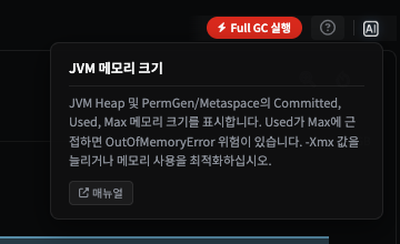
This description comes from the same source as R2. Chart Metric Reference (the
?catalogue in the product). Read it quickly on the screen, and look up the detail per chart in R2. The big picture of the metrics is set out in E3. What the Metrics Mean.
When It Does Not Work
| Symptom | What to check |
|---|---|
| Dragging does not zoom | Check you pressed the magnifier icon at the top right first. Also check whether that chart supports zooming (some table and gauge charts do not) |
| The comparison option is not visible | It is provided only on charts that support comparison with yesterday or last week |
| There is no CSV download icon | Check the chart is in history mode -- CSV export is provided on history charts (not in real time mode) |
| There is no Excel export button | Check the screen supports table data export (statistics, reports, and so on) |
The ? description is empty | There may be no description registered for that chart -- check in R2 |
Related Documents
- H1. Narrowing the Monitored Target · H2. Changing the Period
- H3. My Dashboard -- gathering only the charts you look at often
- R2. Chart Metric Reference · E3. What the Metrics Mean
- R5. Kinds of Report -- the list of reports and downloads