T1. Quick Start in 5 Minutes
Diátaxis: Tutorial · Audience: anyone opening OPENMARU APM for the first time ← Back to contents · ← E1 Overview
Finishing this exercise leaves you able to sign in, choose the target you want to see, and read the meaning of a chart. It takes about 5 minutes. Just follow it in order -- explanations of why are left to links, and the focus here is on doing.
What you need
- The OPENMARU APM address (the URL from your administrator)
- A user ID and password (issued by your administrator)
- A current browser (Chrome recommended)
Step 1 — Signing In
Entering the address in a browser brings up the sign-in screen.
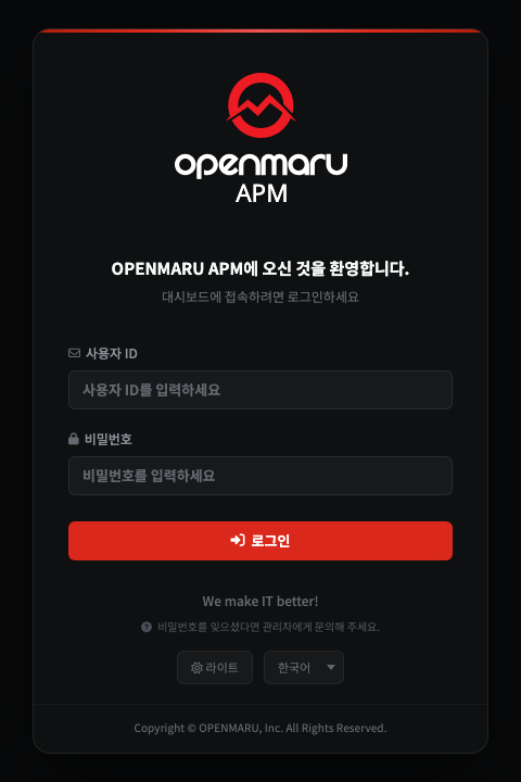
- Enter your ID in the User ID field.
- Enter your password in the Password field.
- Press the Sign In button.
If your company uses single sign-on (SSO), press the SSO Sign In button instead. 한국어/English and dark/light can also be changed in advance at the bottom of the screen.
Result -- on a successful sign-in, the first screen (the WAS dashboard) opens automatically.
Step 2 — Getting to Know the First Screen (3 Areas)
Every screen is made up of the same three areas. Learning where they are once now means never getting lost whichever menu you go to afterwards.
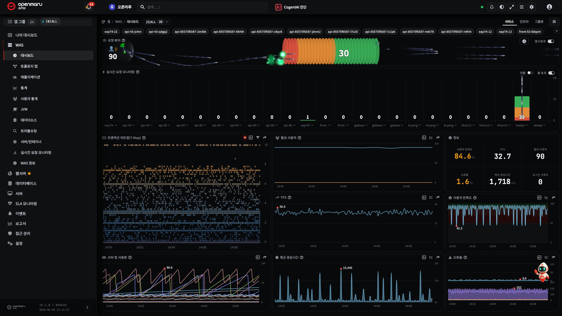
- The top header (the row at the very top) -- search, the AI diagnosis button, theme and language, alerts, settings, the user menu
- The left menu (the column on the left) -- pressing a major category (WAS, Web Server, Database, and so on) unfolds the minor categories. At the top of the menu is the target selector.
- The main area (centre to right) -- the charts and tables of the chosen screen. At the top of the main area is the context selector, and depending on the screen a period picker (for querying past intervals) as well. (The dashboard is real time only, so it has no period picker.)
There is no need to memorize it. For now just remember "the top is global tools, the left is the menu, the centre is the content". If you want the full menu list, open R1. Screen Map.
Step 3 — Choosing What to Look At
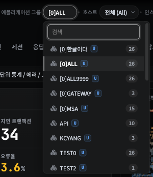
A dashboard only means something once you decide "whose" data it shows. On the WAS dashboard, use
the application group selector at the top of the left menu (or the top of the main area), for
example [0]ALL.

- Choose one application group. (The name of a service in production, for example.)
- The totals and averages of that whole group then appear in the charts.
- The three tabs at the top of the main area show the same group from different points of view.
| Tab | What it shows |
|---|---|
| Service | "Is the service running well" -- TPS, response time, APDEX (user satisfaction), and error rate, plus live requests (Request Viewer, Request Velocity), the T-Map, the JVM heap, and active users |
| Infrastructure | "Are the resources underneath all right" -- the service metrics above plus resource charts such as system CPU, system memory, and active database connections |
| Group View | "Every group at a glance" -- regardless of the selection, lists every application group and its instances with their state, as cards or a list |
Result -- when the charts fill with data, it has worked.
Note The WAS dashboard shows the whole group -- this screen has no host or instance selector. To see one particular instance, go into an instance-level screen (WAS ▸ Application, Topology Map, and so on). How to narrow from group → host → instance is in H1. Narrowing the Monitored Target.
Caution If the charts are empty, either the target (the application group) is not selected yet, or no agent is connected on that target. "What a group, instance, and agent are" is in E2. Core Concepts.
Step 4 — Reading What a Chart Means
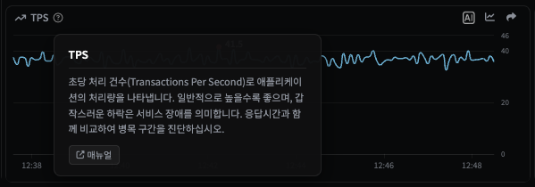
When you do not know what a chart's numbers mean, press the ? icon beside the chart title.
- Click the
?beside the title of any chart (TPS, for example). - An explanation appears of what that chart shows and what counts as a problem.
Result -- you can now find the meaning of any chart you do not recognize by yourself.
The dictionary gathering the explanations of every chart in one place is R2. Chart Metric Reference. The concepts behind the metrics (TPS, APDEX, heap, and so on) are covered in E3. What the Metrics Mean.
When you still cannot tell what the value means -- the chart's AI button
Where ? tells you what the chart is, there are times when you still cannot judge whether this
value is normal and, if not, where else to look. When you know what the number means but not
whether it is good or bad, pressing the AI icon at the top right of the chart card analyses
that one chart closely.
- Click the
AIicon at the top right of the chart card to analyse. (Hovering shows "CogentAI Analysis".) - The chart's title, current metric data, target (host/instance), and shape are passed to the AI together.
- The CogentAI widget opens and reports, in plain language, an interpretation of the current state and where to look next -- along the lines of "this chart is in a … state; check … as well".
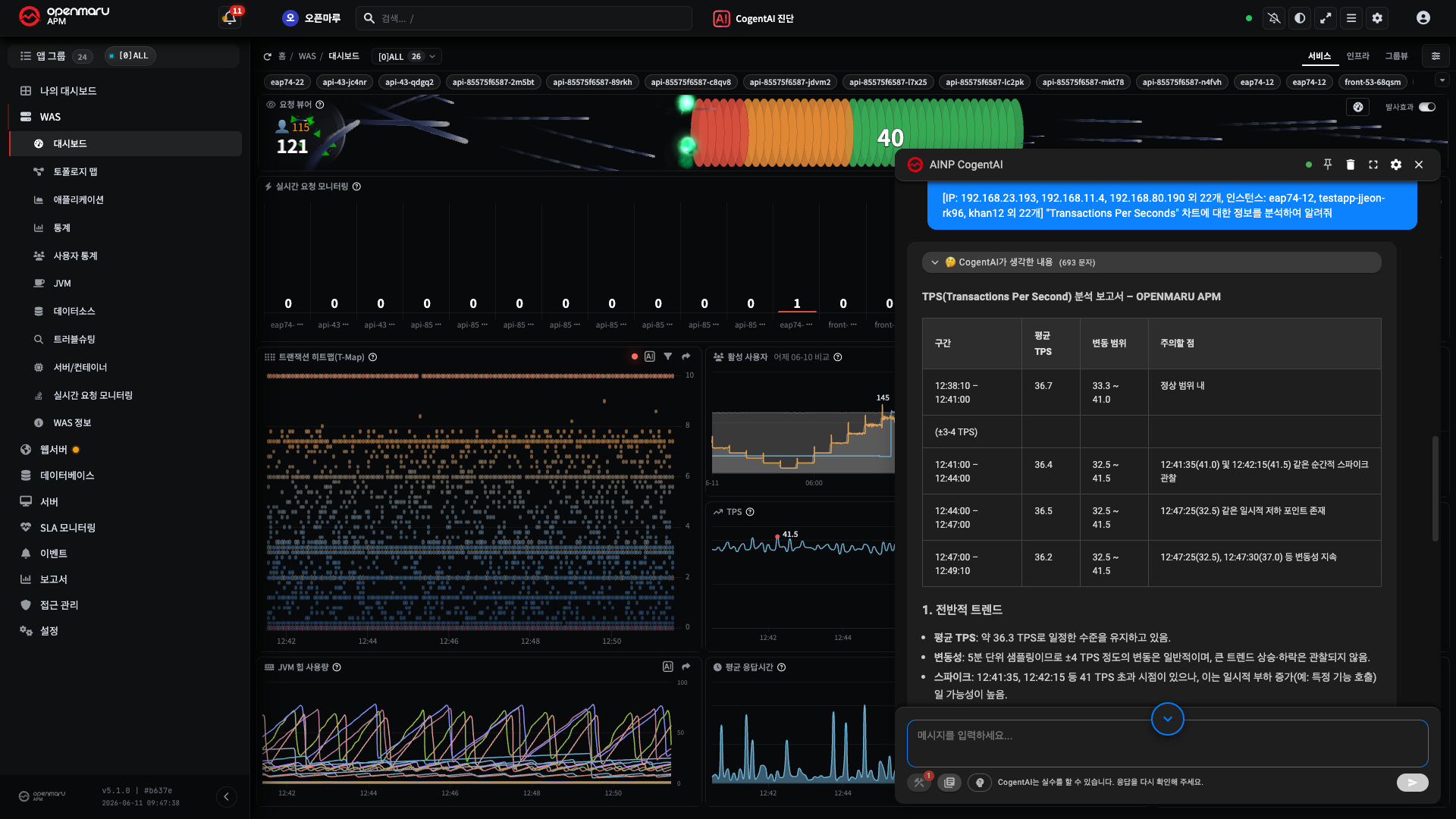
Result -- you can now get not only the meaning of a chart (?) but also an
interpretation of its current value (AI) by yourself.
Prerequisite The
AIbutton is visible only when an administrator has turned the AI features on (Settings ▸ Cogent AI). If it is not visible, ask an administrator. Caution An AI answer is a starting point -- for actions that are hard to undo, such as a restart or a configuration change, cross-check against the actual charts and the R2 reference before deciding. The full set of AI buttons -- AI Diagnose in the header (the whole group), transactions, events, and so on -- is in H14. Getting AI Analysis of Charts and Events, and the tutorial is in T3. Analysing a Cause with AI.
Done — What You Can Now Do
Well done. These 5 minutes have left you able to:
- sign in and open the first screen
- know the three areas of the screen (header, menu, main area)
- choose the target (application group) you want to see and change the point of view with the Service, Infrastructure, and Group View tabs
- check the meaning of a chart with
?and an interpretation of its current value with theAIbutton
Next Steps
| What you want to do | Guide |
|---|---|
| Understand the concepts better | E2. Core Concepts · E3. What the Metrics Mean |
| Trace a slow request all the way through | T2. Tracing a Slow Request |
| See a past interval such as yesterday or last week (the dashboard is real time only) | H2. Changing the Period |
| Learn more of the common operations (search, theme, favourites) | R4. Common UI Elements |
| See the whole menu | R1. Screen Map |
Note Changing your password and setting your profile (time zone) are done from the user menu (the person icon) at the top right.