E1. OPENMARU APM Overview
Diátaxis: Explanation · Audience: operators / administrators (including first-time users) ← Back to contents
This document explains what OPENMARU APM is, what it shows, and why it is arranged the way it is. It does not cover operations such as which button to press -- actual use continues in T1. Quick Start in 5 Minutes, and the concepts in depth in E2. Core Concepts.
E1.1 What OPENMARU APM Is
OPENMARU APM (Application Performance Monitoring) is a monitoring tool that lets you look at a running Java application and its surroundings -- web servers, databases, and server resources -- live on one screen, and quickly point to the cause when something goes wrong.
Note APM is the general term for the monitoring field that shows "is the application running well right now" in numbers and graphs. OPENMARU APM is the name of one product in that field.
Why APM Is Needed
A server being switched on does not mean the service is healthy. A slowing response, a particular SQL statement growing heavier, or memory leaking away little by little are hard to notice until they break as a failure. APM accumulates these changes as figures day to day, and then
- when a pattern differs from usual, it records an event and tells you,
- when a request is slow, it retraces the whole path of that one request (which SQL and which external call took the time),
- and from the 2026 renewal, the AI assistant (CogentAI) explains what those figures mean and what the possible causes are. (new)
In one sentence, then, the purpose of OPENMARU APM is "to see whether things are all right now, and to find the cause quickly when they are not". The whole manual is built to help with those two.
E1.2 What Is Monitored
OPENMARU APM covers five areas. These five map directly onto the major categories of the left menu, so you can find the menu by "what do I want to see" without memorizing the screen structure.
| Area | Left menu | What is monitored | Related reference |
|---|---|---|---|
| WAS (Java applications) | WAS | Request throughput (TPS), response time, APDEX, JVM heap/GC, transaction flow | R2.1 |
| Web server | Web Server | Requests, workers, and traffic of the web tier, such as Apache and Nginx | R2.2 |
| Database | Database | DBMS (MySQL, CUBRID, and so on) connections, response time, cluster state | R2.3 |
| Server (system) | Server | The OS CPU, memory, disk, and network | R2.4 |
| SLA | SLA Monitoring | Service availability and attainment against target | H17 |
These five areas are not separate pieces of information. When the WAS response slows, for example, they are designed so that whether the cause is the database, a shortage of server resources, or an external call can be compared on the same time axis. Diagnosis across the areas is covered in H6. Finding the Cause of a Slow Transaction.
Depending on the environment, Kubernetes (K8s), distributed tracing (Trace), and telemetry (OpenTelemetry) menus can also appear. Whether they are shown depends on the administrator settings.
E1.3 Why the Screen Is Arranged This Way
Signing in opens the WAS dashboard by default. Every screen shares the three parts below -- learn them once and you will not get lost whichever menu you go to.
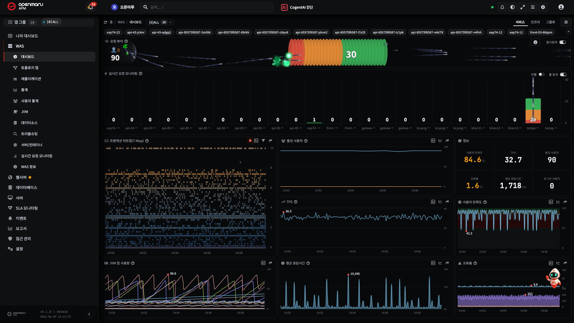
| Area | Role | Why it is here |
|---|---|---|
| Top header | Search, AI diagnosis, theme/language, alerts, settings, user menu | Global functions needed on any screen, so always in the same place |
| Left menu | Two levels, major → minor category (new) + the app group and instance selector | "What to see" (the menu) and "whose" (the target) are decided in one place |
| Main area | The charts, tables, and cards of the chosen screen + the context selector and period picker | "What, and as of when" is changed immediately at the top of the main area |
The point of this structure is that "what / whose / when" is always decided in the same place. Moving from one screen to another therefore keeps the target and period you were looking at.
- The full map of the menu is in R1. Screen Map
- The common UI for choosing the target and period is in R4. Common UI Elements
E1.4 The 5.1.0-11.0 Design Renewal -- What Changed, and Why
The design renewal is not a change of appearance but a redesign of the screens and behaviour around the purpose of "finding problems faster". The main changes and their intent are as follows.
| Change | Intent (why) | Learn more |
|---|---|---|
| Menu reorganized into two levels | A menu that was one long row became major → minor category -- fewer steps to reach the screen you want | R1 |
| Smoother live screens | No stutter even when data floods in -- stable with a monitoring screen left on for a long time | T1 |
| Automatic transaction diagnosis | Slow SQL, external calls, and errors as a waterfall picture -- it points to "where it is slow" first | H6, H5 |
| Overview tab consolidated | Scattered charts brought into one screen with only the essentials -- what took several clicks now takes one | R2.1 |
| SLA at a glance | Ordered top to bottom -- judge "is the SLA all right now" in one second | H17 |
| AI assistant (CogentAI) | AI analysis on every chart and event -- the meaning of a metric and its cause explained on the spot | H14 |
| Smarter alarms | Instead of the same alarm repeating, one at the start and one at recovery plus a regular reminder -- no flooded inbox | H15, H16 |
| Safer operation | A confirmation window before risky work -- preventing mistakes during night response | R6 |
| Stability at scale | A lighter alarm engine and faster reflection of instance changes -- more instances on the same server | R6 |
| PromQL support | APM metrics exposed as standard Prometheus queries -- direct connection to AI and external tools | R7 |
If you used it before the renewal, nothing has been removed -- it has been rearranged with shorter paths and clearer colours and spacing.
E1.5 Recommended Environment
The OPENMARU APM web console is reached through a browser, with nothing to install.
- Browser: a current modern browser (Chrome, Edge, Safari) is recommended.
- Screen size: it is designed for a desktop monitor. The wider it is, the more room the charts have, and it suits the large monitors of an operations room. (The live screens are optimized to work on lower-specification laptops and tablets too.)
- Account: a user ID and password issued by an administrator. The menus visible differ by permission.
Caution Some management features (marked (administrators only) in this manual) are visible only with administrator permission. If a menu is not visible it may be a permission matter, so ask an administrator.
Installing the agents and building the APM server are out of scope for this user manual and are covered in a separate installation guide.
What to Read Next
- The concepts in more depth -- E2. Core Concepts and the Data Flow (application groups, instances, and agents; transactions; how the data reaches the screen)
- What the metrics mean -- E3. What the Metrics Mean (TPS, APDEX, heap, GC, and so on)
- Trying it straight away -- T1. Quick Start in 5 Minutes