E3. What the Metrics Mean — What to Judge By
Diátaxis: Explanation · Audience: operators / administrators ← Back to contents · ← E2 Core Concepts
The OPENMARU APM screens are full of numbers and graphs. This document explains, as concepts, what each of the metrics you look at often means, what shape is normal, and when to be suspicious.
Key point This document is about concepts. The exact thresholds and checks for each individual chart are gathered in R2. Chart Metric Reference. Get the big picture from E3 and keep R2 beside you when looking at actual values. On the screen, the
?icon beside a chart title shows the same explanation.
Metrics exist, in the end, to answer three questions.
| Question | The metrics to look at | Section |
|---|---|---|
| Is the service running fast, in volume, and without errors? | TPS · response time · APDEX · error rate | E3.1 |
| Is the WAS (JVM) doing that work healthy? | Heap · GC · threads · classes · files | E3.2 |
| Are we keeping the level we promised? | SLA · availability | E3.3 |
E3.1 Throughput and Response — "Is the Service Running Well"
The four metrics below -- TPS, response time, APDEX, and error rate -- are seen together on one WAS dashboard screen.
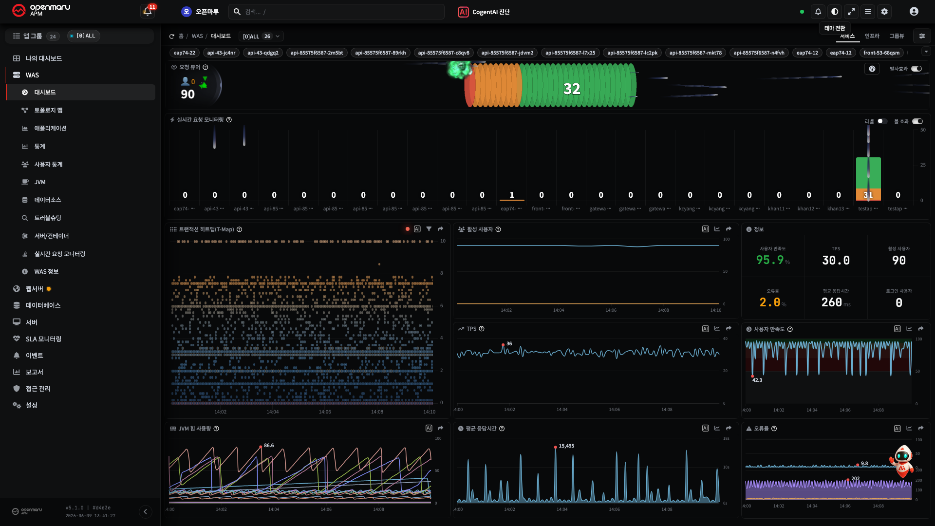
TPS (Transactions per Second)
TPS is the number of requests handled in one second -- the throughput. Higher is generally better. What matters is not the absolute value but the comparison with the usual pattern -- a sudden drop may be a service failure rather than falling traffic, so always read it alongside response time and error rate.
Response Time
The time taken to handle one request (in milliseconds, ms). As general guidance, 2 seconds or less is normal, from 3 seconds users perceive the delay, and 12 seconds or more is serious.
Looking at the average alone is a trap. A large gap between the average and the maximum means most are fast and only some requests are abnormally slow. In that case, open one of those slow transactions and look at the cause → H6. Finding the Cause of a Slow Transaction. The typical causes of a slowing response are slow SQL, external API calls, GC pauses, and resource contention.
APDEX (User Satisfaction Index)
APDEX (Application Performance Index) converts response time into a score from 0 to 100 from the point of view of user satisfaction. It is calculated by splitting responses into three groups.
- Satisfied: within the threshold time T
- Tolerating: T to 4T
- Frustrated: over 4T, or an error
The score bands are 94 to 100 excellent · 85 to 93 good · 70 to 84 fair · 50 to 69 poor · below 50 critical. Where response time answers "how many ms", APDEX compresses "was the user satisfied" into one number, which makes it useful for reporting and for judging trends.
Error Rate
The proportion (%) of 4xx/5xx error responses among all requests. The ideal value is close to 0%. A rising error rate is more likely a code, deployment, or dependency problem than a traffic one, so read the error log, the recent deployment history, and whether a dependent service has failed alongside it.
Note These four are not read separately. "TPS normal + response time spiking + error rate 0%" points first at external calls or a database delay, while "error rate spiking" points first at a deployment or a dependency -- read them as a combination.
Transactions in Flight -- Request Viewer and Request Velocity
Where the four metrics above aggregate "requests that have just finished", the Request Viewer and Request Velocity show the transactions being handled right now (not yet finished, pending) live. The number in the middle of the screen is the count of pending transactions, and each request is coloured one of three ways according to how long it has taken so far.
Key point The first thing to look at in service monitoring is "is there any red in pending". If there is no red at all among the pending transactions, every request is being handled within the threshold time and the service is healthy. If red appears, check that first before any other metric -- average and aggregate metrics only move after the failure is over, whereas red in pending is the earliest signal that a failure is being created right now. That is why "is there no red" is the first priority in a live service check.
This colour classification applies exactly the same criteria as APDEX above (the threshold time T, 3 seconds by default) to each in-flight request in real time.
| Colour | State | Elapsed time | Meaning |
|---|---|---|---|
| Green | Satisfying | Within T (3 seconds or less by default) | Being handled at normal speed |
| Orange | Tolerating | T to 4T (3 to 12 seconds by default) | Slowing -- the band where users start to perceive the delay |
| Red | Frustrating | Over 4T (12 seconds or more by default) | Seriously slow -- a request tied up for more than 12 seconds without finishing |
How to read it -- see the current state from the proportion of the colours.
- Mostly green: normal. Requests coming in are draining away quickly.
- Orange increasing: a precursor to slowing. The average response time may rise soon, so watch it.
- Red increasing: it means transactions that have not finished in over 12 seconds are piling up. Requests are tied up by slow SQL, an external API delay, a GC pause, resource contention, or the like. Left alone, the in-flight requests hold the thread pool and do not release it (see threads in E3.2 below) and it spreads to new requests waiting and failing. When red keeps piling up, open one of those slow transactions and look at the cause → H6. Finding the Cause of a Slow Transaction.
Note If the average response time (above) is "the result", this colour distribution is "the result being created". Acting when red starts to rise means responding before the average response time and error rate are ruined.
E3.2 JVM Health — "Is the Engine Doing the Work All Right"
The WAS runs on a Java virtual machine (JVM). When the JVM wobbles, response time and errors wobble with it, so the engine's state is seen through the metrics below.
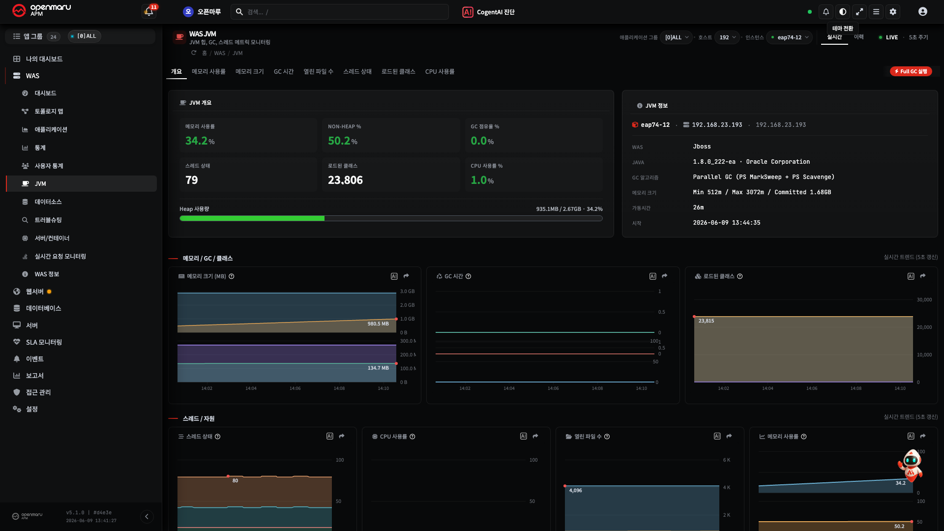
Heap Memory -- the Shape Is the Point
The heap is the memory space where Java objects accumulate. The normal pattern is a sawtooth -- it rises as objects accumulate, then drops sharply when GC (garbage collection) clears them, repeatedly.
- Danger signals: utilization staying flat while high (nothing is being cleared) or staying above 80% suggests a memory leak.
- A leak left to run ends in an OutOfMemoryError.
Read heap utilization (%) and size (MB) together, and dig in with the heap histogram or a heap dump when you suspect something → H7. Checking for a Memory Leak.
GC (Garbage Collection) -- the Cause of Pauses
GC is the work of clearing the heap, and the application pauses briefly while it cleans (stop-the-world). Short and occasional is normal, but frequent long GC pauses (500 ms or more, for example) are felt by users as a stall. The heap size, the object creation rate, or the GC algorithm settings can be the cause.
Threads
The workers that handle requests. Their health is seen from the state distribution (Runnable, Blocked, Waiting).
- Many blocked threads → suspect lock contention
- Many waiting threads → suspect thread pool exhaustion
- The cause is analysed with a thread dump.
Other JVM Metrics
| Metric | Normal / danger |
|---|---|
| Class count | Rising continuously with no unloading → suspect a classloader leak (in environments with frequent redeployment); can cause a Metaspace OOM |
| Open files (open file descriptors) | Approaching the maximum → a 'Too many open files' error. Check for socket leaks, unclosed streams, and the ulimit |
| JVM CPU | High means computation-intensive work is running. Compare with the system-wide CPU to see whether the JVM is the main consumer |
For the specific figures and checks of each chart, see R2.1 WAS Charts.
E3.3 SLA and Availability — "Are We Keeping the Promise"
An SLA (Service Level Agreement) is the promise of "the level at which this service will be provided". It is usually expressed as availability (the proportion of time the service responded normally, 99.9% for example).
Where the metrics above look at "is it fast and healthy at this moment", an SLA looks at "taken over the whole period, did we keep the level we promised". The point of view is therefore different.
- Even with moments of slow response, overall availability can still meet the target, and
- conversely, short but frequent failures accumulating can break the availability target.
The SLA dashboard shows "are we keeping the SLA now" at a glance, and the report sets out the attainment per period. How to configure and check it is covered in H17. Setting SLA Targets and Getting Reports.
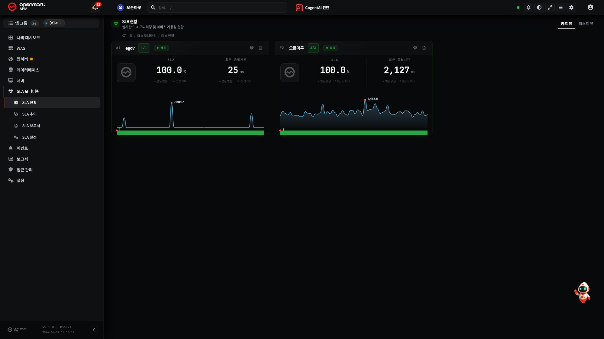
Summary
| Metric family | The question it answers | What normal looks like | Signals to suspect |
|---|---|---|---|
| TPS, response time, APDEX, error rate | Is the service running well | The usual pattern holds, error rate ~0% | TPS collapsing / response spiking / error rate rising |
| Heap, GC, threads | Is the engine healthy | A heap sawtooth, short GC | Heap flat or 80%+, frequent long GC, many blocked/waiting |
| SLA, availability | Are we keeping the promise | The target attainment holds | Attainment falling from accumulated failures |
What to Read Next
- R2. Chart Metric Reference -- the concepts above as specific thresholds per chart
- H6. Finding the Cause of a Slow Transaction · H7. Checking for a Memory Leak
- Just the term definitions, quickly -- R8. Glossary