3.2. Custom dashboards
User-defined dashboards where you combine metrics, logs, security events and APM spans into panels, arrange them, and save and share the result.
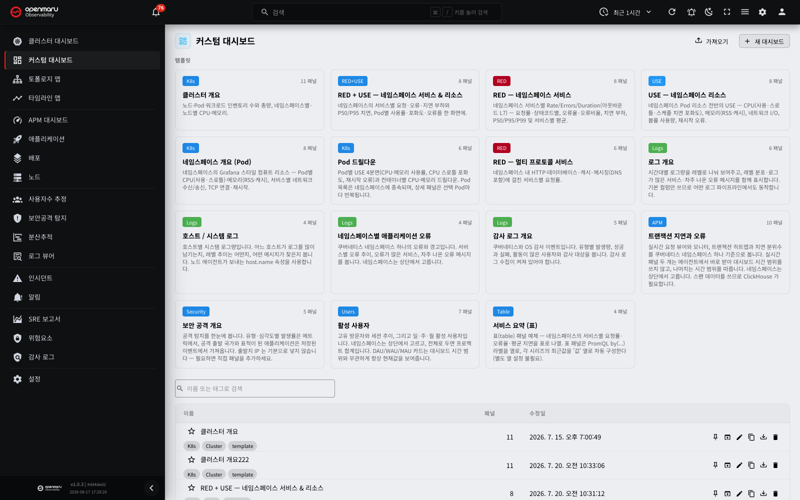
Overview
A custom dashboard lets you build your own panels, drag them into place, and save the result as a dashboard you can reuse. Unlike the dashboard and the APM dashboard, which are fixed in code, custom dashboards let a developer or site reliability engineer (SRE) assemble any combination of namespace, pod and arbitrary metrics without changing code.
Use them to gather resource usage, database and application metrics, and metrics specific to your own team onto a single screen the team looks at together. Saved dashboards are shared across the team for viewing (editing is restricted to users with the right permission), and the data is connected to the server in real time, so it refreshes on its own.
Open it from the Custom Dashboards menu in the dashboard group of the left sidebar, immediately below Cluster Dashboard. When you open a dashboard, its identifier is written into the address (URL) — for a template preview, the template key — so bookmarks, refreshes and the back button all keep working.
Note: PromQL is the query language used to read metrics in Prometheus-family monitoring. You describe the metric a panel should show in this language. You do not need to know the syntax in detail — starting from a template, described below, covers most screens. When you do write queries yourself, see the Cache PromQL query guide for the supported syntax and its caveats.
Screen layout
Custom dashboards have a list (landing) screen and a viewer/editor screen for an individual dashboard.
List screen
| Area | Description |
|---|---|
| Top header | The page title and the Import and New dashboard buttons |
| Template gallery | Cards for the verified starting templates that suit your deployment type. Each card shows a category chip, its panel count and a description |
| Search bar | Shown once you have saved dashboards. Filters by name or tag |
| Dashboard list | A table with name / panel count / last modified / actions columns. Click a row to open that dashboard |
| Row actions | Set as default, open, rename, duplicate, export, delete, plus a favourite (star) toggle before the name |
Viewer / editor screen
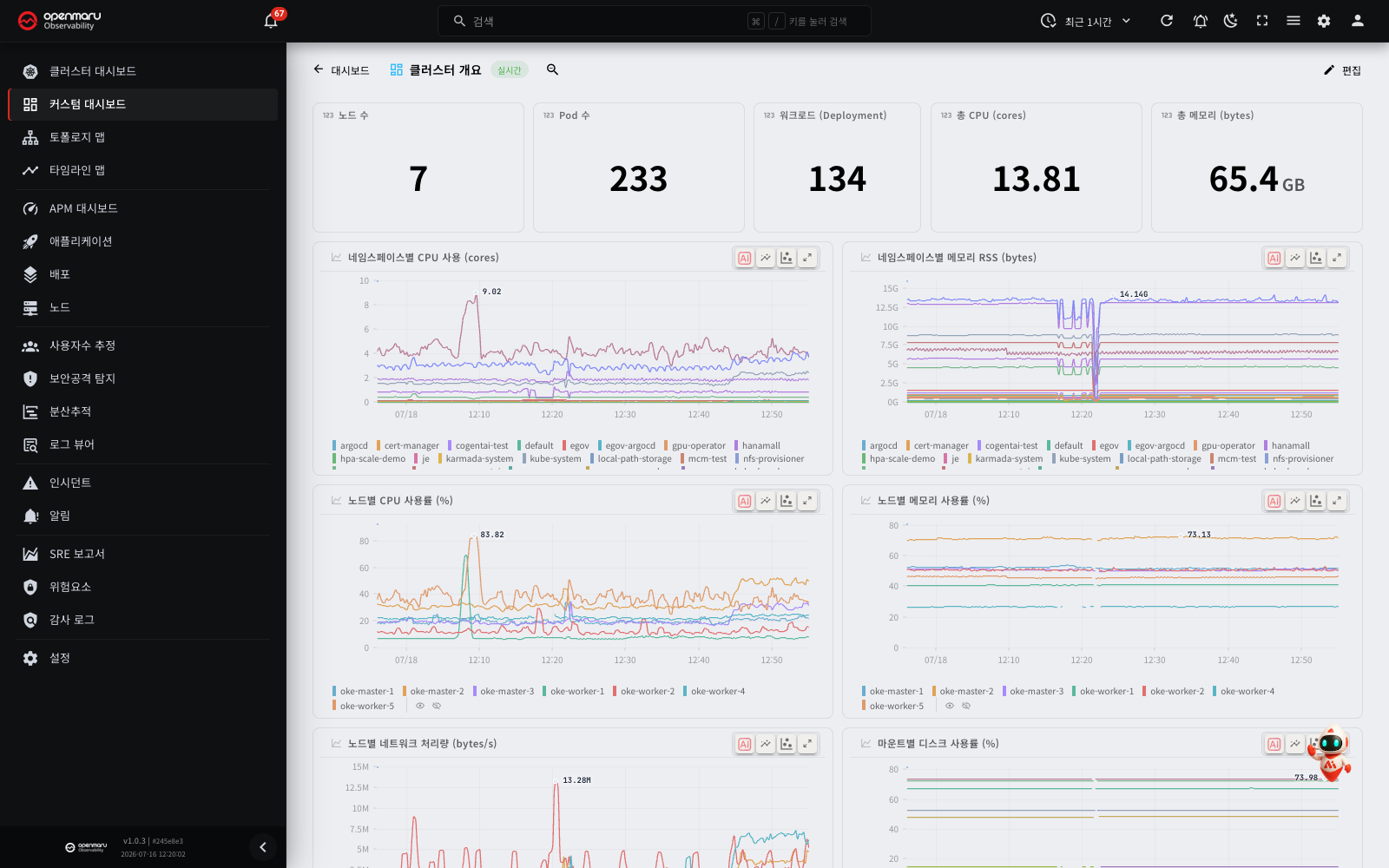
| Area | Description |
|---|---|
| Back | Returns to the list screen |
| Title area | The dashboard name and a real-time connection chip (a Template preview chip when you have opened a template) |
| Header variable combos | Filters for selecting a namespace and other variables in view and preview mode (pill combos in the APM style) |
| Zoom out button | Doubles the query time range in view mode (drag on a chart to zoom in) |
| Edit / Save, Add panel | Shown when you have edit permission. During a preview, a Clone & edit button instead |
| Tag editor | Shown in edit mode only |
| Variable bar | Shown in edit mode only. Add, edit and delete variables |
| Panel grid | The grid where you drag panels around and resize them (interactive in edit mode only) |
Main features
Building a dashboard from a template
The fastest route is to start from a ready-made template.
- Click a card in the template gallery at the top of the list screen and you go straight to a preview screen with no dialog in between. This state is read-only and nothing has been saved yet.
- In the preview, use the header variable combos to choose a namespace and so on and see real data.
- If you like it, click Clone & edit in the header. The template is copied into a dashboard of your own and you land in the editor, free to change anything.
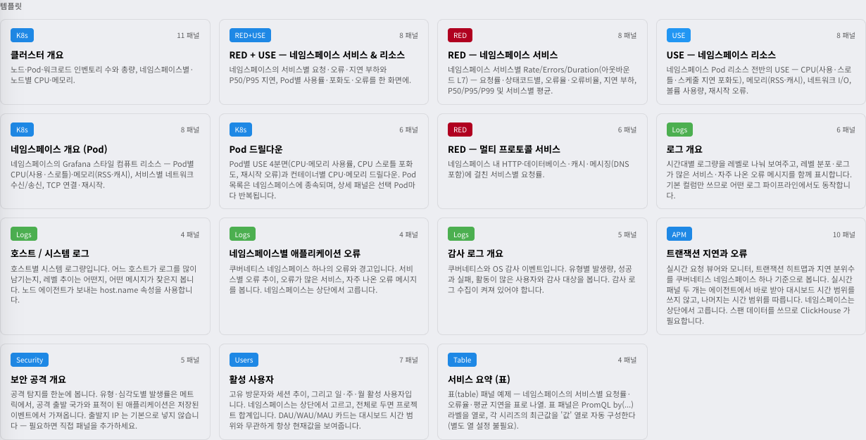
The 17 templates supplied are listed below. Which ones appear in the gallery depends on your deployment type (Kubernetes / host), on whether ClickHouse is configured and on whether a GPU is present.
| Template | Category | Contents |
|---|---|---|
| RED — Namespace services | RED | Rate, errors and duration — the service perspective |
| USE — Namespace resources | USE | Utilization, saturation and errors — the resource perspective |
| RED + USE — Namespace services & resources | RED+USE | Both the service and the resource perspective |
| RED — Multi-protocol services | RED | Requests, errors and duration for services on several protocols (HTTP, gRPC, databases) |
| Namespace overview (Pods) | K8s | CPU, memory and more per pod within a namespace |
| Pod drill-down | K8s | Narrow to one pod and look at its detailed metrics |
| Cluster overview | K8s | The state of the cluster as a whole |
| Service summary (table) | Table | Request, error and latency metrics per service, summarised as a table |
| Host services (non-K8s) | Host | Node metrics for non-Kubernetes (host) deployments |
| Transaction latency and errors | APM | A transaction latency heatmap and realtime widgets |
| Active users | Users | Active-user trend from user estimation |
| Security attack overview | Security | A summary of security attack detection events |
| Logs overview | Logs | Log volume by level and by service |
| Application errors by namespace | Logs | Error and warning logs broken down by namespace |
| Host / system logs | Logs | Host and systemd logs |
| Audit log overview | Logs | A summary of audit events |
| GPU and vLLM | AI | GPU utilization, memory, temperature and power per node, together with vLLM queue, KV cache, token throughput and time to first token (TTFT). 21 panels |
Note: RED stands for rate, errors and duration; USE for utilization, saturation and errors. Both are widely used standard metric sets. The category chip colour tells them apart (RED red, USE blue), so you can see at a glance which perspective a dashboard takes.
If the log, APM or GPU templates are missing from the gallery: the templates below appear only where their condition is met. Where it is not, they are absent from the gallery entirely.
- Logs overview, application errors by namespace, host / system logs, audit log overview and transaction latency and errors: these appear only where ClickHouse is configured.
- GPU and vLLM: this appears only when the project has one or more nodes with a GPU. Before the screen has checked for a GPU, or if the check fails, the gallery does not show this template.
To start from an empty screen, press New dashboard, enter a name and create it.
The GPU and vLLM template
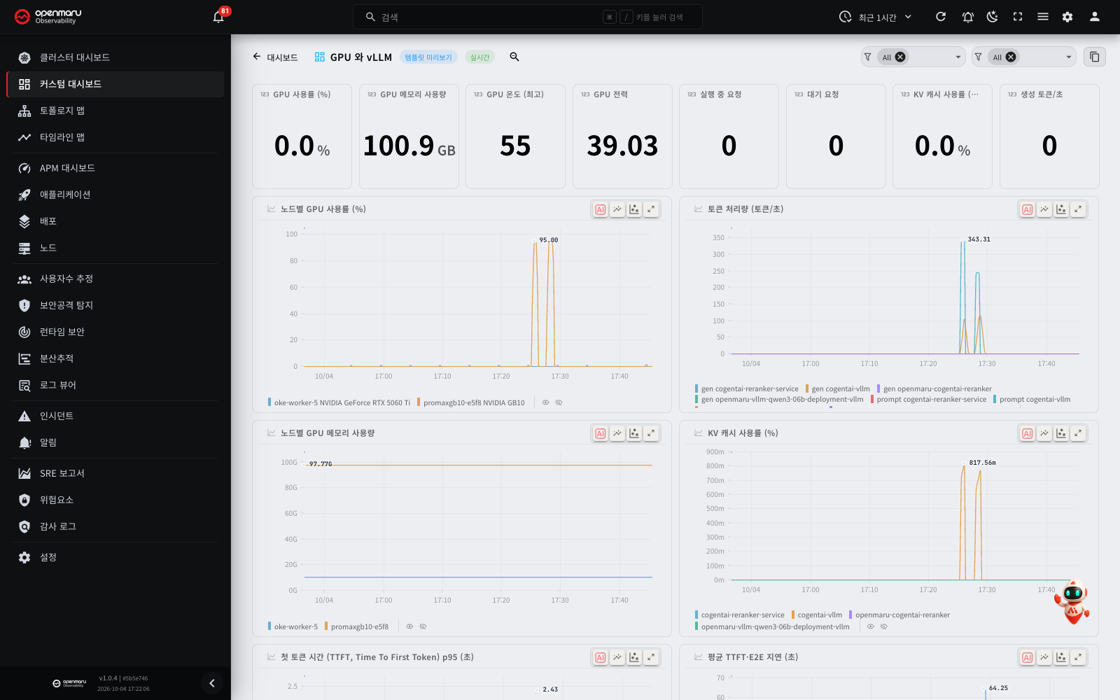
The GPU and vLLM template shows the GPU state and the vLLM inference server state on one screen. You can see the GPU on the GPU tab of the node details, and vLLM on the vLLM tab of the application details. This template puts the two side by side on the same time axis.
The header has two variables. Each variable accepts more than one value and All.
| Variable (label) | What you select |
|---|---|
Host | Nodes that have a GPU |
vLLM engine | vLLM engines that run on the selected nodes. The list changes when you change the nodes |
In the preview and in the view mode, the header does not show the labels. Each variable shows as a selection box with a filter icon. At first, both boxes show only an All chip. The left box is Host, and the right box is vLLM engine. The labels show in the variable bar of the edit mode. If you clear all values in a selection box, the box shows the label as a placeholder.
The panels are in this order.
| Position | Panels |
|---|---|
| First row | 8 single values: GPU utilization, %; GPU memory used; GPU temperature, max; GPU power; Running requests; Waiting requests; KV cache usage, max %; Generation tokens/s |
| Middle | 8 time series charts: GPU utilization by node, %; Token throughput, tokens/second; GPU memory used by node; KV cache usage, %; Time to first token (TTFT), p95, seconds; TTFT and E2E latency, average, seconds; Running and waiting requests; Finished and failed requests, per second |
| Tables | The vLLM engines table (columns app_id, hostname, kv_cache_size_tokens, model_name, vllm_runner, Value) and the GPUs table (columns gpu_uuid, hostname, name, Value). Use the hostname column of the two tables to match engines to GPUs |
| Bottom | 3 time series charts: GPU Temperature (℃); GPU Power (W); GPU memory used by vLLM engine |
Note: if vLLM runs in multiprocess metrics mode (
PROMETHEUS_MULTIPROC_DIRis set), an engine does not send the running requests, waiting requests and KV cache usage values before it gets its first request. Thus an engine that has not received a request is absent from the panels that use these values. It does not show as 0. After the first request, the engine shows normally.
Adding and editing panels
A panel is one visualisation block within a dashboard.
Opening the panel editor
In edit mode, press Add panel, or click the pencil icon in an existing panel's header, and the panel editor dialog opens.
Step 1 — choose a data source
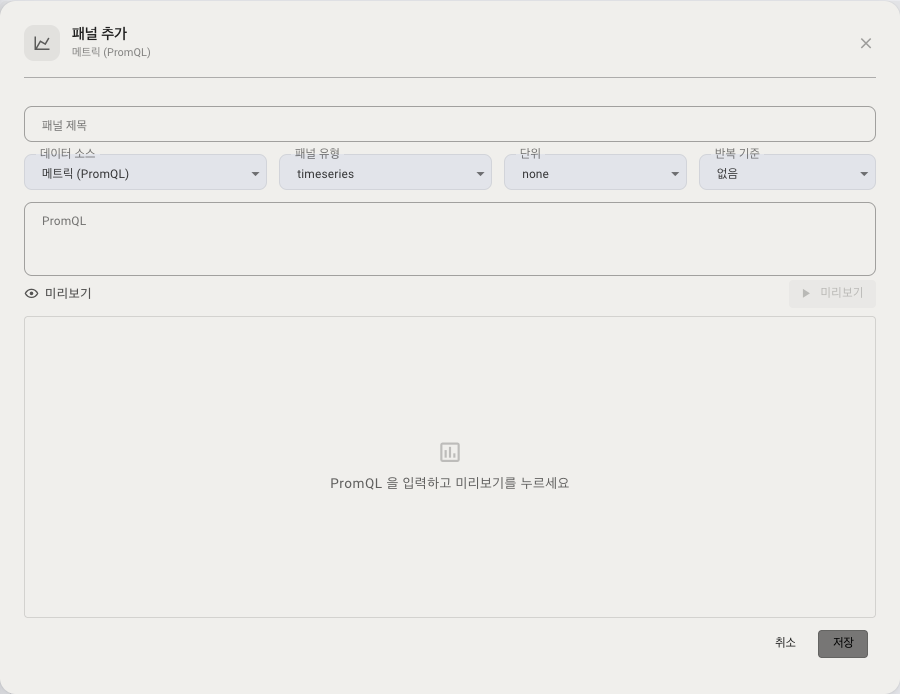
Decide what the panel draws first. The data source determines both the fields below and the panel types you can pick.
| Data source | What it draws | Notes |
|---|---|---|
| Metrics (PromQL) | Time-series metrics: CPU, memory, request rate | You write the query |
| Logs | Application log aggregates | Needs ClickHouse |
| Audit logs | Audit event aggregates | Needs ClickHouse |
| Security events | Security attack detection events | |
| APM spans | Transaction latency and errors | |
| Active users | User-estimation metrics (DAU/WAU/MAU and so on) | Cannot be selected until data has been collected |
| Realtime APM widget | Request viewer, realtime request monitor | See "Realtime widget panels" below |
Some entries are disabled when their conditions are not met, with the reason shown alongside.
- Active users: no user-estimation data has been collected for this project yet
- Realtime APM widget: the dashboard has already reached its realtime widget limit
Logs and audit logs appear in the list even without ClickHouse. Unlike the template gallery, the editor does not filter these two out. Pick one where ClickHouse is not configured and the panel cannot fetch data. If a log panel stays empty, check whether ClickHouse is configured.
Step 2 — choose a panel type
Which types you can choose depends on the data source.
| Data source | Panel types available |
|---|---|
| Metrics (PromQL) | Time-series chart · single value · table |
| Logs · audit logs · security events | Time-series chart · single value · table · bar list |
| APM spans | Time-series chart · single value · table · bar list · heatmap |
| Active users | Time-series chart · single value (there is no grouping key, so table and bar list are not offered) |
| Realtime APM widget | Widget only — you do not choose a display type |
If you change the data source while a type it does not support is selected, the type reverts to time-series chart. Pick a heatmap under APM spans, switch to metrics (PromQL), and you get a time-series chart.
Step 3 — fields
| Field | Description |
|---|---|
| Panel title | The name shown at the top of the panel |
| Unit | none / percent / bytes / cores / ms |
| PromQL query | Metrics source only. For example sum by (pod) (container_cpu_usage{namespace='default'}). Variables such as {{namespace}} can be used |
| Thresholds | Single-value panels only. Specify the value and the colour (ok / warning / critical) |
| Query conditions | For sources other than metrics: the target, grouping key and filters, chosen on screen |
What each panel type is for
- Time-series chart: a line chart against time. The most common type, and the one for seeing trends.
- Single value (stat): shows one representative number, large. Set a threshold and the number changes colour when the value crosses it. You can, for example, turn CPU usage red at 90% and above.
- Table: lists labels and values as a table. Useful for comparing the current values of several targets at once. If a label name ends with
_tokens,_bytes,_blocks,_count,_totalor_size, its integer values show with a comma every three digits (for example, a KV cache size of4,481,505). Other numeric labels, such as port numbers, show without commas. - Bar list: shows the top N as horizontal bars. Use it for "which is the most" questions, such as log volume by level or by service.
- Heatmap: shows the distribution of transaction latency in two dimensions, time against response time. The resolution of the cells adjusts to the query range.
Note: single-value and table panels do not issue a separate instant query — they use the most recent value of the series.
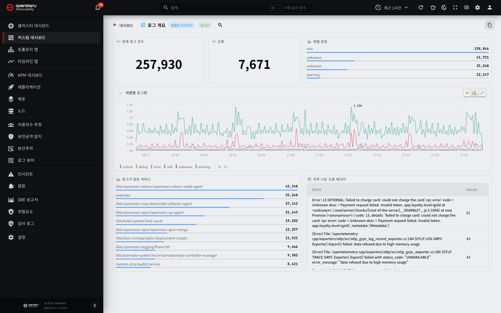
Things to watch with log panels
- Group by a field with very many distinct values (a request ID, say) and a warning appears. The chart would run to thousands of bars and become unreadable, so narrow the range.
- Where the query range is wide, the server folds it to at most 24 hours for the aggregate. Longer periods are not shown.
Preview and save
- Press Preview and the query runs once before you save, rendering according to the type (a number for single value, a table for table, a chart otherwise).
- If there is no data, or the query has an error, a message such as "No series returned" is shown.
- Press Save and the panel is added at the bottom of the grid.
The panel editor has no Legend field, and it edits only one PromQL query. A panel from a template or an imported JSON file can have several queries (for example, response time P50 and P95), each with its own legend. If you save such a panel in the editor, only the first query changes. The other queries and their legends stay as they are. If a query has no legend, the series name shows the label list (for example, {pod=api-0}). The icons in the panel header duplicate, edit and delete the panel.
Tip: in a JSON file to import, put a label such as
{{pod}}in the query legend (legend), and each series gets its name automatically. Path-shaped values such as/k8s/ns/checkoutare shortened to their last segment (checkout).
Realtime widget panels
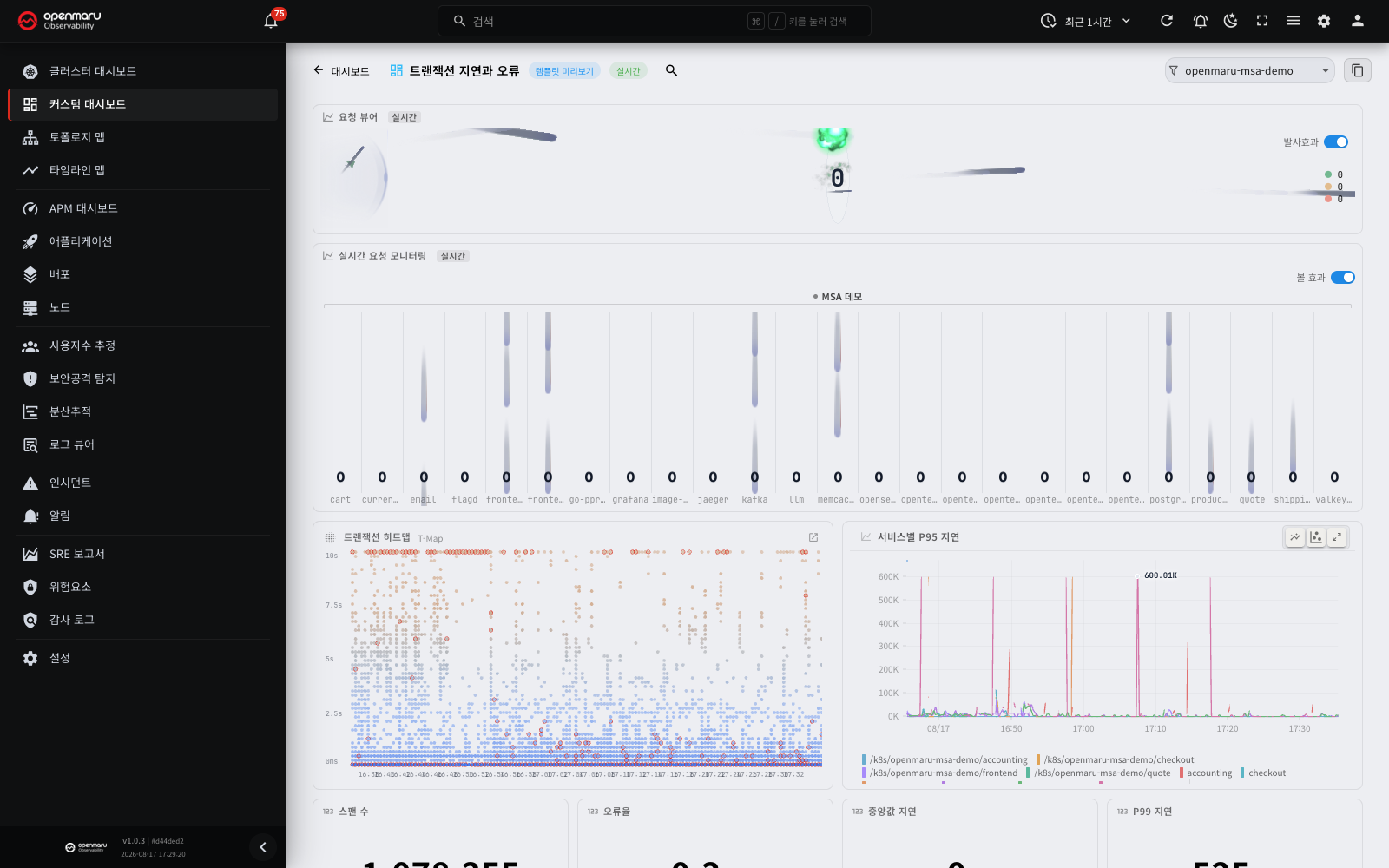
The request viewer and realtime request monitor from the APM dashboard can be placed on a custom dashboard. Choose Realtime APM widget as the data source. These panels ignore the query time range and always show the traffic flowing right now, with a Realtime badge in the header.
| Widget | What it shows |
|---|---|
| Request viewer | Requests flying towards services as particles, coloured by success or error |
| Realtime request monitor | Request rate per instance, drawn as bands |
The per-dashboard limit
One dashboard can hold up to three distinct filter combinations of realtime widgets. The unit is the filter combination, not the panel, so several widgets watching the same namespace and category count as one.
Once the limit is reached, Realtime APM widget turns disabled in the data source list of the panel editor, with the reason shown. Existing panels do not quietly go blank; you are stopped at creation time instead.
Small panels stop
A realtime widget stops animating below a certain size (160px wide, 72px tall). If a widget looks frozen, try making the panel bigger first.
Click through to detail
- Drag across the T-Map in the request viewer to open the transaction list for that span.
- Click an instance name in the realtime request monitor to open that application's detail screen.
Filtering with variables
A variable is a filter value applied across the queries of several panels at once. Define a namespace variable, for instance, and changing the namespace in the combo re-queries every panel against it.
Note: the namespace you select on one screen (the APM dashboard, say) carries over to others, including custom dashboards and user estimation, and your last selection is remembered in template previews too.
Creating a variable
- In the variable bar at the bottom of edit mode, press Add variable to open the variable editor dialog.
- Fill in the following.
| Field | Description |
|---|---|
| Variable name | The name you refer to in queries (for example namespace → {{namespace}}) |
| Display label | The name shown on the combo |
| Type | From a query to look label values up automatically, or Fixed list to list values yourself |
| Query (From a query) | The label to look up, for example label_values(namespace) |
| Options (Fixed list) | A list of values separated by commas or newlines |
| Multi-select | Select several values at once (substituted into queries as `label=~"a |
| Include All | Adds an "All" entry that matches everything |
- Save and the variable appears as a combo. Change the selection and every panel re-queries immediately with the substituted query. Variable definitions and selected values are part of the saved dashboard and are restored next time you open it.
Dependent variables (namespace → pod)
You can make one variable's list depend on the selection of another. Give the pod variable this query, for example:
label_values(container_info{namespace="{{namespace}}"}, pod)
and changing the parent namespace reloads the pod list automatically (the dependency runs top to bottom). If a parent change makes the existing selection invalid, it resets to the first value.
Inline variable combos in the header
In view and preview mode the variable combos appear inline in the header, as searchable pills with a filter icon. Select several values and they are summarised on one line as "first value + N more".
Tip: the namespace you choose is remembered in the browser, so the same namespace stays selected on other screens such as the APM dashboard and user estimation. A saved dashboard's own value takes precedence, though, and the namespace list can differ between screens (APM, for instance, shows only namespaces with recent traffic).
Saving, duplicating, renaming and deleting
| Action | How |
|---|---|
| Enter edit mode | The Edit button in the viewer header → dragging, resizing and variable management become available |
| Save | Save in edit mode → grid positions, panels, variables and tags are all written to the server and you return to view mode |
| Rename | The pencil icon on a list row → the rename dialog |
| Clone | The clone icon on a list row → copies the whole configuration into a new dashboard named "name copy" |
| Duplicate a panel | The duplicate icon in a panel header in edit mode → adds a new panel at the bottom of the grid |
| Delete | The delete icon on a list row → deletes after confirmation (this cannot be undone) |
Favourites and the default dashboard
- The star icon before the name toggles a favourite.
- The pin icon sets the default dashboard. The default dashboard opens automatically the first time you enter in a session (there is one).
- The list is sorted default, then favourites, then by name.
Time range and zoom
Adjust the query range with the time picker at the top. Drag on a chart in view mode to zoom in; press the zoom-out button in the header and the range doubles.
- A relative range (last hour, say) moves the window about every 30 seconds to stay current, and a Live badge appears beside the title.
- An absolute range (start and end times you set) does not move, so the badge reads Fixed range instead.
Realtime widget panels ignore this setting and always show current traffic.
Exporting and importing dashboards (JSON)
Dashboard configuration can be exchanged as a JSON file, for backup or for moving to another environment.
- Export: click the export icon on a list row and the dashboard configuration downloads as a JSON file. Instance-specific information (internal identifiers, modification times, favourite status) is left out; only the name, description, tags, variables, panels and time range are included.
- Import: press Import in the list header and choose a JSON file. A confirmation dialog shows the file name and panel count. Adjust the name and import, and it is created as a new dashboard.
Use this for backup and version control, for moving from a development environment to production (or to an air-gapped environment), and for sharing within a team. Files that are not in the right format, or that exceed the size or panel limits, are rejected with the specific reason.
| Rejection message | Cause |
|---|---|
| Not a valid JSON file | The file is not valid JSON |
| Not an OPENMARU dashboard file | Not a custom dashboard export file |
| Unsupported file version / Unsupported dashboard version | Schema version mismatch |
| File too large (max 1MB) | The file exceeds the size limit |
| Too many panels (max 200) | The panel count exceeds the limit |
Worked examples
A dashboard just for your team's namespace
- Open the RED — Namespace services template and choose Clone & edit.
- Set the
namespacevariable to your team's namespace. - Delete the panels you do not need, and use Add panel to add the metrics your team looks at often (the response time of a particular API, say).
- Tag the dashboard with your team name, save it, and set it as the default with the pin icon.
A namespace → pod drill-down dashboard
- Create an empty dashboard with New dashboard.
- Define a
namespacevariable (label_values(namespace)) and a dependentpodvariable (label_values(container_info{namespace="{{namespace}}"}, pod)). - Use
{{namespace}}and{{pod}}in the queries of your per-pod CPU and memory panels. - Change the namespace in the header and the pod list refreshes automatically, so one dashboard covers several namespaces.
Moving a dashboard to another environment
- Export the dashboard you finished in your development environment from the list, and take the JSON file.
- In the custom dashboard list of the production (or air-gapped) environment, upload that file with Import.
- Confirm the name and import, and a dashboard with the same configuration is created.
Frequently asked questions
I cannot see the save and edit buttons
Editing, saving, deleting and importing are available only to administrators and users with edit permission. Without it you can only view. For permissions, see user and permission management under Settings.
Only one panel shows an error
An error in one panel's query is confined to that panel rather than affecting the whole dashboard. Open its editor dialog with the pencil icon and check the query with Preview.
An orange warning icon appears next to the panel title
The server reported something to watch while computing the result. The result is shown, but hover over the icon to read the warning: the tooltip shows a translated description and the original text from the server. A panel with an error shows the error instead of the warning icon.
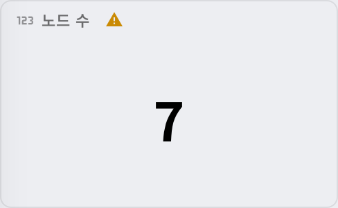
| Warning | Meaning | What to do |
|---|---|---|
| Some window function results are approximated | A range aggregation (avg_over_time, say) was computed from values reduced to the query interval instead of the stored interval, because the values to read exceeded the limit or too many queries were doing the same calculation at once | Shorten the time range or narrow the series in the query. If it was the concurrency limit, query again a little later to get the exact value |
| Part of the stored data could not be read, so the result may be incomplete | Part of a cache file is damaged and that span is missing | Tell your administrator |
| Calculated by averaging the stored rate values in the window | rate() · increase() · irate() was used on a metric already stored as a rate | Check that this is the calculation you want. See the Cache PromQL query guide |
| The window is shorter than the stored rate window, so the stored values were used as they are | The window, as in rate(x[30s]), is shorter than the stored window (3 × the scrape interval, usually 45 seconds) | Make the window longer than the stored window (1 minute or longer for a 15-second scrape interval) |
The variable combo has no values
A query variable finds values only where the label has data. For a dependent variable, you have to select the parent variable first before the list fills. In non-Kubernetes (host) environments there are no namespace or pod labels, so those variable options come up empty and you should use the templates based on node metrics (node_*).
The log, APM or GPU templates are missing from the gallery
The four log templates and the Transaction latency and errors template appear only where ClickHouse is configured. Where it is not, they are absent from the gallery. Note that the panel editor still offers the Logs and Audit logs data sources; pick one there and the panel cannot fetch data.
The GPU and vLLM template appears only when the project has one or more nodes with a GPU. If a node has a GPU but the template does not appear, first make sure that the Nodes screen shows a GPU count for that node.
A realtime widget is not moving
Check two things.
- Panel size — below 160px wide or 72px tall the animation stops. Try making the panel bigger.
- Traffic — realtime widgets draw the requests happening now. With no traffic in that namespace, empty is correct.
If you cannot create a new realtime widget, the dashboard has reached its limit of three filter combinations. The reason is shown in the data source list.
A panel shows "No data"
Nothing matches the query conditions. Check the time range, the variable selection and the query conditions in turn. For a log panel, check whether ClickHouse is configured as well.
I cannot move or resize a panel
Moving and resizing panels, managing variables and editing panels are possible in edit mode only. Press Edit in the viewer header to switch. View mode allows querying, filtering and zooming only.
Terms
| Term | Description |
|---|---|
| Namespace | The unit Kubernetes uses to group resources logically. The default variable for dashboard filters |
| PromQL | The Prometheus-family metric query language. You describe the metric a panel shows in it |
| Panel | One visualisation block within a dashboard (chart, single value, table, bar list, heatmap, realtime widget) |
| Data source | What a panel draws from: metrics, logs, audit logs, security events, APM spans, active users or a realtime widget |
| Bar list | A panel type listing the top N as horizontal bars |
| Heatmap | A panel type showing distribution in two dimensions, time against response time (APM spans only) |
| Realtime widget | A panel that draws current traffic regardless of the query range (request viewer, realtime request monitor) |
| Variable | A filter value applied across several panels (for example {{namespace}}) |
| Dependent variable | A variable whose list changes with the selection of another (for example namespace → pod) |
| Template | A ready-made starting dashboard (RED, USE and so on) |
| RED / USE | Standard metric sets for the service perspective (rate, errors, duration) and the resource perspective (utilization, saturation, errors) |
| Legend | The rule for naming series (a {{label}} template) |
| Threshold | The boundary at which a single value changes colour |
| Repeating panel | Duplicates a panel for each selected value of a variable |
Related documents
- Dashboard — the code-defined dashboard of overall cluster state
- APM dashboard — the shared namespace selection and live application performance
- SRE report — turning metrics into PDF and Excel documents with custom reports
- Cache PromQL query guide — the PromQL syntax supported in panel queries, and its caveats
- User estimation — active user analysis based on the shared namespace selection
- Settings — user and permission management (granting edit permission)