6.2. SRE report
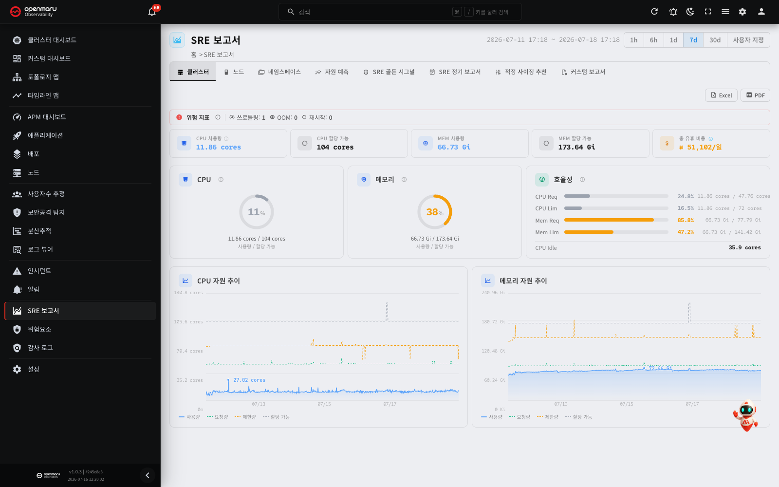
A tabbed report gathering cluster resource status, forecasting, SLOs, optimisation and user-defined reports onto one screen.
What SRE is
Site reliability engineering (SRE) is an operational methodology established at Google that applies software engineering principles to running systems, managing a service's reliability (availability and performance) as an engineering discipline rather than by instinct. The core idea is to handle operations through metrics, targets and automation rather than by hand.
What it gives you
- Reliability managed as a measurable target: you define the indicators users actually feel (SLIs) and judge the state against a target (SLO). Instead of "it feels slow", you say "the target is 99.9% and we are at 99.5%".
- Balancing speed and stability — the error budget: rather than chasing 100% perfection, you set an SLO and release at speed within the failure allowance (the error budget) the target permits. With budget left, you deploy quickly; once it is spent, you concentrate on stabilising. The trade-off between development speed and stability is settled with data.
- Less toil: manual responses give way to automatic inspections, alerts and standardisation, so people concentrate on fixing root causes.
- Acting ahead of time: capacity exhaustion, regressions and anomalies are caught in advance through forecasting and automatic detection rather than after the fact.
What to concentrate on
- SLI / SLO / error budget: track the key indicators users feel — availability, response time — against their targets, and watch how fast the error budget is burning.
- The four golden signals: latency, traffic, errors and saturation. Watching just these four catches most problems early.
- Tail latency (P95, P99): look at "the slowest experience" through percentiles rather than the average (for why percentiles, see the P50 and P95 explanation in the APM dashboard).
- Capacity planning: forecast future usage to prepare for resource exhaustion, and correct over- and under-allocation by comparing requests with actual use.
- Regressions and root causes: track performance regressions and error increases after a deployment, and the root causes of repeated incidents.
The SRE features the product provides
OPENMARU Observability supports the focuses above with the following features.
| SRE focus | Product feature |
|---|---|
| SLOs and error budgets | The availability and response time SLOs and error budget alerts on an application's SLO tab, and the SRE Golden Signals tab of this report |
| Golden signals (latency, traffic, errors, saturation) | The SRE Golden Signals tab of this report summarises all four |
| Latency percentiles (P50, P95, P99) | P50 and P95 on the APM dashboard, and p50, p95 and p99 in distributed tracing |
| Root cause analysis (RCA) | The automatic analysis of cause service, propagation path and causal timeline in incidents |
| Capacity planning and forecasting | The Resource Forecast tab of this report, and chart forecasting and anomaly detection |
| Rightsizing | The Quick Sizing tab of this report (actual use against requests and limits) |
| Regular reporting and sharing | The SRE Periodic Report tab (with scheduling), and PDF and Excel output |
| Reducing toil | Around 80 automatic inspections, automatic alerts, and the automatic service map |
Overview
The SRE Report gathers the cluster's resource status, forecasts of future usage, periodic SLO reporting, resource optimisation recommendations and a custom report you assemble yourself into one tabbed report view.
SREs and operators who need capacity planning and periodic SLO reporting use it, as do developers checking their team namespace's resource efficiency and managers who need weekly and monthly summaries. As well as reading it on screen through dashboards, tables and charts, you can download it as a PDF or Excel file to distribute and share. Every file is generated on the server, so it works in air-gapped environments with no internet access.
Open it from the SRE Report menu in the left sidebar. The selected tab is written into the address (URL), so bookmarks and shared links work.
The shared period picker
The period picker at the top right of the screen sets the query range. It offers presets (1h · 6h · 1d · 7d · 30d, defaulting to 7d) and Custom; choose Custom and start and end date/time pickers appear with an Apply button. The range actually selected is shown in the header as YYYY-MM-DD HH:mm ~ ….
Note: this period picker at the top is hidden on the Resource Forecast, SRE Periodic Report and Custom Report tabs, because those three carry their own period (and interval and schedule) controls in the body.
The tabs
The SRE report has the following tabs. In non-Kubernetes environments the Namespaces and Quick Sizing tabs are hidden automatically.
| Tab | Purpose |
|---|---|
| Cluster | Cluster-wide CPU and memory status and totals |
| Nodes | Resource usage and efficiency per node |
| Namespaces | Actual use against requests, per namespace — Kubernetes only |
| Resource Forecast | Forecasts of future usage from past trends (capacity planning) |
| SRE Golden Signals | A summary of the four signals: latency, traffic, errors, saturation |
| SRE Periodic Report | Periodic SLO reports, and the reporting schedule |
| Quick Sizing | Sizing recommendations from actual use against pod requests and limits — Kubernetes only |
| Custom report | A report builder where you assemble sections and panels yourself and output PDF or Excel |
Note: hover over the ⓘ icon beside a table's section title and it explains how the values were aggregated — whether they are a period average, the latest value, an increment or a count. Check this before interpreting the numbers.
The standard tabs
Cluster, nodes and namespaces
- Cluster: cluster-wide CPU and memory status and totals. The shared period picker at the top changes the query range.
- Nodes: resource usage and efficiency per node. Use it to see which nodes are saturated and which have room.
- Namespaces: resource efficiency, comparing actual use against requests per namespace. Kubernetes only.
Click a node or namespace row and a detail dialog opens with summary gauges and CPU and memory trend lines, from which you can download the hourly detail as Excel or PDF. The Excel and PDF buttons at the top right of each tab save the whole list currently shown as a PDF or Excel report (the same as on the Cluster tab).
Resource Forecast
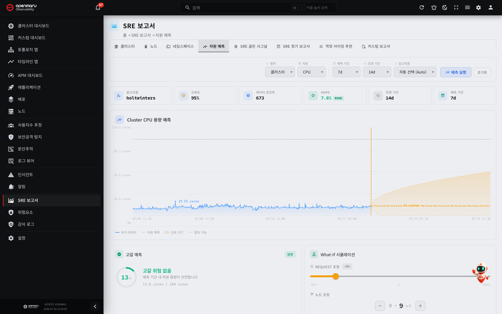
Forecasts future resource usage from past trends, to help you judge when to add capacity.
- Select what to forecast (a namespace, a node and so on).
- Choose the Algorithm.
- Auto: picks the best algorithm automatically from the shape of the data.
- Linear: a simple trend line. Suits metrics that rise or fall steadily.
- Holt-Winters: accounts for seasonality (patterns that repeat by day of week or time of day).
- ARIMA / SARIMA: statistical time-series models. SARIMA accounts for seasonality as well.
- Set the Forecast Horizon and it forecasts that far ahead.
Where the headroom against capacity is forecast to fall below the safety margin, a warning is shown.
Note: a forecast depends on the quality and quantity of past data. Where not enough data has accumulated, or the pattern is irregular, the forecast will be less accurate.
SRE Golden Signals
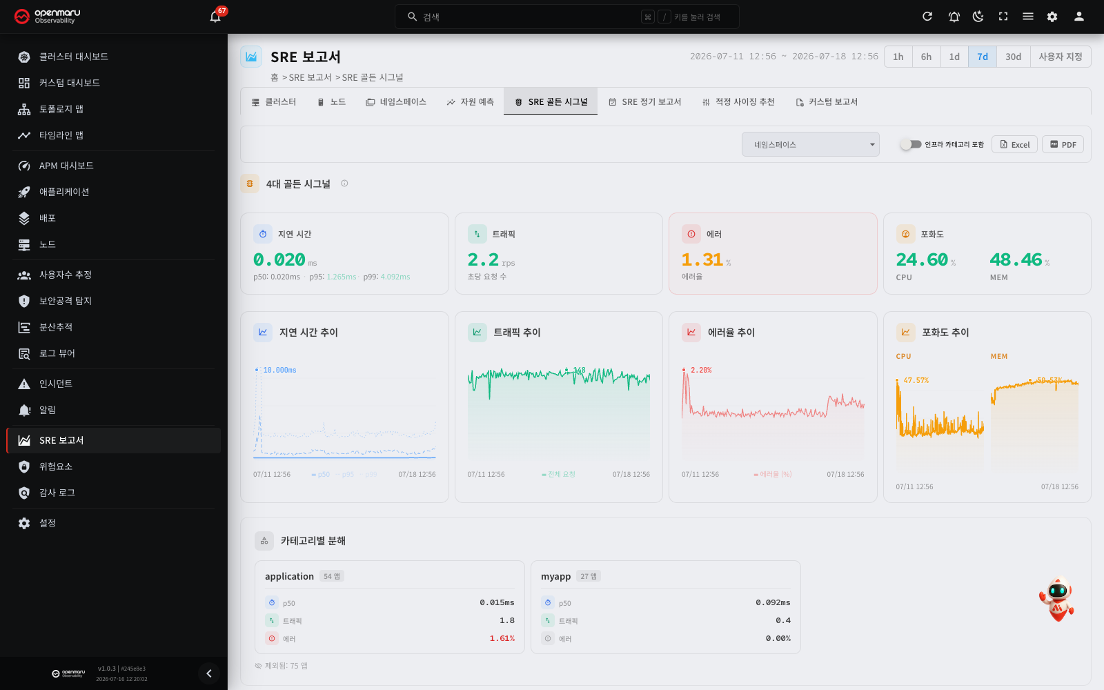
Summarises the four signals — latency, traffic, errors and saturation — to give you the service's health at a glance. The Excel and PDF buttons at the top right of the tab export the whole Golden Signals tab (the four-signal summary, its trends and the breakdown by category) as a Korean or English report.
SRE Periodic Report
Presents SLO status as a periodic report, and lets you set a Report Schedule. Use it to check weekly and monthly SLO compliance regularly.
The report can go to Slack, Teams, email (SMTP) or a webhook. A channel appears in the list only once it has been configured under Settings > Notifications (Settings).
Note: over SMTP the PDF and Excel files arrive as attachments. Where an attachment exceeds the limit (20MB by default), it is left out and the reason is written into the body. The other channels send a link instead of the file.
Quick Sizing
Compares containers' requests and limits with their actual usage to find over- and under-allocation and recommend the right size (as KPI tiles). Use it to reduce waste or to top up an allocation that is short. Kubernetes only.
Note: an SLO is the quality target a service must meet (its service level objective), and the error budget is the failure allowance that target permits. Its burn rate tells you the service's health.
Custom reports
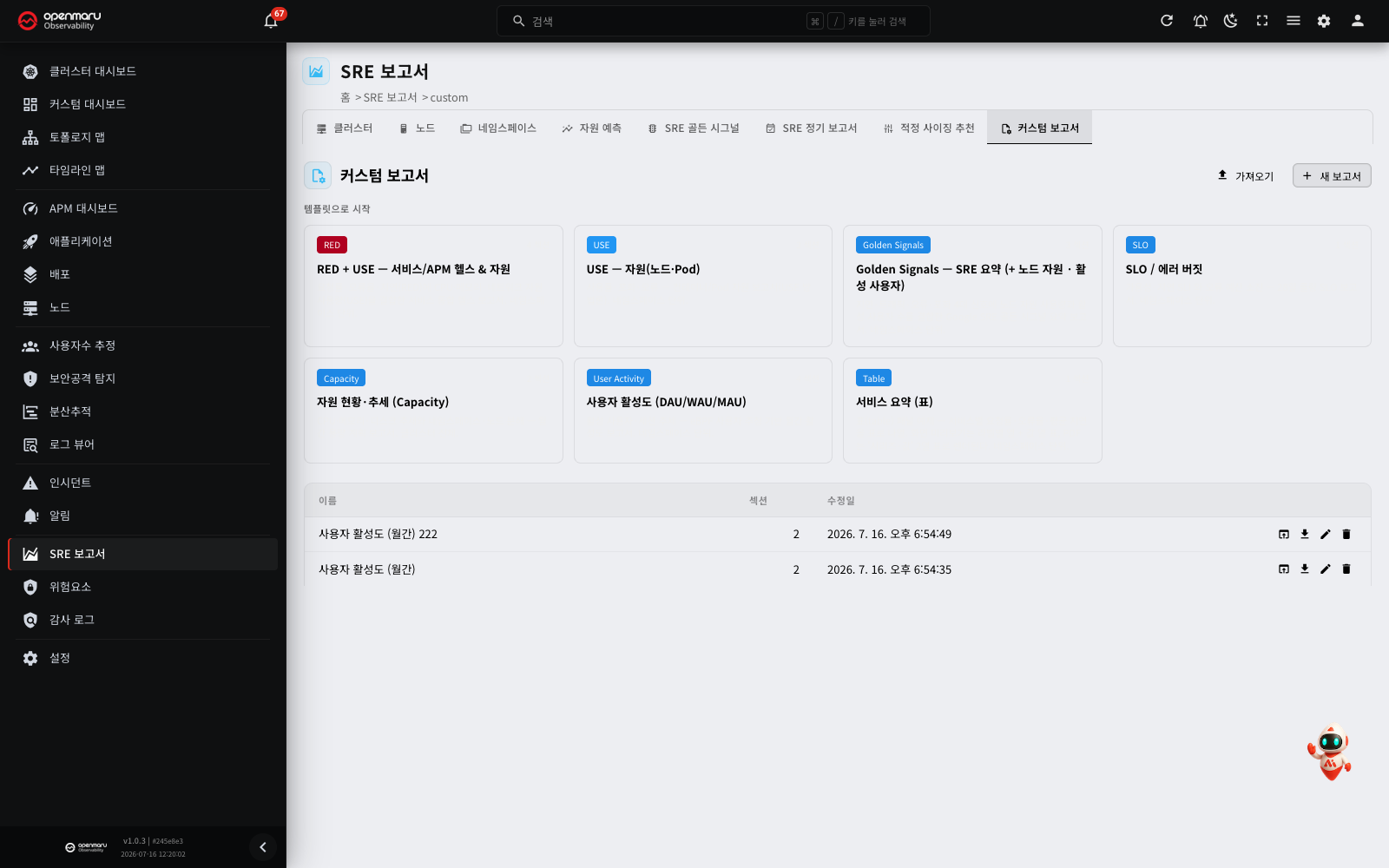
The custom report tab is a report builder, moving between a list screen and an editor. Gather the metrics you want over the period and interval you want, and output the result as a PDF or Excel report.
Starting from a template
- Click a built-in template card in the gallery at the top of the list and you begin editing a draft (it does not appear in the list until you save it).
- To start from an empty report, choose New report.
The built-in templates supplied are as follows.
| Template | Contents |
|---|---|
| RED + USE — service/APM health & resources | Service/APM health together with resources |
| USE — resources (nodes · pods) | Utilization, saturation and errors from the resource perspective |
| Golden Signals — SRE summary (+ node resources · active users) | The four signals + node resources + active users |
| SLO / error budget | SLO compliance and error budget burn |
| Capacity — resource status and trends | Capacity status and how it is trending |
| User activity (DAU/WAU/MAU) | DAU/WAU/MAU active users |
| Service summary (table) | An example of a table-format summary |
Building sections and panels
A report is made of several sections, each carrying a title, a descriptive note and several panels.
- Use Add section to create a section (a title plus a descriptive note).
- Add panels from the section's
+menu. There are three kinds.
| Panel kind | Description |
|---|---|
| PromQL panel | A free PromQL query (variables can be substituted). Choose time-series, single value or table |
| User count (UE) | User estimation data (clients / sessions) |
| Security events | Security attack detection events |
Note: for the query syntax a PromQL panel supports and its limits, see the Cache PromQL query guide. There are caveats — request count metrics, for one, are already stored as a rate, so wrapping them in
rate()turns the value into a window mean.
Variables and output mode (combined / repeat)
Define variables such as namespace and pod in the variable bar (label-lookup or direct entry, with multi-select and dependent variables — the same as the variables in custom dashboards). A toggle decides how several selected values are output.
| Mode | Description |
|---|---|
| Combined | Overlays a series per target on one chart or table for comparison |
| Repeat | Duplicates the section or page for each value of the variable chosen in Repeat by |
Tip: to compare a few namespaces side by side, choose Combined; to produce a page of the same layout for each namespace, choose Repeat. Repeat multiplies pages quickly when there are many targets, so watch the size limits (see below).
Period, interval and orientation
Set the following in the editor toolbar.
| Control | Options |
|---|---|
| Period | 1h / 6h / 1d / 7d / 30d, or custom (an absolute range) |
| Interval | Auto · 1m · 5m · 15m · 1h · 1d |
| Orientation | Portrait / Landscape |
The interval decides how finely the data is sampled. A shorter interval gives more detail but more data points. Where there are many series (columns), Landscape reads better.
Preview and save
- Preview shows you the report on screen.
- Save stores it in the list, where you can open, rename and delete it.
Note: PDF and Excel output renders the current editing state without saving. Exporting a template draft does not add it to the list; saving happens only through the explicit Save button.
PDF output
Download it with the PDF button. You can choose a table mode.
| Mode | Contents |
|---|---|
| Summary | Puts a per-series summary table (metric, item, minimum, average, maximum, latest) alongside the charts in each section |
| Full | Adds the complete grid by timestamp to the summary table. Where it is long, pages are split automatically and the header repeats on each |
Where there are more series (columns) than fit a page's width, the full grid is split into blocks marked with the range they cover, as in "series a–b / n". Each column header is two rows: the metric (merged, on top) and the item (below).
Excel output
Download it with the Excel button. The file has the following characteristics.
- A separate sheet per section.
- Each sheet carries the complete grid by timestamp, with two-row headers of metric and item.
- Numbers are formatted (thousands separators, two decimal places).
- An interactive native line chart is inserted automatically below the grid in each section (you can toggle series, zoom and edit it in Excel).
- In repeat mode, each variable value gets its own sheet.
Exporting and importing reports (JSON)
- Export writes the report definition out as a JSON file.
- Import loads a JSON file (you give it a name as you import).
Use this for backup and version control, for moving to another environment, and for sharing within a team. Only files up to 1 MB, with at most 200 panels, and on a supported schema version are accepted; format errors are reported with the specific reason.
Worked examples
Producing a weekly SLO report
- Open the SLO / error budget template on the custom report tab.
- Set the period to 7d and the interval appropriately (1 hour, say).
- Select the namespaces you need as variables, and where there are several, use Repeat mode to give each namespace its own page.
- Check it with Preview, then download it as a PDF (summary) to share at the weekly meeting.
A forecast report for capacity planning
- Select the namespace or node on the Resource Forecast tab.
- Choose Holt-Winters or SARIMA where there is seasonality, or Linear for a simple rise.
- Set the forecast horizon you want and see whether a headroom warning appears.
- Use it alongside the Capacity — resource status and trends template in the custom report to gather the current state and the forecast into one document.
Reviewing resource optimisation
- Identify the over- and under-allocated containers on the Quick Sizing tab.
- Compare requests and limits with actual usage to decide what to adjust.
- To support the case, download the USE — resources template from the custom report as Excel and attach the detail by timestamp.
Frequently asked questions
The Namespaces and Quick Sizing tabs are missing
In non-Kubernetes environments (no kube_state_metrics) these two tabs are hidden automatically. They are available on a Kubernetes cluster only.
The period picker at the top has disappeared
The Resource Forecast, SRE Periodic Report and Custom Report tabs carry their own period (and interval and schedule) controls in the body, so the shared picker at the top is hidden. Use the controls in the tab body.
Preview or output is refused with a warning
You have most likely exceeded a size limit. The limits are 200 expanded panels and 10,000 data points in total. Too fine an interval, too long a period, or excessive namespace × pod repetition will pass them. Widen the interval, shorten the period or reduce the repeat targets and try again.
The active users and security event panels do not appear in the preview
The user estimation and security event panels use separate data sources and are not shown in the preview; they render when you output PDF or Excel. Check the output file.
I exported but it was not saved to the list
PDF and Excel output renders the current editing state without saving. To keep the report in the list, press Save separately.
Do PDF and Excel work without internet access?
Yes. All PDF and Excel files are generated by the server directly (no headless browser is involved), so they work in air-gapped environments.
Terms
| Term | Description |
|---|---|
| SLO / SLI | The quality target a service must meet / the indicator that measures it |
| Error budget | The failure allowance the SLO target permits. Its burn rate indicates health |
| RED | Rate, errors and duration — three metrics from the service perspective |
| USE | Utilization, saturation and errors — a methodology from the resource perspective |
| Golden signals | The four signals of latency, traffic, errors and saturation (Google SRE) |
| Forecast | Estimating future usage from past trends. You set the horizon |
| Rightsizing | Resource recommendations from actual use against requests and limits |
| Section / panel | A division of a report (title, description, panels) / an individual chart, table or single value |
| Combined / repeat | The output modes that overlay several variable values for comparison / duplicate per value |
| Interval | The data sampling step (1 minute, 5 minutes and so on) |
| Orientation | Portrait or landscape for PDF and Excel output |
Related documents
- Custom dashboards — building live screens with the same kind of panels and variables
- Cache PromQL query guide — the syntax PromQL panels support, and its caveats
- Dashboard — live monitoring of cluster resource status
- Nodes — node resource status and agent management
- Applications — SLO detail per application
- User estimation — the data behind the active users panel
- Security attack detection — the data behind the security event panel