3.4. Timeline map
Incidents and deployment events laid out in time order, so you can see how they relate.
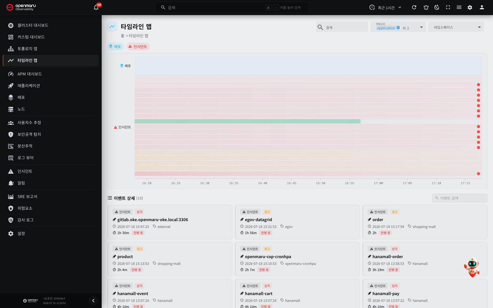
Overview
The Timeline Map puts the incidents and deployment events from a chosen time range onto a single chart. You can see at a glance which deployment happened when, and what incidents occurred before and after it.
Use it to find the cause quickly when performance drops or errors rise straight after a deployment, or when several applications suffer incidents at the same time. Open it from the Timeline Map menu in the left sidebar.
Screen layout
The timeline map is made up of the following areas.
| Area | Description |
|---|---|
| Top header | Page title, application filter |
| Event type filters | Chips that toggle deployments and incidents on and off |
| Timeline chart | The area that visualises event distribution against time (a deployment lane and an incident lane) |
| Event detail list | Individual event cards, shown below the chart |
Main features
Application filter
Use the application filter on the right of the top header to show events for particular applications only. You can narrow by namespace, category and application name.
Reset the filter and events for every application come back.
Note: event data is queried against the time range picker in the top bar. To see events over a wider range, change the time range first.
Event type filters

The filter chips above the chart choose which event types to show.
| Chip | Colour | Events shown |
|---|---|---|
| Deployments | Blue | Deployment events for Kubernetes workloads |
| Incidents | Red | Incident events raised by SLO breaches |
Click a chip to turn that type on or off. At least one type always stays selected.
The timeline chart
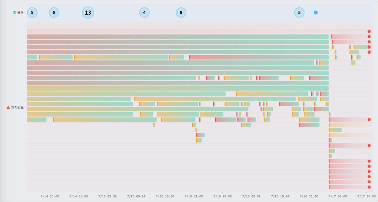
The timeline chart visualises where events fall in time and how densely. It is split into two areas — the deployment lane (top) and the incident lane (bottom) — each with an icon and label on its left.
How to read the chart
- X axis (time): the past on the left, the present on the right. Tick spacing adjusts automatically to the query time range.
- Deployment lane (top): each deployment appears as a blue circular marker. (Severity colouring applies mainly to the incident lane below.)
- Incident lane (bottom): each incident appears as a horizontal bar. The bar starts where the incident began and ends where it was resolved. Unresolved incidents extend to the present.
Incident bar colour follows severity.
| Colour | Meaning |
|---|---|
| Red | Critical |
| Yellow | Warning |
| Red-to-green gradient | Critical, since resolved |
| Yellow-to-green gradient | Warning, since resolved |
Ongoing critical incidents carry a blinking dot at the end of the bar to show they are still running.
Where several incidents overlap in the same period, each is placed on its own row so they do not obscure one another.
Clusters
Where several deployment events are packed into the same period, they are combined into a single cluster. The cluster shows how many events it contains as a number, and the circle grows with the count.
Click a cluster and the individual events it contains appear in a popup. There you can check each event's application name and time, and click through to its details.
Tooltips
Hover over a chart marker or an incident bar and a tooltip appears, containing the following.
- Event type: deployment or incident
- Application: the application the event belongs to
- Version (deployments): the version deployed
- Time: when the event started
- Duration (incidents): how long the incident lasted
- Status (incidents): Open or Resolved
Hovering over a chart marker also highlights the matching card in the event list below. The reverse holds too: hovering over an event card highlights its marker on the chart.
Selecting a time range by dragging (brushing)
Drag across an empty part of the chart and a translucent blue area appears; the query period changes to that range. It lets you zoom into a stretch where deployments or incidents are concentrated and look at it in detail.
After the drag, the time range picker at the top updates to the range you selected.
Tip: after narrowing the time range with a brush, choose the period you want again in the time range picker at the top to return to a wider view.
Clicking events, and the cluster filter
Click an individual marker or an incident bar on the chart and the event detail list below filters down to that event.
Select a cluster and a chip appears at the top of the screen showing how many events are selected. Click the same cluster again, or the chip's close button, to clear the filter.
Event detail list
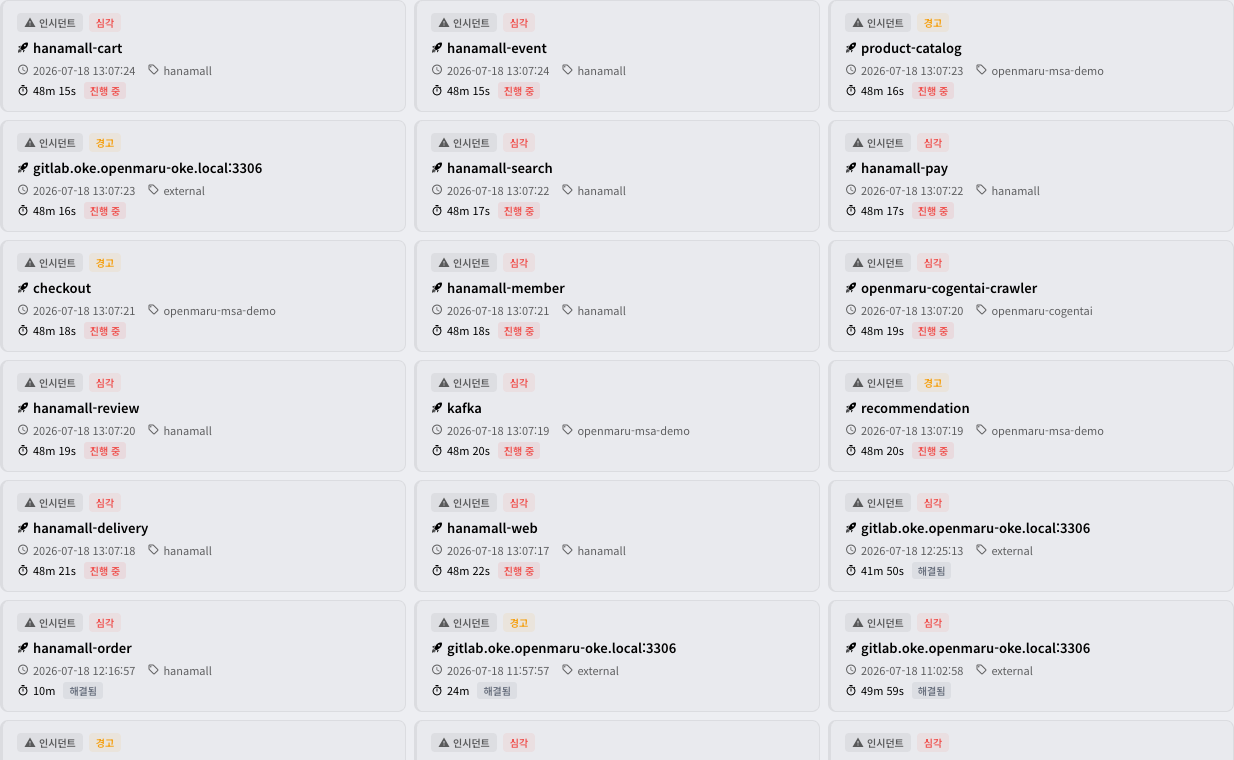
The Event Details list sits below the chart. Each event is a card, most recent first. The cards are laid out in a grid so you can compare several events at once. A card's left border colour follows the event's severity.
| Border colour | Meaning |
|---|---|
| Red | Critical incident |
| Yellow | Warning incident |
| Green | Successful deployment |
Type an application name, a namespace, an event type and so on into the search box at the top right of the list to filter down to matching events.
Deployment event cards
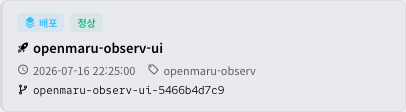
A deployment card shows the following.
- Event type: deployment
- Application name: the application deployed
- Time: when the deployment started
- Namespace: the namespace it was deployed into
- Version: the version deployed
- Deployment summary: the deployment check results (normal, or the items that raised warnings)
Click a deployment card and that application's details open in a dialog, where you can see how its metrics changed over the timeline's current query range.
Incident event cards
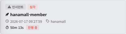
An incident card shows the following.
- Event type: incident
- Severity: Critical or Warning
- Application name: the application affected
- Time: when the incident started
- Namespace: that application's namespace
- Duration: how long the incident lasted
- State: Open or Resolved
Click an incident card and the incident detail dialog opens, where you can check the following.
- Incident summary: severity, application, start and resolution times, duration, category
- SLO status: the compliance rate and target for the availability SLO and the response time SLO. Breached items are highlighted in red.
- RCA (root cause analysis): the automatic analysis of the incident's cause, with the relevant metric charts
- Distributed tracing: trace data from the period the incident covered
Click the application name at the top of the dialog to switch to that application's detail dialog. Click the open-as-full-page button to go to the Incidents detail page for deeper analysis.
Show all
Where there are more than 100 events, only the most recent 100 are shown at first. Click Show all at the bottom of the list to see them all.
Worked examples
Analysing a failure after a deployment
- On the Timeline Map, check whether an incident occurred just after a deployment event.
- Select that stretch of time by dragging (brushing) to zoom into it.
- Click the incident card and check the SLO breach details and the RCA results.
- In the same dialog, click the application name and compare how the metrics changed.
Spotting simultaneous incidents
- In the event type filters, leave only Incidents turned on.
- Look for stretches in the incident lane where several bars start at the same time.
- Check the event cards for that stretch to see which applications were affected.
Related documents
- Dashboard — overall cluster status
- Incidents — the incident list and detailed analysis
- Deployments — deployment history
- Applications — detailed application metrics