4.1. APM dashboard
Near real-time application performance, based on L7 requests collected with eBPF.
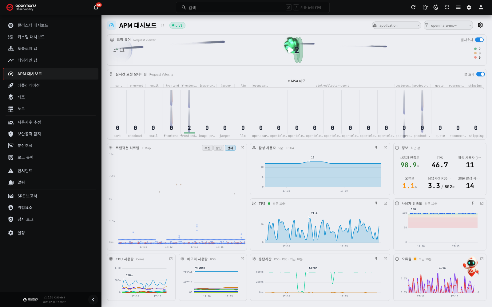
Overview
The APM Dashboard shows application performance in near real time (a lag of roughly one to five seconds), based on the L7 requests (spans) observed with eBPF. It monitors, on one screen and by category and namespace, the request volume your applications are taking right now, along with response times, errors, concurrency and resource use.
Operators, SREs and developers use it to read the state of things now. It suits watching how traffic responds just after a deployment, spotting an instance whose response time has jumped, or catching the moment errors spike. Unlike the Applications screen, which is built around querying past periods, the APM dashboard uses a real-time data path with the lag kept to a minimum.
Open it from the APM Dashboard menu (the speedometer icon) in the left sidebar. This screen is always anchored to "now", so unlike other screens it has no start and end time picker at the top.
Note: L7 means layer 7 of the network stack, the application layer. eBPF observes application requests such as HTTP, gRPC and database calls at the kernel level, so performance data is collected without changing application code or adding a separate library.
Screen layout
The filter bar at the top sets the scope by category and namespace, and the widgets below refresh against that scope.
| Widget | Description |
|---|---|
| Request Viewer | An in-flight request gauge, the active user count, and a three-band elapsed-time legend |
| Realtime Request Monitoring | A column per instance with falling-request animation, namespace bands, and stopped-state markers |
| Transaction Heatmap (T-Map) | A response time × time heatmap. Click or drag cells to query traces and transactions |
| Info | Six cells summarising User Satisfaction (Apdex), TPS, active users, error rate and response time (P50/P95) |
| TPS | The trend in transactions per second (last 10 minutes) |
| User Satisfaction (Apdex) | The satisfaction trend, with satisfied, tolerating and frustrated bands |
| Response Time | The P50 and P95 response time trend |
| Error Rate | The error rate (%) and error count trend |
| CPU Usage / Memory Usage | The top resource consumers per application, over time |
| Active Users | The active user trend over the last 10 minutes |
| Transactions dialog (drill-down) | Not a permanent widget — the transaction list that opens when you drag a selection on the T-Map |
Note: a real-time connection badge is shown at the top of the screen. When the screen is connected to the server, the badge shows LIVE. When the connection drops, the badge changes to Reconnecting (N)... and the screen connects again by itself. If the screen does not connect in 10 attempts, the badge shows Disconnected and the time of the last received data. The screen then continues to try again every 60 seconds, so you do not have to refresh the page. For more information, see the "Checking the real-time connection" section in 3.1 Dashboard.
Main features
Category and namespace filters
Two combos in the filter bar at the top set the scope.
- Category filter: exactly one category is always selected; it cannot be emptied. Change it and only data for the applications in that category is shown.
- Namespace filter: only the namespaces belonging to the selected category appear in the list, and you can choose ALL.
Changing a selection re-subscribes to the server so only that scope's data arrives, which lets you concentrate on the group of services you care about. Your selection is saved and restored next time you connect.
If no application matches the filters, a message reading "No applications match the selected category/namespace" appears with a Reset filters button.
Tip: the namespace selection is shared with other screens such as custom dashboards and user estimation. Choose a namespace on one screen and the same selection follows you to the others, which makes tracking one target across screens easier.
The right of the filter bar carries these secondary controls.
| Control | Description |
|---|---|
| Full-screen toggle | Switches to full screen. Useful for leaving on a shared team monitor |
| Settings (gear) | Adjusts display options such as the strength of the traffic visual effects |
| LIVE badge | Shows the real-time connection state |
| Aggregation lag badge | Appears when server aggregation falls behind. The data may be briefly out of date |
| Top-N notice | When there are too many items to show them all, a "Showing top N of M" notice |
Info summary card
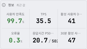
The info card at the top of the screen summarises the current state in six figures.
| Cell | Contents |
|---|---|
| User Satisfaction (Apdex) | Response time satisfaction (%). Colour-coded by value |
| TPS | Transactions (requests) per second |
| Active Users | The active user count (over the last 5 minutes) |
| Error Rate | Errors as a proportion of the requests that the app received (%). Colour-coded by value |
| Response Time P50/P95 | P50 / P95 response time of the requests that the app received (ms) |
| 30m Active Users | The active user count over the last 30 minutes |
The values are the most recent, taken from the last completed 10-second bucket. Apdex and error rate change colour with state (good = green, fair = orange, poor = red), so problems are visible at a glance. Where there is no data, "—" is shown.
Which requests the error rate, response time and Apdex count
The error rate, response time (P50/P95) and Apdex on the information cards and trend charts count only the requests that the app received (inbound). They do not include the database queries and message queue calls that the app sends. Thus, when the app sends many queries, the error rate and response time do not show lower values than the real values.
- The default (all) view of the transaction heatmap (T-Map) continues to show the calls that the app sends. To see only received requests, select Inbound in the T-Map direction toggle.
- For an app that receives no requests (a batch job, a message consumer and so on), the values show "—" or show the live L7 values instead.
Note: the active users label carries the basis of the estimate. Where session coverage is sufficient it reads (Session); otherwise the estimate is (IP+UA). For the difference between the two, see user estimation.
Live trend charts
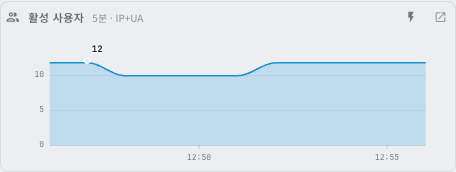
TPS, response time, error rate and Apdex are each aggregated over the last 10 minutes in 10-second buckets and drawn as trends. "Last 10 min" appears under each chart title.
The response time chart
The response time of the requests that the app received is drawn as two lines, P50 and P95. Where live L7 values are unavailable, a single average response time line replaces them.
- P50 (median): half of all requests complete within this time. It represents the ordinary user experience.
- P95: the boundary of the slowest 5% of requests. Use it to understand tail latency. A low P50 with a high P95 means only some requests are slow.
Why P50 and P95 rather than an average: response time distributions are usually right-skewed — most requests are fast and a few are very slow. An average is dragged upwards by that slow minority into a figure nobody actually experiences, or else dilutes the slow requests among the many and hides the problem. If 990 of 1,000 requests take 100 ms and 10 take 5,000 ms, the average is 149 ms and looks healthy — but ten users waited five seconds.
| Metric | Value in the example above | What it tells you |
|---|---|---|
| Average | 149 ms | Dragged up by the slow minority — neither the typical experience nor the worst one |
| P50 (median) | 100 ms | The middle value when requests are ordered by response time = what a representative user actually experiences (unmoved by the slow minority) |
| P95 | 5,000 ms | The boundary of the slowest 5% = tail latency. The part the average conceals |
Users abandon, and SLOs and SLAs are breached, in the tail (P95, P99) rather than at the average. Looking at P50 ("how fast is it usually?") alongside P95 ("how slow is it at its worst?") separates the fast majority from the slow minority, which a single average misses, and tells you immediately whether the problem is universal or confined to some requests.
The error rate chart
An error rate (%) line with a secondary error count line. Hover over the line and a tooltip gives the request count for that bucket, so you can judge whether a rate came from a small sample.
The Apdex chart
A satisfaction line over satisfied, tolerating and frustrated bands. The threshold is fixed at three seconds (satisfied below 3 s, tolerating 3–12 s, frustrated 12 s and above).
Comparison mode
Each trend chart has a comparison mode dropdown behind a lightning icon.
- Realtime: shows only the current trend (the default).
- vs Yesterday: overlays the values from the same period yesterday.
- vs Last week: overlays the values from the same period last week.
Use it to compare before and after a deployment, or to see day-of-week patterns. When values change sharply, a status dot (green → orange → red) appears beside the chart title to flag the anomaly.
Tip: click the chart header, or the jump (↗) button at its top right, to drill down into the application details (the SLO tab and so on). Where the filter scope holds more than one application, a dialog asks you to choose the target application first.
Transaction Heatmap (T-Map)
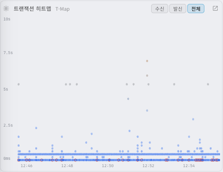
The transaction heatmap divides response time (vertical) and time (horizontal) into a grid and shows how many transactions fell into each cell, as colour intensity.
How to read the heatmap
- Each cell represents the number of transactions in one time × response time bucket. The darker the colour, the more requests in that bucket.
- A cell with a red border contains errors.
- Points clustered towards the top (higher response times) mean many slow requests.
Interacting with cells
- Hover and a tooltip gives the time range, the response time bucket, the response count and the 5xx error count.
- Click a cell to jump to a representative trace for that bucket and analyse it span by span.
- You can also move between cells with the arrow keys and open one with Enter.
- Drag to select a time range and the Transactions dialog opens. That list is fixed to the data at the moment you selected it and does not follow the live stream. The Drill-down screens section below covers what the dialog shows in detail.
Direction toggle
Where data exists for all three directions (all, inbound, outbound), a direction toggle appears in the header, letting you separate the requests the app received (inbound) from the requests it sent (outbound). The jump (↗) button at the top right goes to the distributed tracing tab.
Note: in environments where the distributed trace store (ClickHouse) is not configured, the T-Map is disabled and a notice is shown instead.
Realtime Request Monitoring
A wide area at the bottom of the screen, where each column is one application instance.
Columns and their order
- Namespace bands run across the top. The application (deployment) name is on the instance label at the foot of each column.
- Click an instance name to open that application's detail screen. The same applies when the widget is placed on a custom dashboard.
- The order is fixed as namespace → deployment → name, so instances do not move around when the screen refreshes.
- Each column stacks its pending requests in three colours (satisfied, tolerating, frustrated); the falling-request animation can be toggled on and off.
- When more than one instance has the same name, a 4-character identifier is added after the name. In Kubernetes, it is the last 4 characters of the pod name (for example,
app3-extdb·nv69). On a host (VM), it is 4 characters that identify the server (for example,nginx.service·583c). When the names are different, no identifier is added.

Column detail tooltip
Hover over an instance column and the tooltip gives the following.
- A status dot and the instance name (with the original name too, where a display name is set). In Kubernetes, Original name shows the full pod name (for example,
app3-extdb-54946fbc5f-2nv69). - TPS, P50 and P95 response times
- The number of Pending requests, broken into the three satisfied / tolerating / frustrated bands
- For stopped instances, the time it stopped and the reason (no metrics received, node down, and so on)
Setting a display name (alias): you can give namespaces and applications a recognisable custom name. Register an alias on the Application categories card of the Settings > Applications tab and the APM dashboard's labels show the alias instead of the original identifier (the tooltip shows both). Filtering, sorting and routing continue to work against the original name.
Stopped-state markers
The column of a stopped instance shows a vertical STOPPED label. When you hover over the column, the tooltip shows the reason (stopped, no metrics, node down and so on). The request count and the pending request count of a STOPPED column are 0.

- When the process of an instance ends, its column changes to STOPPED after approximately 16 to 17 seconds. This is the same in Kubernetes and on hosts (VM).
- A STOPPED column disappears from the screen after approximately 92 seconds.
- When all instances of an app are removed (for example, when you set the replica count to 0 in Kubernetes), the screen shows them in the same way.
- The reason for an instance whose process ended is stopped. This is the same in Kubernetes and on hosts (VM). The reason does not show the difference between an intentional scale-down and an abnormal end.
Note: If an instance received no requests for approximately the last 90 seconds and then stops, the screen can fail to show it as STOPPED. This is because the instance had no column on the screen before it stopped. To check whether an instance stopped, independently of requests, use the pod map or the service map in 3.1 Dashboard.
Where clicks take you
| What you click | Where it goes |
|---|---|
| A namespace name | The topology map dialog |
| A column (an instance) | The application detail dialog |
| A column with slow requests (3 seconds or more) | In-flight request detail |
Note: at most 200 columns are shown. Beyond that, a
+Nbadge appears in the header. When space is not sufficient, the screen first keeps up to 5 places for STOPPED columns and fills the remaining places with running instances. When one type of column does not use all its places, the other type uses them. Thus you can see stopped instances also in an app with many instances.
Request Viewer

The request viewer at the top of the screen shows the current processing situation at a glance.
- The Concurrent Requests (in-flight) count is shown large in the centre. It is the absolute number of requests in progress that have not yet received a response.
- The active user count is on the left.
- A three-band elapsed-time legend breaks the in-progress requests down.
| Band | Meaning |
|---|---|
| Under 3s | Satisfied — the normal range |
| 3 – 12s | Tolerating — somewhat slow |
| Over 12s | Frustrated — a slow request |
The Shot Effect (particle) animation can be toggled on and off. Where there are slow requests (three seconds or more), an In-flight request detail button appears, giving you the protocol, the URL or query being run, the destination and the elapsed time.
Note: the in-flight count is based on pending outbound requests and does not include HTTP/2 (this is stated in the widget tooltip). Even where the number appears to keep climbing, the requests may simply be long-lived by design, as with streaming or long polling.
Resource and active user widgets
- CPU Usage (cores) / Memory Usage (RSS): the top consumers per application, as lines. Unlike the other widgets, these two use the metric path, so they lag by about a minute (they are not strictly real time). The category filter applies.
- Active Users: the active user trend over the last 10 minutes. Whether the basis is session or IP+UA is noted alongside, and the jump (↗) button goes to the user estimation screen.
Drill-down screens
Clicking or dragging on a particular point of a widget opens a more detailed screen (a dialog). Here is what each shows.
The Transactions dialog
Opens when you drag to select a time range on the transaction heatmap (T-Map). It shows the transactions (requests) within that range at the top, and the spans (the call path) of the selected request below.
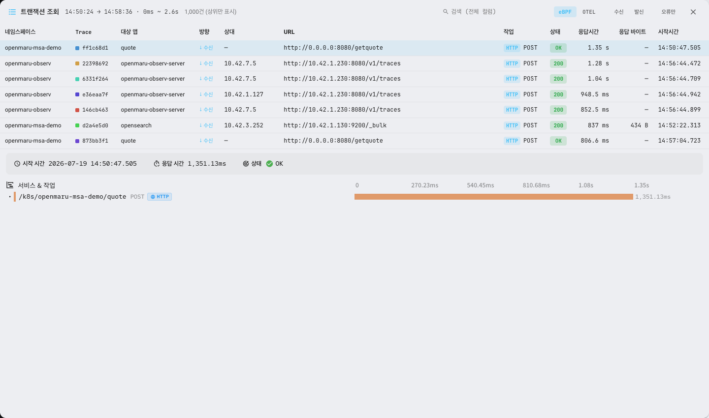
The toolbar
| Control | Description |
|---|---|
| Title and selected range | "Transactions" and the selected time and response time range (for example 10:20:05 → 10:20:25 · 0.2s ~ 1.0s). Where there is no upper bound on response time, ∞ |
| Count | How many transactions were found. Where the server limit truncated the result, it reads "(top only)" |
| Search | Filters the list against the text of every column |
| Span source toggle | Switches between eBPF (observed automatically by the agent) and OTEL (instrumented in the app) |
| Direction toggle | Inbound / Outbound (press again for both). Inherits the T-Map's direction selection |
| Errors only | Shows only failed transactions |
Transaction list columns
Click a header to sort (again for reverse order, a third time to return to the default order).
| Column | Contents |
|---|---|
| Namespace | The namespace the transaction belongs to |
| Trace | A coloured dot for the trace identifier and its first 8 characters. Requests in the same trace share a colour (the full value is in the tooltip) |
| Target app | The application that handled the request |
| Direction | ↓ inbound / ↑ outbound (colour-coded) |
| Peer | The caller for inbound requests, the destination server for outbound ones |
| URL | The request URL or name (the full value is in the tooltip) |
| Operation | A type badge (HTTP, PostgreSQL, Redis, Kafka and so on) and the operation name |
| Status | The HTTP status code, or OK/ERR (errors in red) |
| Duration | How long it took. Three seconds or more is shown in bold red |
| Resp bytes | The response size. Where a payload cap may have made this an undercount, it is prefixed with ≥ |
| Start time | When the request started (to the millisecond) |
Request details (the span tree)
Click a row in the list (the first row is selected automatically) and the span tree for that transaction appears below, showing the call path and how long each step took. Where the list is empty it reads "Normal · No traffic"; before you pick a row it reads "Select a row to see transaction details".
Note: this dialog is navigated by scrolling rather than paging, and the server returns at most 1,000 transactions at a time. The list is fixed to the data at the moment you selected it and does not follow the live stream.
In-flight request detail
A list of the requests running for three seconds or more among those still in progress (not yet answered). It opens from two places.
- The In-flight request detail button in the Request Viewer → the oldest requests across the whole scope (the top N).
- Clicking a column with slow requests in the Realtime Request Monitoring widget → only that instance's slow requests.
Each request is shown with the following.
| Column | Contents |
|---|---|
| Protocol | A coloured badge: HTTP, HTTP/2, PostgreSQL, MySQL, Oracle, ClickHouse, MongoDB, Redis, Memcached, ZooKeeper and so on |
| Running URL / query | The URL or SQL currently executing (with bind values where present). A copy button is provided |
| Destination | The namespace and app name (where resolved), or IP:port |
| Elapsed | How long since the request started. Colour-coded by band (green under 3 s, orange 3–12 s, red 12 s and over) |
Where there are too many slow requests to list, it reads "Showing the M oldest of N delayed"; where there are none, "No delayed requests".
Note: the in-flight request detail is based on pending outbound requests, and the requests in this list are not necessarily errors. Use it to catch long-running queries and external calls as they happen.
The application detail dialog
Opens when you click a column (an instance) in the Realtime Request Monitoring widget, or press the jump (↗) button on a widget. It is the Applications detail page moved into a dialog, and contains the following.
- Title area: the application name with its namespace and kind, and a button to open it as a full page.
- Time range bar: shows the query period. Beyond three days a "3d limit" badge appears, and the dependency map can be collapsed and expanded.
- Dependency map (AppMap): how this application relates to the services connected to it.
- Report tabs: SLO, Tracing, Logs, Profiling, Security and other tabs appear in the order the server supplies them, each with a status light. Each tab shows the charts and tables for its perspective.
- Opening from a column selects the default tab; opening from the transaction map widget's ↗ selects the Tracing tab; opening from a trend chart's ↗ selects the SLO tab.
- The security tab lists attacking IP addresses (address, country, city, count) and lets you configure exceptions, and dragging on the heatmaps in the SLO and Tracing tabs drills back down into the Transactions dialog.
Tip: what each tab of the application detail dialog shows is covered in detail in the "Report tabs" section of Applications.
How the live data behaves
Each widget on the APM dashboard looks at a different window of time.
| Widget | Window |
|---|---|
| Request viewer and request monitor (particles/gauges) | A live window of about 90 seconds |
| Trend charts (TPS, response time, error rate, Apdex) | The last 10 minutes (10-second buckets) |
| Transaction heatmap (T-Map) | A window of the last 10 minutes |
| CPU and memory | The metric path (about a minute of lag) |
The essential point is that this screen is based on live L7 requests. A second, an application or a namespace with no traffic therefore does not appear on screen. Each widget reads "Normal · No traffic" when there is none. In environments where node-agent is not deployed, a notice explains that there is no live data.
Worked examples
Checking the response just after a deployment
- Narrow the filters to the category and namespace the deployed application belongs to.
- On the Info card, check that the error rate and response times (P50/P95) are holding at their pre-deployment levels.
- Set the Error Rate chart to vs Yesterday and see whether errors have risen against the same period.
- In the Realtime Request Monitoring widget, check that the new instances are taking requests normally, without a STOPPED marker.
Finding the cause of slow requests
- Find the moment P95 jumped on the Response Time chart.
- On the Transaction Heatmap (T-Map), drag across the upper (high response time) region at that moment to open the Transactions dialog.
- Pick out a slow transaction and click its cell to move to distributed tracing, then find the longest step in the span waterfall.
- If the Request Viewer has caught slow requests, check the URL being run and its destination under In-flight request detail.
Responding to a spike in errors
- Notice that the error rate cell on the Info card has turned red.
- Establish the time of the spike and the error count on the Error Rate chart.
- Click a red-bordered cell (a bucket containing errors) on the T-Map to jump to a representative trace and check the exception and status code.
- Where only one instance is producing errors, click its column in the Realtime Request Monitoring widget to go into the application details.
Checking one instance's resource use
- Find the application whose usage jumped on the CPU Usage / Memory Usage widgets (with about a minute of lag).
- Look at the colour distribution of pending requests in that application's column in the Realtime Request Monitoring widget.
- Click the column to go to the application details and analyse resources and requests together.
Frequently asked questions
A namespace or application is missing from the screen
The APM dashboard is based on live L7 requests, so it shows only what has had traffic. Something missing from the list because it has had no traffic is not an error. To see the application list regardless of traffic, use the Applications screen: it is based on the existence of workloads and pods, so applications appear even with no traffic.
The values look briefly out of date
Check whether the aggregation lag badge is showing at the top. It appears when server aggregation falls behind repeatedly, and the data may be briefly out of date. The last few seconds of the live request window may also not be on screen yet, while aggregation completes.
Only the CPU and memory widgets respond slowly
Unlike the others, the CPU and memory widgets use the metric path, so they lag by about a minute. This is normal, and their refresh interval differs from the live widgets such as request volume and response time.
I want to look at a time in the past
The APM dashboard is a live-only screen and has no start and end time picker. For analysing past periods, use a screen where you can set a time range: the Applications details, the distributed tracing heatmap, or incidents.
The in-flight count keeps rising
The in-flight count is based on pending outbound requests and does not include HTTP/2. Requests that are long-lived by design — streaming, long polling, subscriptions — can register as in-flight without being slow. Confirm whether they are genuinely slow using the elapsed-time bands in the Request Viewer and In-flight request detail.
No live data appears at all
Check that node-agent is deployed. eBPF-based L7 observation is collected by node-agent, so without the agent a notice explains that there is no live data. For installation, see the installation guide.
Terms
| Term | Description |
|---|---|
| APM | Application performance monitoring |
| L7 request (span) | A record of one application-layer request (HTTP, gRPC, database and so on) as observed by eBPF |
| Transaction | One unit of request handling. The unit of aggregation for the heatmap and the transaction query |
| TPS | Transactions per second |
| P50 / P95 | Response time percentiles. P50 is the median; P95 is the boundary of the slowest 5% |
| Error rate | Failed requests as a proportion of the requests that the app received (%) |
| In-flight | The number of requests in progress that have not yet been answered (based on pending outbound requests) |
| Apdex | A response time satisfaction metric, on a 3-second threshold (satisfied, tolerating, frustrated) |
| Active users | The user count estimated from recent traffic (on a session or IP+UA basis) |
| Direction (inbound/outbound) | Traffic the app received versus traffic the app sent |
| STOPPED | The marker for an instance that stopped, for example because its process ended. It disappears after approximately 92 seconds |
Related documents
- Applications — the application list that appears even without traffic, and detailed analysis of past periods
- Distributed tracing — the span waterfall and trace details a T-Map cell leads to
- User estimation — how active users are estimated (session / IP+UA) and their geographic distribution
- Topology map — the service dependency map that opens when you click a namespace
- Custom dashboards — the shared namespace selection and user-defined metric screens
- Settings — setting response time SLO targets and check conditions