3.1. Dashboard
The screen that shows the whole state of a Kubernetes cluster at a glance, in real time.
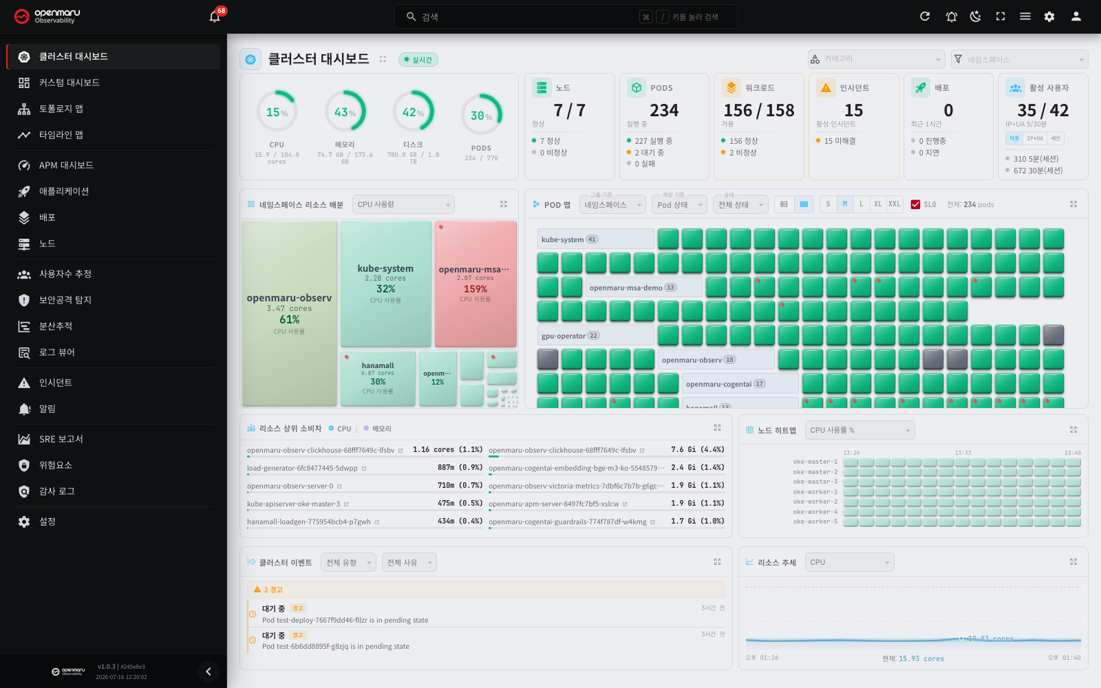
Overview
The Cluster Dashboard is the main screen. It shows resource usage, workload health, pod status and events for the Kubernetes cluster you are monitoring, all in real time. Use it to check quickly that nothing is wrong with the cluster, or — when something is wrong — to work out where it started.
Open it from the Cluster Dashboard menu in the left sidebar. The dashboard is a real-time-only screen, so the time picker at the top is disabled.
Note: the time-series charts throughout this document share a common set of controls (zoom, legend toggling, tooltips, forecasting, anomaly detection). See Chapter 21, the common chart guide.
Screen layout
The dashboard is made up of the following areas.
| Area | Description |
|---|---|
| Top header | Real-time connection status, category filter, namespace filter, full-screen button |
| Cluster resource gauges | Cluster-wide CPU, memory, disk and pod usage |
| Cluster health cards | Summary of nodes, pods, workloads, incidents and deployments |
| Namespace resource allocation | Treemap of how resource use is distributed across namespaces |
| Pod map | Every pod's state visualised as a tile |
| Top resource consumers | The workloads using the most CPU and memory |
| Node heatmap | Heatmap of resource usage per node |
| Cluster events | Recent Kubernetes events |
| Resource trends | Charts of cluster resource usage over time |
Main features
Checking the real-time connection
The dashboard exchanges data with the server in real time. The badge next to the screen title shows the current connection state.
| Badge | Meaning |
|---|---|
| Live (green dot) | The screen is connected to the server. Cluster data updates in real time. |
| Connecting... | The screen is connecting to the server for the first time. This text, with the seconds left (for example, (1s)), also shows for about 1 second after the connection drops, until the first retry. The attempt count is still 0 at that time. |
| Reconnecting (N)... | The connection dropped and the screen is connecting again automatically. N is the number of attempts. The seconds after it show the time until the next attempt. |
| Disconnected (red dot) | The screen did not connect after 10 attempts. The badge also shows the time of the last received data (for example, 14:32 (5h)). |
When the connection drops
When the connection drops, the screen connects to the server again by itself. You do not have to do anything.
- For the first 10 attempts, the interval is 1, 2, 4, 8, 16 and 30 seconds. When the interval reaches 30 seconds, it stays at 30 seconds until the 10th attempt.
- If the screen does not connect in 10 attempts, the badge changes to Disconnected. The screen then tries again every 60 seconds. The attempts do not stop.
- The real interval is a little longer or shorter than these values. This prevents many screens from connecting at the same time.
- When the server responds again, the next attempt restores the connection and the badge changes back to Live.
Thus a screen that nobody operates, such as a TV, recovers by itself when the server comes back. You do not have to refresh the page.
When the badge shows Disconnected, these items also appear.
- Message bar: a message about the lost connection and a Reconnect button appear at the top of the screen. Click the button to connect again immediately, without a wait for the next attempt. The attempt count also starts again from zero.
- Red icon in the top bar: a red icon and a number appear at the top right of the screen. The number is the count of disconnected real-time channels. Click the icon to open the channel list. Use Reconnect all to connect all channels again.
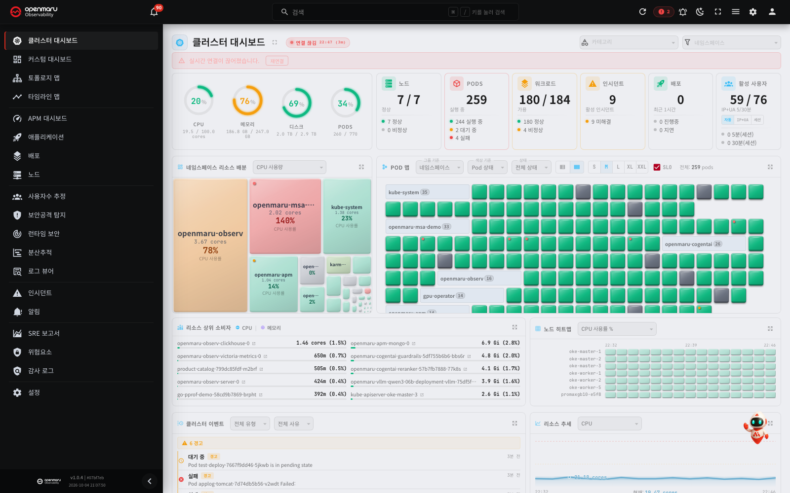
Note: While the connection is down, the numbers and charts on the screen are the last received values. Use the last received time next to the badge to see how old these values are.
The Topology Map, APM Dashboard, User Estimation and Attack Detection screens use the same reconnection method. But on the Topology Map and Attack Detection screens, the badge shows only Connecting... and the seconds left during retries, without the attempt count.
Category and namespace filters
Select a category and a namespace in the top header to show only part of the cluster.
- Category filter: pick a category from the dropdown and the dashboard shows data only for applications in that category. Every area — health cards, namespace resource allocation, pod map, top resource consumers — refreshes against the selected category. Click the X button to clear the filter.
- Namespace filter: pick a namespace and only that namespace's data is shown. The default is all namespaces.
Note: a namespace is the unit Kubernetes uses to separate resources logically.
Cluster resource gauges
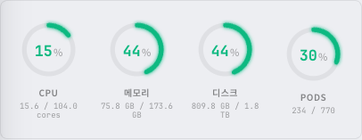
Cluster-wide resource usage is shown as circular gauges. Four items are displayed.
| Gauge | Description |
|---|---|
| CPU | CPU usage (%). Current usage / total capacity |
| Memory | Memory usage (%). Current usage / total capacity |
| Disk | Disk usage (%). Current usage / total capacity |
| Pods | Pod usage (%). Current pod count / maximum allowed pods |
Each gauge changes colour with its usage level.
| Colour | Threshold | Meaning |
|---|---|---|
| Green | Below 75% | Normal |
| Yellow | 75% to 90% | Caution |
| Red | 90% and above | Critical |
The current usage and total capacity are shown as numbers below the gauge (for example 2.5 / 8.0 cores, 12.3 / 32.0 GB).
Gauge detail tooltip
Hover over a gauge and a detailed tooltip appears with the following information.
| Item | Description |
|---|---|
| Usage | Current usage, with a gauge bar |
| Capacity | Total capacity |
| Available | Remaining capacity |
| Request | Requested amount (CPU and memory only) |
| Limit | Limit (CPU and memory only) |
Cluster health cards

Six cards summarise the cluster's key state. Click a card to jump straight to the matching detail screen. The one exception is the Active Users card: there you have to click the number itself, not the card, to reach the user estimation screen. (In host mode, Pods and Workloads merge into a single Services card, giving five cards.)
| Card | Headline figure | Sub-items | Click destination |
|---|---|---|---|
| Nodes | Ready / total | Ready, NotReady | Node list |
| Pods | Total pods | Running, Pending, Failed | Topology map |
| Workloads | Available / total | Healthy, Unhealthy | Application list |
| Incidents | Active incidents | Unresolved | Incident list |
| Deploys | Deployments in the last hour | In Progress, Stuck | Deployment list |
| Active Users | Active users in the last 5 minutes | Estimation method toggle (Auto, IP+UA, Session), 5 min / 30 min | User estimation |
A card's border colour changes with its state.
- Default border: normal, nothing wrong
- Red border: there is a NotReady server, or a Failed / CrashLoop pod
- Yellow border: there is an unhealthy workload, an active incident, or a stuck deployment
- Blue border: a deployment is in progress
Namespace resource allocation
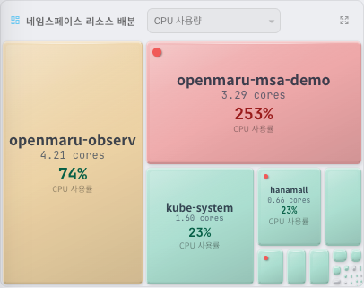
A treemap showing how much of the cluster's resources each namespace is using. The larger the tile, the larger that namespace's share.
Switching metric
Choose which metric to display from the dropdown at the top of the panel.
| Metric | Tile size represents | Value shown in the tile |
|---|---|---|
| SLO Status | Total SLOs | SLO breach rate (Warning + Critical / total) |
| CPU Usage | CPU usage | Usage as a proportion of request |
| Memory Usage | Memory usage | Usage as a proportion of request |
| Pod Count | Pod count | Pods per namespace |
Tile colour
For the CPU and Memory metrics, tile colour represents usage against request.
| Colour | Threshold | Meaning |
|---|---|---|
| Green | Below 75% | Normal |
| Yellow | 75% to 90% | Caution |
| Red | 90% and above | Over-used |
| Grey | No request set | Usage rate cannot be shown (absolute usage only) |
For the SLO metric, tiles are green (OK), yellow (Warning) or red (Critical) according to the SLO breach rate.
SLO status dot
A small dot may appear at the top right of a tile. It represents the SLO state within that namespace.
- Yellow dot: an SLO warning exists.
- Red dot (blinking): an SLO critical state exists.
Detail tooltip
Hover over a tile and a detailed tooltip appears.
- Namespace name and a usage-rate badge
- Share: that namespace's share of the total (%)
- The value of the selected metric (for example CPU usage, pod count)
- CPU usage: current usage with a gauge bar, plus request and limit values
- Memory usage: current usage with a gauge bar, plus request and limit values
- Pod count: pods in that namespace
- SLO status: where SLOs are configured, the OK / Warning / Critical counts and the compliance rate
Filtering by clicking a namespace
Click a namespace tile in the treemap and the whole dashboard filters to that namespace.
- The namespace you clicked is set automatically in the namespace filter at the top of the dashboard.
- Every area of the dashboard — pod map, health cards, top resource consumers — shows only that namespace's data.
- The selected namespace name appears as a filter chip beside the treemap panel title, and the same chip appears on the pod map panel.
- The pod map's Color by setting follows the treemap's metric automatically. For example, if the treemap is showing CPU Usage, the pod map's colour basis changes to CPU Usage as well.
- Click an already-selected namespace again to clear the filter.
- You can also clear it manually with the X button on the filter chip.
| Treemap metric | Pod map Color by follows |
|---|---|
| CPU Usage | CPU Usage |
| Memory Usage | Memory Usage |
| Pod Count | Pod Status |
| SLO Status | SLO Status |
Resource efficiency analysis in the expanded view
Expand the panel and a resource efficiency analysis appears below the treemap. If you have selected a namespace, it compares that namespace's CPU and memory request, limit and usage; if not, it shows the totals across all namespaces.
| State | Threshold | Description |
|---|---|---|
| Over-provisioned | Usage below 40% of request | More resources are allocated than are needed, so capacity is wasted. Reducing the request lets the cluster use its resources more efficiently. |
| Optimal | Usage between 40% and 90% of request | Resources are being used efficiently, with a sensible margin left over. |
| Over-utilized | Usage above 90% of request | Resources are short, which can cause degraded performance or problems such as OOM (out of memory). Consider raising the request and limit. |
| No Request | No request configured | Only actual usage is shown. |
Pod map
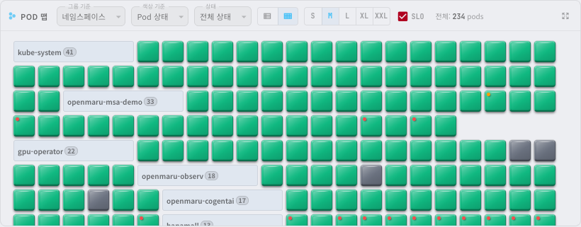
Every pod in the cluster is drawn as a small tile so you can take in their state at a glance. Each pod is one tile, and the tile's colour represents its state or resource usage. Tiles for pods with problems (Failed, CrashLoop, usage above 90%, and so on) blink to draw attention, so you can pick them out quickly.
How ended pods are removed
When a running pod ends, it disappears from the pod map and the Pods card in approximately 1 minute. For example, if you decrease the pod count from 2 to 1, the tile of the removed pod disappears in approximately 1 minute.
The pod map continues to show these pods.
- Pods that failed (Failed) or completed (Succeeded)
- Pods that are restarting (including CrashLoop)
Note: The application list and the application detail use metrics to find the state. Thus they change later than the dashboard. The change appears after approximately 3 minutes in Kubernetes and approximately 5 minutes in host mode.
Pod map controls
The control bar at the top of the pod map offers several display options.
Group by
Choose how pods are grouped.
| Option | Description |
|---|---|
| Namespace | Group by namespace (default) |
| Node | Group by node |
| Workload | Group by workload (Deployment, StatefulSet and so on) |
| Pod Status | Group by pod state (sorted crashloop, failed, pending) |
| SLO Status | Group by SLO state (sorted Critical, Warning, OK, N/A) |
Color by
Choose what the tile colour represents.
| Option | What the colour means |
|---|---|
| SLO Status | Green (OK), yellow (Warning), red (Critical), grey (N/A) |
| CPU Usage | Green (0–75%), yellow (75–90%), red (above 90%, blinking), grey (no request set) |
| Memory Usage | Green (0–75%), yellow (75–90%), red (above 90%, blinking), grey (no request set) |
| Pod Status | Fixed colour per pod state (see the legend below) |
| Restart Count | Green (0), yellow (1–3), red (above 3, blinking) |
Pod Status colour legend:
| Colour | State | Description |
|---|---|---|
| Green | Running | Running normally |
| Yellow | Pending | Waiting to be scheduled |
| Red (blinking) | Failed | Failed |
| Dark red (blinking) | CrashLoop | Terminating abnormally over and over |
| Grey | Succeeded | Completed |
| Light grey | Evicted | Evicted |
| Transparent | Unknown | Unknown |
Status filter
Show only pods in a particular state.
| Option | Description |
|---|---|
| All Statuses | Show every pod (default) |
| Running | Show only running pods |
| Pending | Show only pending pods |
| Failed | Show only failed pods |
| CrashLoop | Show only pods terminating abnormally over and over |
| Succeeded | Show only completed pods |
| Evicted | Show only evicted pods |
Layout
Choose between two layouts.
- Flow view (default): pod tiles are packed into a grid. Group names appear inline between tiles as tags. This uses space efficiently and suits large pod counts.
- Grouped view: each group gets a divider and a header, with its tiles arranged inside. Group boundaries are explicit, which makes comparison easier.
Tile size
Choose S, M, L, XL or XXL. With many pods, S or M makes the whole picture easier to take in; to look at individual pods, choose XL or XXL.
SLO overlay
Turn on the SLO checkbox (on by default) and each tile carries an SLO breach dot at its top right (yellow = warning, red = critical).
The right of the control bar shows the total number of pods matching the current filters.
Pod tile popup
Hover over an individual pod tile and a detail popup (tooltip) appears with the following information.
- Pod name and state badge (Running, Pending, Failed, CrashLoop, Succeeded, Evicted, Unknown)
- Namespace and node names
- CPU usage: a gauge of usage against request where a request is set; absolute usage where it is not
- Memory usage: a gauge of usage against request where a request is set; absolute usage where it is not
- SLO status: the SLO state (OK / Warning / Critical) of the application the pod belongs to, its availability target and its P99 response time
- Restart count and pod age
- Workload information: the kind (Deployment, StatefulSet and so on) and name of the workload it belongs to
Clicking a pod tile
Click a pod tile and the application detail popup for that pod's application appears. It lets you check the application's metrics and details without leaving the dashboard.
Clicking a group name
When Group by is set to Namespace, clicking a group name (a namespace) takes you to the topology map for that namespace.
The legend in the expanded view
Expand the pod map and a colour legend for the current Color by setting appears at the bottom. It tells you which state or value range each colour stands for, which helps you read pod state from colour alone.
Service map (host mode)
In host mode, the Service Map appears in place of the pod map. The service map shows the services that run on the servers as tiles. When an instance of a service stops, the tile state changes in approximately 20 seconds.
| Instance state | Tile state |
|---|---|
| Some instances stopped | Warning |
| All instances stopped | Critical |
| One instance only, and that instance stopped | Critical (without Warning first) |
- The Services card at the top counts a service with a stopped instance as unhealthy.
- When you hover over a tile, the tooltip shows the number of running instances and the total number of instances (for example,
0/1 Instances). - If the agent or the server itself does not respond, the services on that server are not marked as stopped.
Top resource consumers
Lists the workloads using the most CPU and memory. Useful for spotting the applications that concentrate resource use within the cluster.
- The default view shows the top five CPU consumers and the top five memory consumers side by side.
- The expanded view shows up to 20 entries each for Top CPU Consumers and Top Memory Consumers.
- Click an application in the list to see its details in a popup.
Node heatmap
Shows resource usage across the cluster's nodes as a heatmap. The darker the colour, the higher the usage.
- Choose CPU Usage % or Memory Usage % from the dropdown on the right of the panel.
- Click a node cell to see that server's details in a popup.
Cluster events
Lists events from the Kubernetes cluster in time order. Pod failures, resource shortages, deployments and other significant operational events appear here.
Event types:
- WARNING: an event that needs attention. Pod failures, resource shortages, scheduling failures and other problems.
- NORMAL: an ordinary operational event. Deployments, scaling, pod starts and so on.
Common event reasons:
| Reason | Type | Description |
|---|---|---|
| CrashLoopBackOff | WARNING | The container keeps terminating abnormally and being restarted. |
| OOMKilled | WARNING | The container exceeded its memory limit and was killed. |
| Pending | WARNING | The pod could not be scheduled onto a node and is waiting. The cause may be a resource shortage or unmet server conditions. |
| Failed / Evicted | WARNING | The pod failed, or was evicted because the server was under resource pressure. |
| InstanceDown | WARNING | An instance is down, which may affect the service. |
| ScalingReplicaSet | NORMAL | A Deployment is scaling a ReplicaSet. This is a deployment or autoscaling action. |
| Started | NORMAL | An instance started normally. |
| Switchover | NORMAL | A primary/replica switchover was performed, for example on a database. |
Note: operational events such as deployments, instance up/down and switchover are shown for the last 15 minutes. Pod state events such as CrashLoopBackOff, OOMKilled, Pending and Failed reflect the cluster's state right now. Up to 200 events are shown, newest first, and the default view puts WARNING events first.
Use the filters at the top of the panel to filter by event type (All Types / Warning / Normal) or by reason.
In the expanded view, an Event Guide panel appears alongside the list, explaining what each event reason means.
Resource trends
Charts how cluster resource usage changes over time. Choose CPU or Memory from the dropdown on the right of the panel.
Full-screen mode
Click the full-screen button beside the dashboard title to switch to a browser-wide view without the sidebar, giving you more room. Click it again or press Esc to return.
Tip: leaving the dashboard in full screen on a shared team monitor gives you continuous visibility of the cluster.
Expanded panel view
Click the Expand button at the top right of any panel to see that panel alone on a larger canvas. The expanded view shows more data and more detail.
| Panel | What the expanded view adds |
|---|---|
| Namespace resource allocation | Resource efficiency analysis panel |
| Pod map | Colour legend |
| Top resource consumers | Extends to the top 20 |
| Cluster events | Event guide panel |
Settings are remembered
Settings you change on the dashboard are saved in the browser automatically. Next time you open the dashboard, your previous settings are still in place. The following are saved.
- Category filter
- Pod map: Group by, Color by, Status filter, layout, tile size
- Namespace resource allocation metric
- Node heatmap metric
- Cluster event filters
- Resource trends metric
Related documents
- Topology map — service dependencies and traffic flow
- Nodes — detailed resource status per node
- Applications — per-application monitoring detail
- Incidents — detected incidents and their details
- Deployments — deployment history