10.1. Common chart guide
The shared components and controls of OPENMARU Observability's time-series charts.
Every screen in OPENMARU Observability visualises metric data through time-series charts. This document explains the components and controls those charts share across the product.
How to read a chart
Each chart is made up of the following.
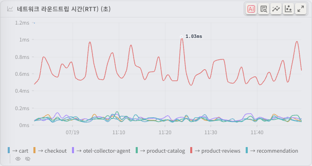
| Component | Description |
|---|---|
| Chart title | At the top left, the name of the metric the chart shows. |
| X axis (horizontal) | Time. Shown as HH:mm or HH:mm:ss depending on the query range, with MM/DD added where the date changes. |
| Y axis (vertical) | The metric's value. Unit prefixes (K, M, G and so on) are added automatically according to the magnitude, and each chart shows its own unit (%, /s, bytes and so on). |
| Legend | Below the chart, giving each series' name and colour. |
| Action buttons | To the right of the chart title: drill-down (goes to the related detail screen, shown only on charts that have one), CogentAI Insight, forecast, anomaly detection, full screen and so on. |
How to read the tooltip
Move the cursor over the chart area and a tooltip appears.
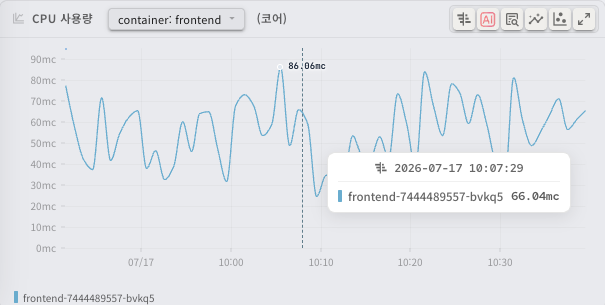
- Time: the exact time at the cursor (
YYYY-MM-DD HH:mm:ss), at the top of the tooltip. - Series values: each series' name, colour marker and value at that moment.
- Total/share: depending on the chart, the overall total or a particular series' share may also be shown.
- Incident information: where the cursor sits within an incident, the incident's start time, end time (or "in progress") and duration are shown too.
Where there are more than 10 series, only the 10 with the largest values are listed and the rest are summarised as "and N more...".
The chart information dialog
Some charts carry an information icon in the title area. Click it to open the chart information dialog, which gives the following.
- Description: what the metric represents
- Value Direction: whether lower is better or higher is better
- Warning Level / Critical Level: the warning and critical levels
- Related Charts: a list of related charts. Click one to go to it.
Chart types
Single charts
The basic time-series chart, showing one metric or a few series. Drawn as a line or an area, it shows how the data changes over time.
- A line chart icon appears to the left of the chart title.
- With a single series, the legend may be hidden.
Group charts
A chart that lets you switch between several related metrics in one chart area. The chart title carries a dropdown for choosing which metric to show.
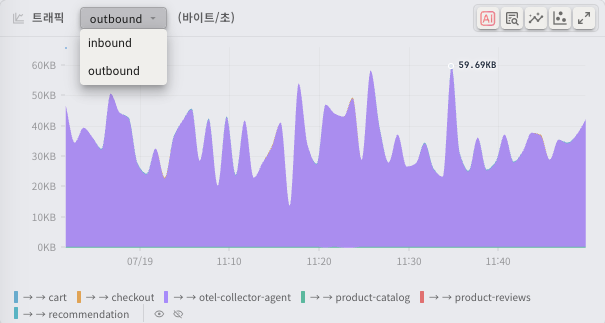
- A dropdown button appears in the chart title. Click it to see the metrics in the group.
- Choose a metric from the list and the chart switches to that metric's data.
- A multi-chart icon appears to the left of a group chart's title.
Heatmaps
A chart whose X axis is time, whose Y axis is a range of values (response time bands, for instance), and whose colour density is the frequency of requests in that band. It is used mainly to visualise the response time distribution on the tracing screens.
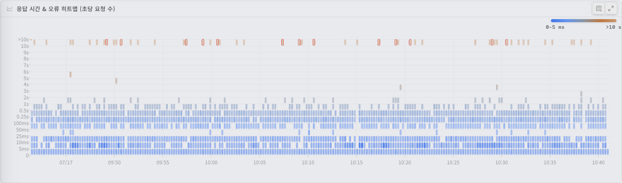
- Y axis: response time bands, increasing from bottom to top.
- Colour: light where few requests fell in that band, dark where many. A colour legend (minimum to maximum) sits at the top right of the chart.
- Error bands: request bands classified as errors are drawn in shades of red.
- Tooltip: hover and the requests per second (/s) in each response time band appear as bars.
- Selecting a region: drag on the heatmap to select a time and response time range, and you can move to the traces matching it.
Selecting a region on a chart (zoom)
Drag on the chart area to select a particular period.
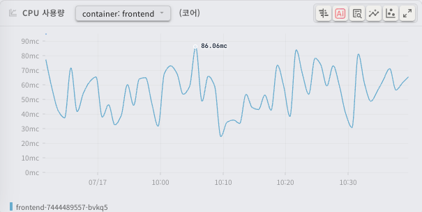
- Hold the left mouse button on the chart and drag horizontally across the range you want.
- Release and the selected period is highlighted, with action buttons above it.
- The action buttons offer the following.
| Button | What it does |
|---|---|
| Comparison mode (the double arrow icon) | Compares the selected period side by side with the preceding period of the same length. The selection is labelled "comparison" and the earlier period "baseline". |
| Zoom (the magnifier icon) | Changes the whole screen's time range to the selected period. |
| Close (the X icon) | Clears the selection and returns to the previous state. |
Tip: after zooming, choose the period you want again in the time range picker at the top of the screen to return to a wider view.
Event overlays on charts
Charts can carry overlays of significant events along the time axis.
Incidents
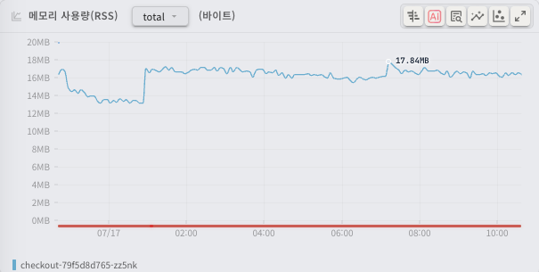
Periods with an incident appear as a coloured bar below the chart.
- Healthy periods: a green bar
- Incident periods: a red bar
Hover over an incident period and the tooltip gives the incident's start time, end time and duration.
Deployments
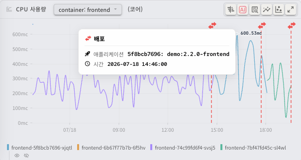
A vertical dotted line and an icon mark where a deployment was detected.
- Deployment icon: a green lightning icon.
- Hover over the icon and a tooltip gives the deployment's details (application name, version, time).
Autoscaling
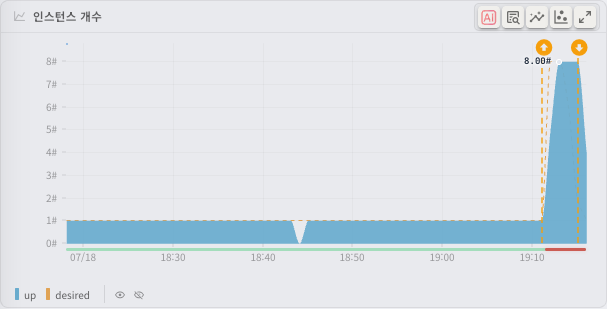
The instance count chart marks scale events driven by HPA and CronHPA. The example above shows an autoscaling cycle in which CPU load took the instances from one to eight (↑) and, once the load passed, back down to one (↓).
- Scale-up (↑) marker: an orange circle with an up arrow, at the moment of scale-out (pods added).
- Scale-down (↓) marker: an orange circle with a down arrow, at the moment of scale-in (pods removed).
- Hover over a marker and a tooltip gives the instance count before and after (
from→to) and the reason (a CPU or memory target exceeded, or a schedule).
The SLO response time target line
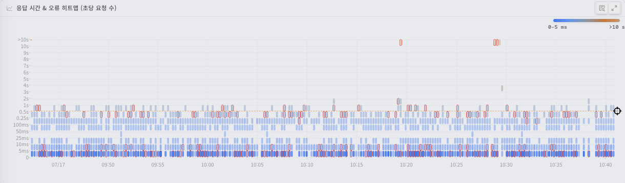
On a heatmap, the response time target set in the SLO appears as a horizontal dotted line.
- A target icon sits at the right end of the line.
- Hover over the icon and a tooltip gives the response time target (for example "99.5% of requests must be handled within 500 ms").
- The heatmap tooltip also gives the proportion of requests (%) above and below the target line.
Thresholds
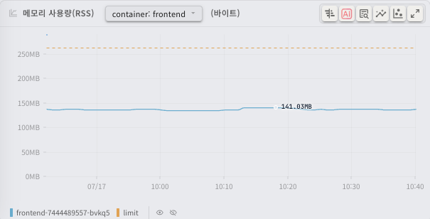
Where an inspection condition sets a threshold, that value is drawn on the time-series chart as a dotted line.
- The threshold line uses a dashed style so it stands apart from the series.
- The tooltip gives the current value as a proportion of the threshold.
Shared chart controls
Toggling series from the legend

Click a series name in the legend below the chart to show or hide it.
- Click: hides or shows that series. Hidden series appear translucent in the legend.
- Hover: hovering over a series name in the legend highlights that series and temporarily dims the rest. Move away and they return.
- Show all / hide all: with two or more series, show all (the eye icon) and hide all (the eye-off icon) buttons appear at the right of the legend.
Full screen
Click the expand icon at the right of the chart title area and the chart opens enlarged in a dialog.
- In full screen the chart takes 85% of the screen's width, so you can read the data in more detail.
- Tooltips, legend toggling, incident and deployment overlays, forecasting, anomaly detection and CogentAI Insight all work the same in full screen. The tooltip does list up to 30 series, though, rather than the usual 10.
- For a group chart, the dropdown at the top of the full-screen view switches metric.
- Press
Escor click the close (X) button to leave full screen.
Cursor synchronisation
The cursor position is synchronised across the charts on a page. Move the mouse on one chart and the cursor appears at the same moment on the other charts sharing that time axis, letting you compare several metrics at the same instant.
CogentAI analysis
CogentAI is the AI-based analysis platform integrated into OPENMARU Observability. Use CogentAI Insight on a chart and the AI analyses its data and offers insight.
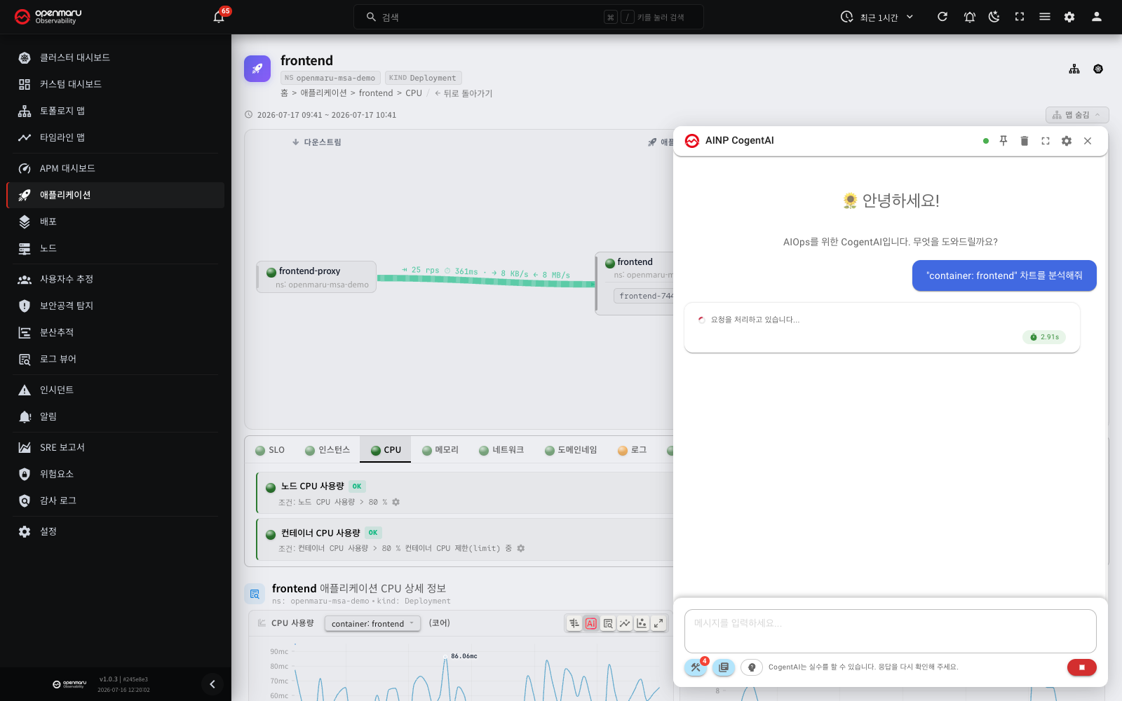
Requesting an analysis
- Click the CogentAI icon (the AI logo) in the area to the right of the chart title.
- The CogentAI widget opens at the bottom right of the screen and analysis of that chart's data begins automatically. An image of the chart (title, legend and chart) is attached to the question, so a thumbnail of the chart appears above the question in the widget chat. From the full-screen view the enlarged chart is attached. The image is kept in the chat history; the AI analysis uses the chart data.
What it analyses
CogentAI extracts and analyses the following from the data shown on the chart.
- Basic statistics: minimum, maximum and average
- Time range: the start and end times of the data on the chart
- Per-series statistics: where there are several series, the statistics for each
Follow-up questions
Once the analysis appears, type a follow-up question into the CogentAI widget to ask for more — what caused a sharp change at a particular moment, what counts as a normal range, how to improve things.
Note: CogentAI is available only where an administrator has enabled it. If the CogentAI icon does not appear, ask your administrator.
Forecasting
Forecasting predicts how a metric will trend from its past data. Use it on a chart to see visually where the metric will go if the current trend continues.
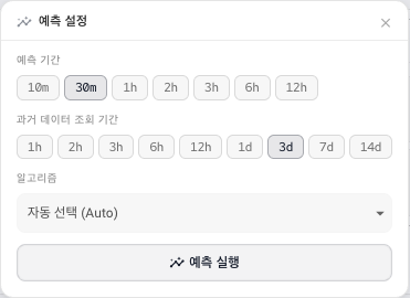
Running a forecast
- Click the forecast icon (the sparkling chart icon, in orange) in the area to the right of the chart title.
- The forecast settings panel opens.
- Adjust the settings below and click Run Forecast.
Settings
| Setting | Description |
|---|---|
| Horizon | How far into the future to forecast: 10 minutes, 30 minutes, 1 hour, 2 hours, 3 hours, 6 hours or 12 hours. |
| Lookback period | How much past data to use, from 1 hour to 14 days. A longer lookback reflects longer-term patterns. |
| Target Series | Where the chart has several series, which one to forecast. Hidden where there is only one. |
| Algorithm | Which forecasting algorithm to use. |
On first opening, Horizon 30 minutes, Lookback period 3 days, Algorithm Auto are selected.
Forecasting algorithms
| Algorithm | Description |
|---|---|
| Auto | Chooses the algorithm that suits the data automatically. Recommended when you are unsure which to pick. |
| Holt-Winters | Suits data with seasonality (repeating patterns). Effective on traffic that repeats on a regular cycle. |
| Linear | Suits data rising or falling steadily. Useful for reading a simple trend. |
| ARIMA | The autoregressive integrated moving average model, which suits short-term forecasts of non-stationary time series. |
| SARIMA | Seasonal ARIMA, which accounts for both periodic patterns and non-stationarity. |
Tip: choose Auto and several algorithms are tried, giving you the best result automatically. Where one algorithm fails, another is used instead.
Reading the forecast
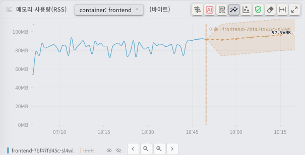
Once the forecast completes, the chart gains the following.
- The forecast line: a new line continuing from the end of the current data, showing the predicted values.
- The confidence interval: a translucent band around the forecast line. The actual value is likely to fall within it.
Forecast details
Click the forecast information icon (the shield icon) that appears in the chart title area after a forecast to see its details.
- Analysis Period: the start and end times of the data used
- Algorithm: the algorithm actually applied (with Auto, the one chosen automatically)
- Confidence Level: the forecast's confidence level, as a percentage and a colour
- Model Quality: accuracy figures such as MAPE (mean absolute percentage error)
Clearing a forecast
- Clear one: click Clear Forecast in the forecast settings panel.
- Clear everything: click the eraser icon in the chart title area to clear both the forecast and the anomaly detection results.
Anomaly detection
Anomaly detection identifies values that fall outside the normal range in a time series automatically. It is useful for spotting unexpected sharp changes and abnormal patterns quickly.
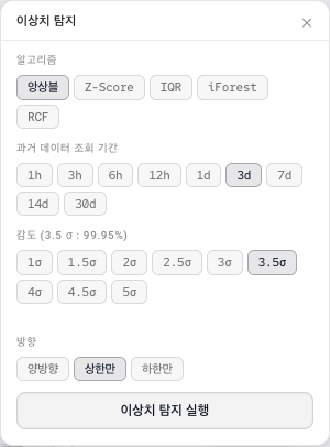
Running anomaly detection
- Click the anomaly detection icon (the scatter plot icon, in blue) in the area to the right of the chart title.
- The anomaly detection settings panel opens.
- Adjust the settings below and click Run Anomaly Detection.
Settings
| Setting | Description |
|---|---|
| Algorithm | Which detection algorithm to use. |
| Lookback period | How much past data to use, from 1 hour to 30 days. |
| Sensitivity | The threshold for calling something an anomaly, from 1.0σ (most sensitive) to 5.0σ (strictest). The lower the value, the more data points are judged anomalous. |
| Direction | Which direction to detect. Both catches rises and falls, Upper Only only abnormally high values, Lower Only only abnormally low ones. |
| Target Series | Where there are several series, which one to analyse. |
On first opening, Algorithm Ensemble, Lookback period 3 days, Sensitivity 3.5σ, Direction Upper Only are selected.
Detection algorithms
| Algorithm | Description |
|---|---|
| Ensemble | Runs several algorithms together and decides by majority. It gives the most stable results and is the recommended default. |
| Z-Score | Judges by how many standard deviations a value sits from the mean. Suits data close to a normal distribution. |
| IQR | Judges by the interquartile range. Less sensitive to extreme values in the distribution. |
| iForest | A machine learning algorithm that judges by how many splits it takes to isolate a data point. Effective on anomalies with complex patterns. |
| RCF | The random cut forest algorithm, optimised for anomaly detection on streaming data. |
Reading the results
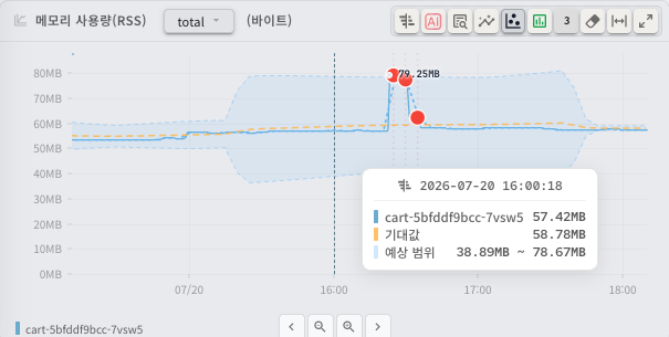
Once detection completes, the chart gains the following.
- The expected band: the range of values judged normal, as a translucent area.
- Anomaly markers: data points outside the normal range, highlighted. The colour follows the severity (critical, high, medium, low).
The severity filter
To see only anomalies of a particular severity, use the Severity Filter in the settings panel or the anomaly list.
- All: shows anomalies of every severity.
- Critical / high / medium / low: shows only the severities you select. Several can be selected at once.
The anomaly list and details
Click the anomaly count badge that appears in the chart title area after detection to open the anomaly list panel.
- Each anomaly card gives the severity, time, value and score.
- Click a card and the chart moves to that moment.
Click the anomaly information icon (the chart box icon) to see the detection details.
- Algorithm: which algorithm was actually applied
- Anomaly Ratio: the proportion of all data points judged anomalous
- Data statistics: mean, median, standard deviation, minimum and maximum
- Per-algorithm results: in ensemble mode, how many anomalies each individual algorithm found
Clearing anomaly detection
- Clear one: click Clear Anomalies in the detection settings panel.
- Clear everything: click the eraser icon in the chart title area to clear both the forecast and the anomaly detection results.
Chart types in summary
| Chart type | Icon | Main use | Where it appears |
|---|---|---|---|
| Single chart | Line chart icon | The trend of one metric over time | Application details, node details |
| Group chart | Multi-chart icon | Switching between related metrics for comparison | Application details, node details |
| Heatmap | Line chart icon | Visualising the response time distribution | Distributed tracing |
Related documents
- Applications - the charts on the metric tabs of the application details
- Nodes - the system metric charts on the node detail page
- Distributed tracing - the heatmap and the span waterfall chart
- Incidents - the SLI charts and the incident overlay