3.3. Topology map
A live visualisation of the dependencies and traffic flow between applications and services.
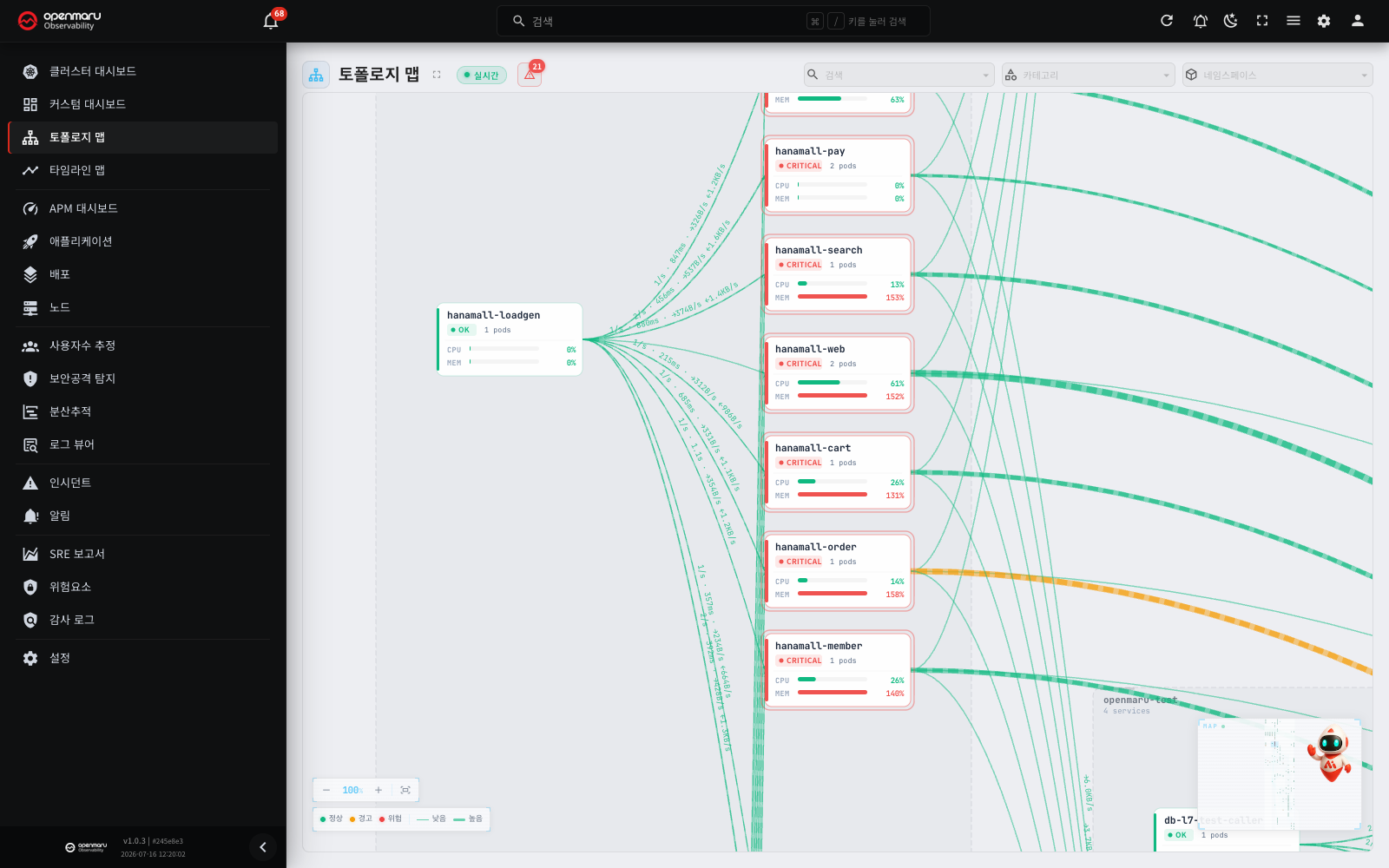
Overview
The Topology Map shows the connections between every application you monitor as a directed graph. You can see at a glance which services each application talks to, how much traffic there is, and whether errors are occurring.
Use it in a microservices environment to identify quickly which services are affected when something breaks, or simply to understand the service architecture in normal times. It is connected to the server in real time, so the topology data refreshes on its own.
Open it from the Topology Map menu in the left sidebar.
Screen layout
The topology map is made up of the following areas.
| Area | Position | Description |
|---|---|---|
| Top header | Top of the screen | Page title, full-screen button, connection badge, alerts button, search, category and namespace filters |
| Map canvas | Centre of the screen | The main area, where service nodes and their connections are drawn |
| Zoom controls | Bottom left | Zoom in and out buttons, the current zoom level, and a fit-to-screen button |
| Legend | Bottom left (below the zoom controls) | The legend for node state colours and traffic line thickness |
| Minimap | Bottom right | A reduced view of the whole topology and the position of the current viewport |
Connection badge
The connection badge in the header shows the state of the real-time connection to the server.
- Live (green dot): topology data is updating in real time.
- Connecting... (grey spinner): the screen is connecting or connecting again to the server. The seconds in parentheses show the time until the next attempt.
- Disconnected (red dot): the screen did not connect after 10 attempts. The badge also shows the time of the last received data. The screen continues to try again every 60 seconds.
When the badge shows Disconnected, an error bar and a Reconnect button appear at the top. Click the button to connect again immediately. When the server responds again, the screen recovers by itself, so you do not have to refresh the page. For the reconnection intervals, see the "Checking the real-time connection" section in 3.1 Dashboard.
Main features
How to read a service node
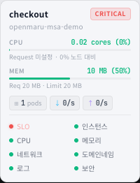
Each application appears on the map canvas as a card-shaped node. A node carries the following information.
| Item | Position | Description |
|---|---|---|
| Service name | Top of the card | The application's name |
| Status badge | Below the name, left | The current state (OK, Warning, Critical) |
| Pod count | Below the name, right | How many pods are running |
| CPU gauge | Bottom of the card | CPU usage (percent) |
| MEM gauge | Bottom of the card | Memory usage (percent) |
| Status bar on the left | The vertical bar down the left of the card | Colour-coded by state |
The node's border colour and its left-hand status bar represent the service's state.
| Colour | State | Meaning |
|---|---|---|
| Green | OK | The service is running normally |
| Yellow | Warning | Needs attention |
| Red | Critical | Needs immediate action |
Nodes in a warning or critical state get a static highlight ring around their border. Nodes whose CPU or memory usage passes 90% are highlighted the same way.
Gauge bar colours also change with usage.
| Colour | Threshold | Meaning |
|---|---|---|
| Green | Below 75% | Normal |
| Yellow | 75% to 90% | Caution |
| Red | 90% and above | Critical |
External service nodes
Services outside your monitoring (an external API or a SaaS, say) are drawn in a reduced form. External service nodes have no CPU or memory gauges — only the service name and a status dot.
Namespace areas
Nodes belonging to the same namespace are grouped inside a dashed border.
- The namespace name and its service count appear at the top of the area.
- Every namespace area uses the same neutral-coloured dashed border.
- Click a namespace name to apply that namespace filter quickly. Click again while it is applied and the filter clears.
Note: a namespace is the unit Kubernetes uses to separate resources logically.
How to read the connections
Traffic between services is drawn as connecting lines with arrows, which carry the following information visually.
| Visual element | Meaning |
|---|---|
| Arrow direction | The direction traffic flows (from the caller to the callee) |
| Line thickness | Requests per second (RPS). More traffic, thicker line |
| Line colour | Error rate. Green (normal) / yellow (above 1%) / red (above 5%) |
| Flow animation | Where there is traffic, a dashed line animates along the connection |
| Inline figures | Requests per second, p50 latency, and bytes sent and received, shown on the line |
The speed of the flow animation follows the volume of traffic — the more requests per second, the faster it flows.
Node and connection tooltips
Hover over a node and a detail tooltip appears, containing the following.
- Service name and status badge
- Namespace
- CPU usage (percent and gauge)
- Memory usage (percent and gauge)
- Pod count
- Inbound and outbound traffic (requests per second)
- Error rate
- Per-inspection status, where present
Hover over a connection and the tooltip gives the detailed figures for it.
- The direction, from calling service to target service
- Requests per second (RPS)
- Error rate
- p50 and p95 latency
- Bytes sent and received per second
Hover highlighting
Hover over a node and only that node, the nodes directly connected to it and the connections between them stay highlighted; everything else dims. This makes a service's upstream and downstream dependencies easy to see.
Hovering over a connection likewise highlights it and the nodes at both ends.
Clicking a node for details
Click a service node on the map and the detail dialog for that application opens, where you can look at metrics, logs, distributed traces and other data.
Double-click a node and the map moves to it at 100% zoom.
Note: clicking an external service node does not open a detail dialog.
Checking alerting nodes
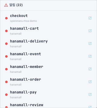
Click the alerts button (the warning icon) in the header to see the services currently in a warning or critical state.
- Where there are alerts, the button carries a red count badge to draw attention.
- With no alerts, a "No alerts" message is shown.
- The list is sorted with critical first, then warning.
- Each entry shows a status colour dot, the service name and the namespace.
- Click an entry and the alert list closes and the map moves to that node.
Tip: when you first open the topology map, if any node is in a critical or warning state, the map focuses on it automatically.
Searching for a service

Type a service name into the search box on the right of the header to find a service quickly. Autocomplete is supported.
- Type a service name into the search box.
- Choose the service you want from the dropdown.
- The map moves to that service's node.
Note: the search list contains only the services currently on screen under the category and namespace filters in effect.
Filtering
Use the filters in the header to narrow which services appear on the map.
- Category filter: shows only services in the chosen categories. Several categories can be selected at once.
- Namespace filter: shows only services in the chosen namespaces. Several namespaces can be selected at once.
With a filter applied, only the matching services and the connections between them appear, and the map layout rearranges itself to fit the screen.
The first selection appears as a chip; further selections are summarised as a +N badge. Clear an individual filter with the X button on its chip, or clear them all with the X button on the dropdown.
Tip: clicking a namespace area's name on the map canvas applies that namespace filter quickly. Click again while it is applied and the filter clears.
Navigating the map
Navigate the map canvas as follows.
| Action | How |
|---|---|
| Pan | Drag an empty area |
| Zoom | Scroll the mouse wheel (zooms around the cursor) |
| Double-click an empty area | Moves to 100% zoom centred on the cursor |
| Double-click a node | Moves to 100% zoom centred on that node |
Zoom controls
The zoom controls at the bottom left of the map canvas offer the following.
| Button | Function |
|---|---|
| - (zoom out) | Zooms the map out |
| Zoom level | Shows the current zoom level as a percentage |
| + (zoom in) | Zooms the map in |
| Fit to screen | Adjusts the view so every service node fits on screen |
Zoom ranges from 30% to 150%.
Legend
The legend sits below the zoom controls.
- Node state colours: the colour for each of OK, Warning and Critical
- Connection thickness: light traffic (thin line) and heavy traffic (thick line)
Minimap
The minimap sits at the bottom right of the map canvas and gives a reduced view of the whole topology.
- The rectangular frame marks the area currently on screen (the viewport).
- Click or drag on the minimap and the map moves to that position.
- Each node appears as a dot coloured by its state.
- The area outside the viewport is dimmed, so you can see at a glance which part you are looking at.
Full-screen mode
Click the full-screen button in the header and the topology map fills the screen, letting you take in a complex service structure at once.
Click the button again while in full screen, or press Esc, to return.
Worked examples
Working out the blast radius of a failure
- When you open the topology map, it focuses automatically on any node in a critical or warning state.
- Hover over the problem node to see its dependencies. Only the upstream and downstream services directly connected to it stay highlighted.
- Check the connection colours to see along which paths errors are spreading.
- Click the problem node and check its metrics, logs and distributed trace data in the detail dialog.
Understanding the service architecture
- Click the fit-to-screen button to take in the whole topology.
- Look at the service groups enclosed by namespace areas.
- Read traffic flow and volume between services from the direction and thickness of the connections.
- Where you are curious about one service's dependencies, hover over its node and read the highlighting.
Focusing on one namespace
- Choose the namespace to analyse in the namespace filter, or click the namespace name on the map canvas.
- Only that namespace's services remain, and the map rearranges itself.
- Analyse the internal communication patterns between the services and their external dependencies in detail.
Related documents
- Dashboard - overall cluster resource status
- Applications - detailed monitoring of an individual application
- Incidents - detected incidents and their analysis
- Timeline map - the relationship between deployments and incidents