5.2. Distributed tracing
Explore all trace data and analyse how requests flow between services.
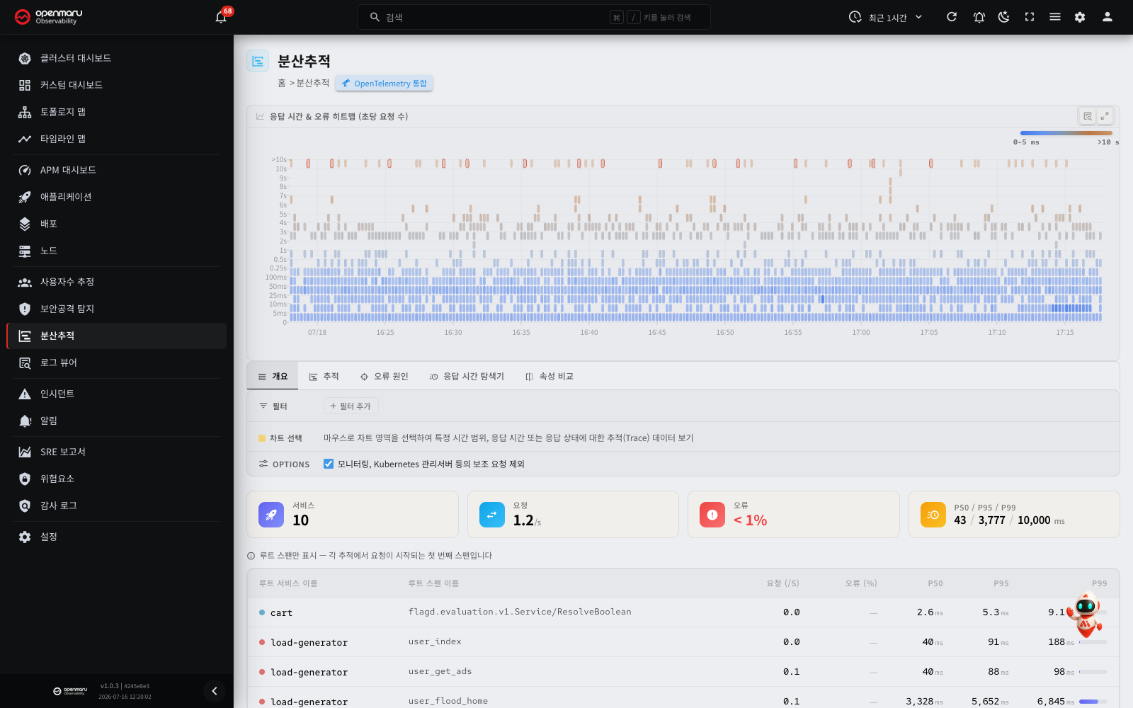
Overview
The Traces screen visualises the whole path a request takes through several services in a microservices environment. A trace is a record of the path one request took through the several services of a distributed system.
A heatmap gives you the distribution of the trace data at a glance, so you can identify slow requests and failed requests quickly. Drill down into a selected region to reach the span details of an individual trace.
Open it from the Traces menu in the left sidebar.
Note: distributed trace data is collected from applications instrumented with the OpenTelemetry SDK. If you have not connected it yet, click the Integrate OpenTelemetry button at the top of the screen to see how.
Screen layout
| Area | Description |
|---|---|
| Top header | The Integrate OpenTelemetry button |
| Heatmap | A distribution chart of time (X axis) against response time (Y axis). Drag to select a range |
| Tabs | overview / traces / error causes / latency explorer / compare attributes |
| Filters | Sets filter conditions such as service name, span name and trace ID |
| Chart Selection | Shows the time and response time range selected on the heatmap |
| Baseline | On the compare attributes and latency explorer tabs, shows the comparison baseline outside the selection |
| Options | The setting for excluding auxiliary requests |
| Content area | The analysis results for the selected tab |
Main features
How to read the heatmap
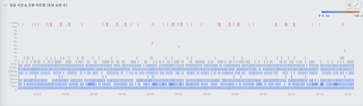
The heatmap visualises the distribution of time against response time as colour density. The horizontal axis (X) is time and the vertical axis (Y) is the trace's response time. Each cell's colour represents the density of requests in that time and response time range.
- The darker the colour, the more requests occurred in that response time range at that time.
- Colour concentrated towards the top means many requests with long response times.
- Red points at a particular time mean errors occurred then.
- In a healthy state, most points sit towards the bottom (low response times).
A colour legend sits at the top left of the heatmap. Its left end (light) marks regions with few requests, its right end (dark) regions with many.
Where a response time SLO target is configured, the heatmap draws the target threshold as a line. Requests above that line have passed the SLO target.
Click the expand button to the right of the heatmap to see it larger, in full-screen mode.
Selecting a region on the heatmap
Drag on the heatmap to select a particular time and response time range. Only the trace data within it is then shown in the tabs.
- Click and drag across the region you want to investigate.
- The selection appears on the Chart Selection row as time range and response time range tags.
- Where you selected an error region, a Status Error tag appears too.
- The tab contents refresh automatically against the selection.
- To cancel the selection, click Clear selection on the Chart Selection row.
The heatmap is drawn as cells. Each cell covers a fixed time width. The query period sets the cell width, as follows.
| Query period | Time width of one cell |
|---|---|
| 1 hour or less | 15 seconds |
| More than 1 hour | 1 minute |
| More than 6 hours | 5 minutes |
| More than 12 hours | 10 minutes |
| More than 1 day | 15 minutes |
| More than 5 days | 1 hour |
This table applies when the collection interval is the default (15 seconds). A cell is never narrower than the collection interval.
The time range that you drag is aligned to the cells. The selection starts at the start of the first cell that you drag across. It ends at the end of the last cell. Thus the requests in the last cell are also in the result.
Tip: select the region where response times spiked (the cluster of points at the top of the heatmap) and then look at the traces or error causes tab to find the cause quickly.
Analysis by tab
Overview tab
Summarises all the trace data.
The summary cards at the top carry the following.
| Metric | Description |
|---|---|
| Services | How many distinct services appear in the traces |
| Requests | Total requests per second (/s) |
| Errors | Errors as a proportion of all requests (%) |
| p50 / p95 / p99 | Response time percentiles (milliseconds) |
The table below shows the request count, error rate and response time percentiles per root service and root span name.
Note: this table shows root spans only. A root span is the first span of a trace, where the request begins.
You can do the following from the table.
- Click a service name (root service): opens the span waterfall chart dialog for a sample trace of that service.
- Click a span name: goes to the traces tab, filtered to that service and span.
- Click an error rate: goes to the error causes tab for that service and span.
- The filter icon (tooltip: Filter by this span): applies a filter for that span.
- The trace icon (tooltip: View sample trace): opens the span waterfall chart for a sample trace.
Note: the root service is the service a request first enters. p50/p95/p99 mean that 50%, 95% and 99% of all requests respectively were handled within that response time.
Traces tab
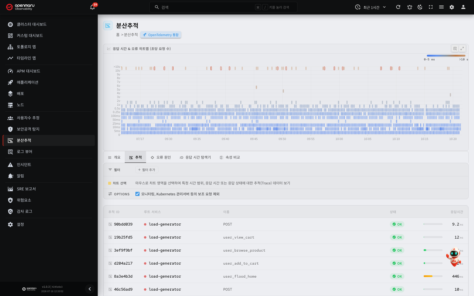
A table of the individual traces found.
| Column | Description |
|---|---|
| Trace ID | The trace's unique identifier (first 8 characters shown) |
| Root Service | The name of the service the request first entered |
| Name | The root span's operation name. If the name is one word, the target is added after it in dimmed text |
| Status | OK or Error |
| Duration | How long the whole trace took (milliseconds), with a bar showing the relative size |
Click a trace ID or name to open that trace's span waterfall chart in a dialog.
If the root span name is one word, such as GET or SELECT, the target is added after the name in dimmed text. This tells you which request it is.
- A Redis command:
GET · scheduled:jobs:version - An HTTP request:
GET · /api/check (10.0.0.5:8080). The path comes first, and the host and port are in parentheses. The query string is not shown.
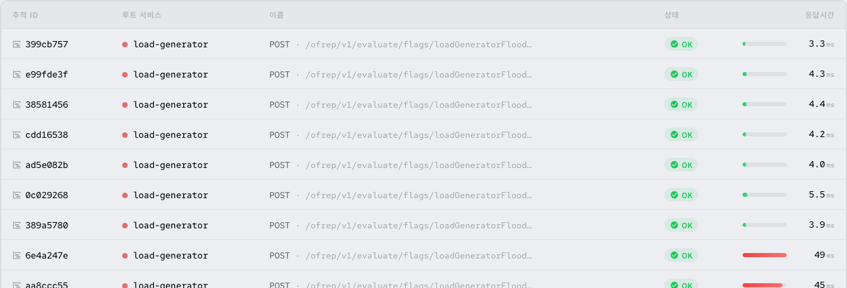
If the added target is longer than 80 characters, it is cut at 80 characters and … is added. For AUTH and HELLO commands, no target is added, because the arguments can contain a password. Sorting and filters use the original name, not the added target.
Note: where the result is large, a message about the maximum row limit may appear. Select a narrower region on the heatmap, or add a filter, to reduce the scope.
Error causes tab
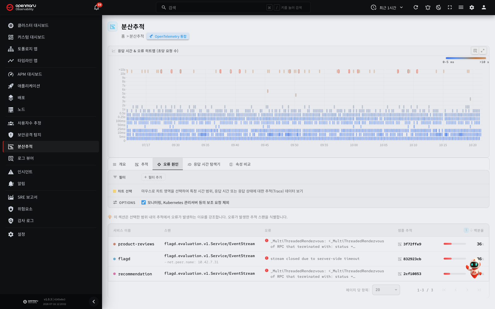
Analyses the spans where errors occurred among the traces in the selected range.
Rather than simply listing the traces containing errors, this tab highlights which span of which service the error originated in.
| Column | Description |
|---|---|
| Service Name | The service where the error occurred |
| Span | The name and labels of the span where the error occurred |
| Error | The error message |
| Sample Trace | The ID of a sample trace containing that error (click to open the span details) |
| Percentage | That error's share of all requests |
Click a Sample Trace link to see the span waterfall chart of an actual trace containing that error. If the span where the error occurred is not the root span, the chart opens at that span. In this case, to see the trace from the root span, click Show parent trace. If the span where the error occurred is the root span, the chart opens at the root span.
Latency explorer tab
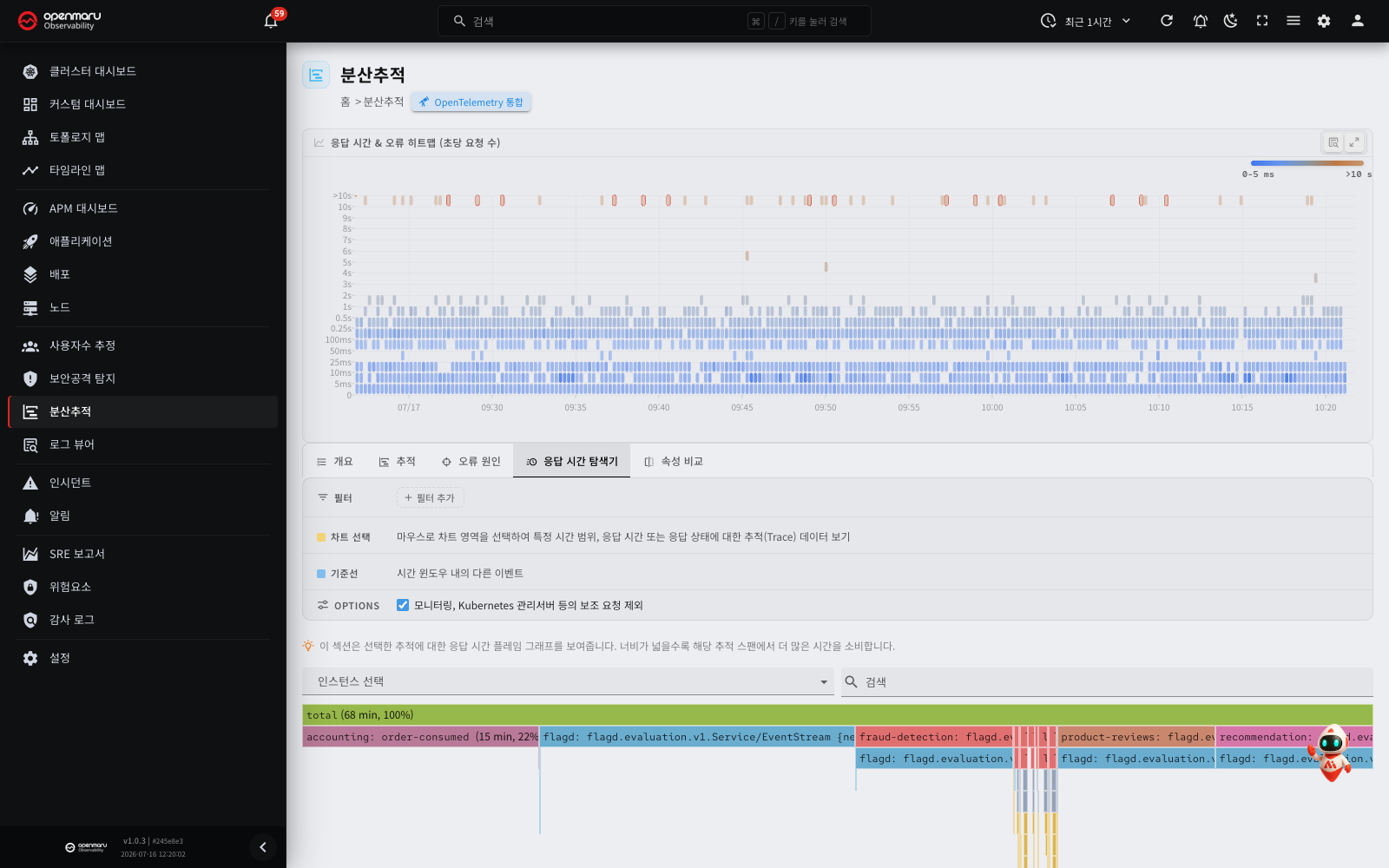
Visualises the response time distribution of the selected traces as a flame graph.
A flame graph visualises the call stack and the time spent in each frame. The wider a block, the more time was spent in that span.
- Click a block, then click Open a sample trace in the menu. The span waterfall chart of a sample trace containing that span opens.
- Selecting a region on the heatmap first and then looking at this tab helps you find which span is the bottleneck among the selected requests.
Compare attributes tab
Compares the attribute distribution of the traces you selected on the heatmap (Chart Selection) with that of the other traces in the same time window (Baseline).
Where the selection carries a higher proportion of some attribute value than usual, that attribute may be related to the cause of the problem.
Each attribute appears as a card, inside which the Baseline and Chart Selection proportions are compared as bars, per attribute value.
Tip: select the slow period on the heatmap and look at the compare attributes tab. You can quickly identify unusual attributes, such as a particular HTTP status code, user agent or database table.
Click an attribute value on a card to see the span waterfall chart of a sample trace carrying that attribute.
Using filters

Add a filter to see only the traces matching a particular service, span or trace ID.
To add a filter:
-
Click Add filter on the filter row.
-
In the Field or attribute key box, choose what to filter on.
Field Description Root Service Name The name of the service the request first entered Root Span Name The root span's operation name Trace ID The unique ID of a particular trace If you type a name that is not in the list, the filter uses it as an attribute key of the root span (for example,
http.route). To filter on a resource attribute, putrattr:before the key (for example,rattr:service.version). An attribute key can contain only letters, digits,.,_and-, and can be up to 128 characters long. -
Choose an operator. For an attribute key, you can choose only
=or!=.Operator Meaning =Equals !=Does not equal ~Matches a regular expression. A match on part of the value is sufficient. For example, ^GETmatches a name that starts withGET!~Does not match a regular expression -
Enter a value in the Value box.
-
Click the check button to apply the filter.
Applied filters appear as chips. Click a chip to edit it, or its X button to delete that filter. To remove every filter at once, click Clear all.
Note: adding several filters returns only the traces that satisfy all of them.
Option: excluding auxiliary requests
The Options row of the filter panel carries the Exclude auxiliary requests (from monitoring, control plane, etc) checkbox.
If you turn it on (the default), the analysis excludes auxiliary requests, such as internal Kubernetes management calls and monitoring health checks. Leave it on when you want to analyse real user requests only.
Trace details: the span waterfall chart
Click a trace ID or name in the trace list and that trace's span waterfall chart opens in a dialog.
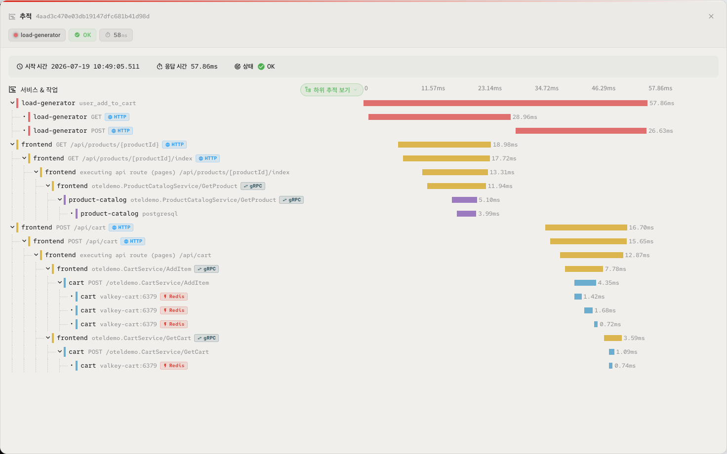
The span waterfall chart visualises the order in which a request passed through each service and how long each step took.
A summary of the trace appears at the top of the dialog.
| Item | Description |
|---|---|
| Trace | The full trace ID, next to the "Trace" title |
| Root Service | The name of the service that started the trace, with the service colour dot |
| Status | OK or Error |
| Duration | How long the whole trace took (milliseconds) |
The chart is split into a Service & Operation area on the left and a time axis area on the right.
- A horizontal bar starts where the span started, and its length is how long the span took.
- Each span's service name gets its own colour.
- Child spans are indented to express the hierarchy. Click a parent span's name to collapse or expand its children.
- Spans where an error occurred carry an error icon.
- Use the toggle button on the right of the Service & Operation header to change which spans are shown. The button depends on the span that the trace opened at.
| Opened at | Toggle button | Action |
|---|---|---|
| The root span (a trace opened from the trace list, the Overview tab, the Attribute comparison tab and so on) | Main steps only / Expand all | Click Main steps only to keep only the steps directly below the root span and collapse the spans below them. Click a collapsed row to expand it one level. Click Expand all to expand all spans. If no span has child spans, the button does not appear. |
| A span that is not the root (a sample trace from the Error causes tab) | Show parent trace / Show from selected span | Click Show parent trace to show the full trace from the root span. Click Show from selected span to show only the span that the trace opened at and its child spans again. |
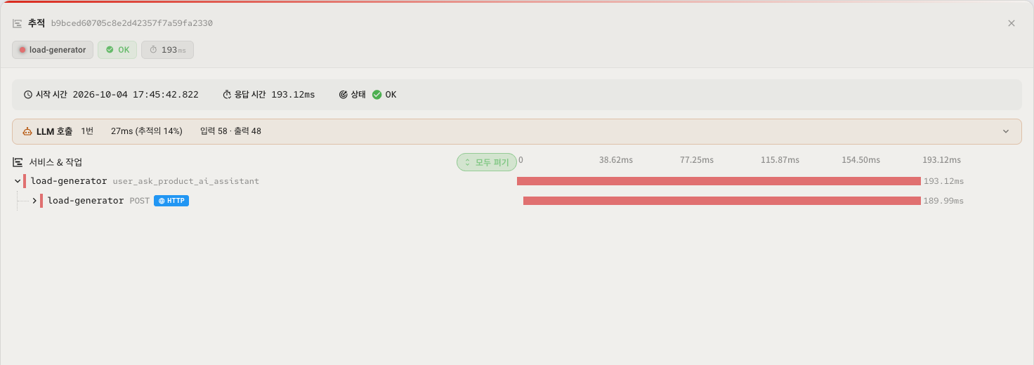
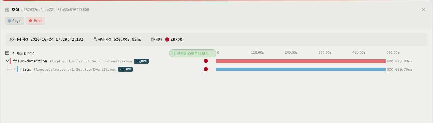
Hover over a span and a tooltip gives the service name, operation name, response time, status, child span count and type (HTTP, gRPC, Kafka and so on). For an LLM call span, the tooltip also shows the Tokens (input / output) row. If there is model data, the tooltip also shows the Model row.
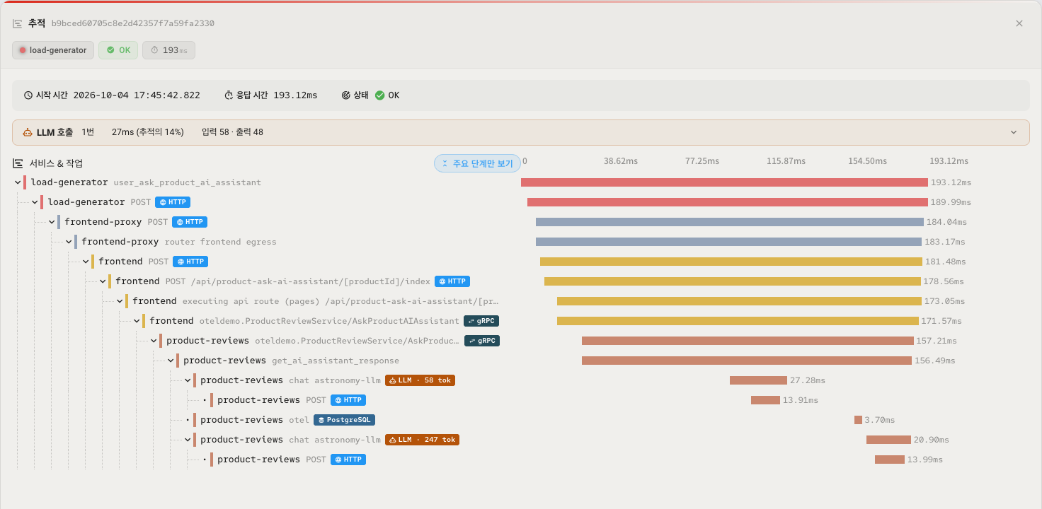
Note: To read the call structure, tokens and input and output messages of an LLM application, refer to LLM application tracing.
Looking at span details
Click a span's bar, its info button or its type badge, and the span's detail dialog appears.
| Item | Description |
|---|---|
| Name | The span's operation name |
| Service | The service the span belongs to |
| Timestamp | When the span started |
| Duration | How long the span took (milliseconds) |
| Status | OK or Error, with the message |
| Span ID | The span's unique identifier (copyable) |
| Tokens | Shown only for an LLM call span. The total of input and output tokens, and each value (for example, 12,430 (in 8,167 / out 4,263)) |
| Model | Shown only for an LLM call span. The name of the model that was called. If there is no model data, – |
| Details | Protocol-specific details (an SQL query, an HTTP request). Syntax-highlighted and copyable. |
| Attributes | The attributes attached to the span (HTTP URL, database query and so on). Each value can be copied individually. |
| Event | Events that occurred while the span ran (an exception stack, for example). Each event's time is given as the elapsed time since the span started. |
Note: in Redis spans collected by eBPF, the password arguments of commands such as
AUTHandHELLO … AUTHare replaced with?before they are stored (for example,AUTH ?). Spans stored before you updated the node agent can still contain the original text. These spans are deleted when the retention period (7 days by default) ends.
The span type is shown as a badge. The supported types are as follows.
| Type | Description |
|---|---|
| HTTP | An HTTP request and response |
| gRPC | A gRPC call |
| Kafka | Kafka message handling |
| Redis | A Redis command |
| Mongo | A MongoDB query |
| PostgreSQL | A PostgreSQL query |
| MySQL | A MySQL query |
| CH | A ClickHouse query |
| ZK | A ZooKeeper operation |
| MC | A Memcached operation |
| LLM | An LLM (large language model) call. Shown on spans that have token usage attributes. The badge also shows the total of input and output tokens (for example, LLM · 1.2k tok) |
OpenTelemetry integration
Click the Integrate OpenTelemetry button in the header at the top of the screen to open the OpenTelemetry Integration dialog.
OpenTelemetry is an open-source observability standard for collecting traces, metrics and logs. Its SDKs, available for Java, Python, Go, Node.js, .NET and other languages, let application code send trace data to OPENMARU Observability.
The dialog carries the following.
- OPENMARU Observability URL: the endpoint address to send trace data to (copyable)
- API Key: the key needed for authentication (copyable)
- OpenTelemetry Collector / SDK tabs: the configuration code and environment variables for the collector or the language you use
Note: eBPF-based automatic tracing is supported too. Trace data collected without code changes appears on the Tracing tab of the application details. This screen (the Traces menu) shows mainly OpenTelemetry SDK instrumentation data.
Worked examples
Analysing the cause of slow requests
- On the Traces screen, find the period where points are concentrated at the top of the heatmap (the high response time region).
- Drag to select that region.
- On the overview tab, see which service has the high response time.
- On the traces tab, click an individual trace to see its span waterfall chart.
- Click the widest bar on the span waterfall chart (the longest span) to see its detailed attributes.
- On the compare attributes tab, find what the slow requests have in common, such as a particular endpoint or a database query.
Tracking down the cause of errors
- Select the region showing errors (the red points) on the heatmap.
- On the error causes tab, see which service and span the errors occurred in.
- Click the Sample Trace link to see the span details of an actual failed trace.
- Read the exception stack in the span's events section.
Following one particular request
- On the Traces screen, click Add filter.
- Choose Trace ID as the field, set the operator to =, and enter the trace ID as the value.
- Click the check button to apply the filter and the trace appears immediately on the traces tab.
- Click the trace ID to see the request's whole path on the span waterfall chart.
Comparing performance across services
- On the overview tab's table, compare each root service's request count, error rate and p50/p95/p99 response times.
- Read the relative performance differences between services visually from the response time bars beside the p99 column.
- Click the error rate badge of a service with a high error rate to go to its error causes tab.
Related documents
- Applications — the Tracing tab of an individual application, showing only that application's traces
- Incidents — moving quickly to the traces involved in an incident
- Log viewer — connecting traces and logs to establish a cause
- Settings — setting response time SLO targets under inspection conditions