4.2. Applications
The full list of monitored applications, and detailed observability data for each one.
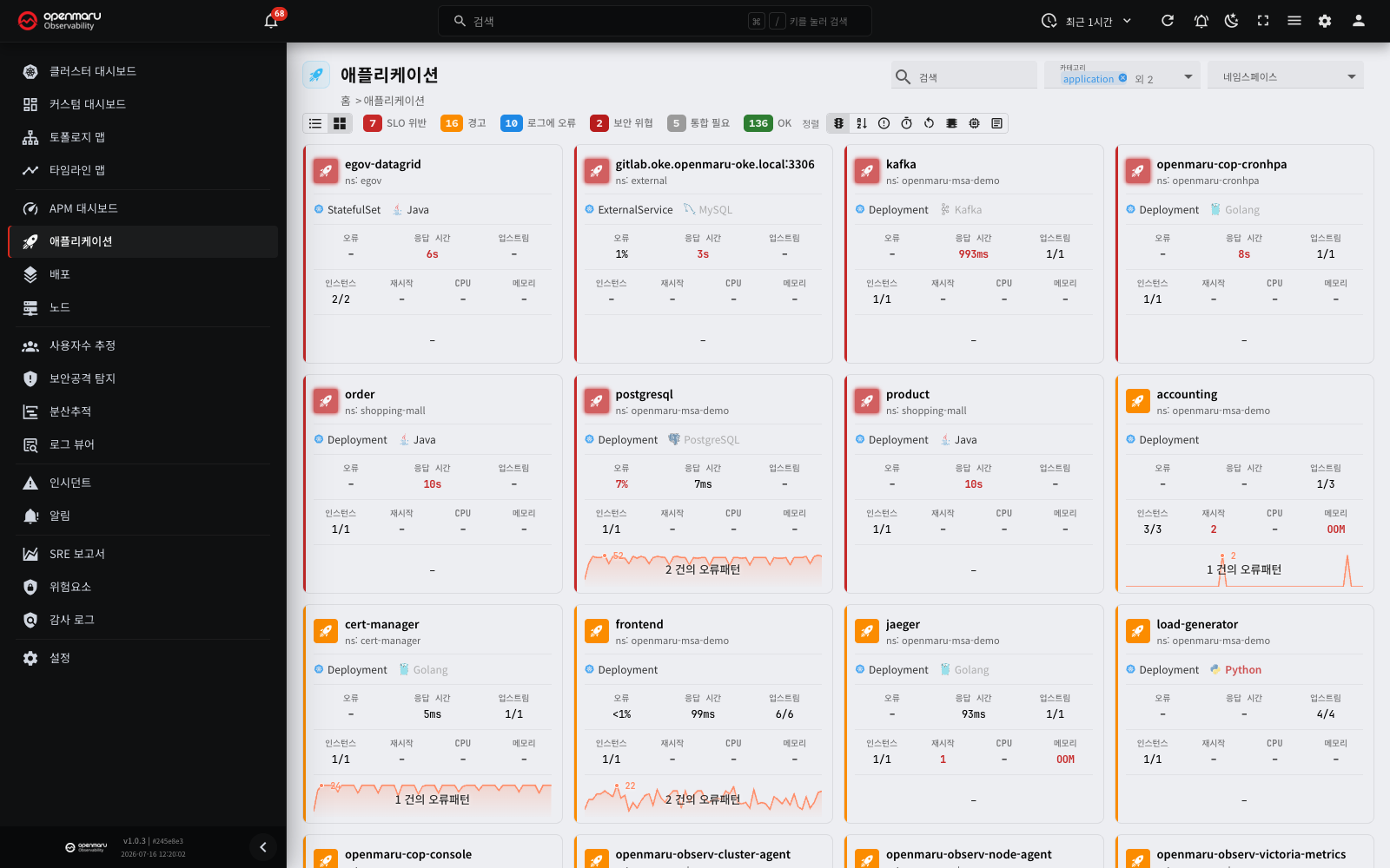
Overview
The Applications menu shows every application OPENMARU Observability monitors, on one screen. An application is the basic unit of monitoring; in a Kubernetes environment that means a workload such as a Deployment, StatefulSet or DaemonSet.
Read each application's current state and headline metrics quickly, then click one to see detailed reports — SLOs (service level objectives), CPU, memory, logs, distributed traces, profiling and more.
Click Applications in the left sidebar to reach this screen.
The application list
Screen layout
The top of the list screen carries the filters, the view toggle and the status legend, with the application list below.
| Area | Description |
|---|---|
| Top header | Page title, application filters (namespace, category, search) |
| View toggle | Switches between list view and card view |
| Status legend | Shows the application count per state, and filters by it |
| List area | List view: a table. Card view: a grid of cards |
| Pagination | Items per page (10, 20, 50, 100, All) and page navigation |
Status legend

The status legend in the toolbar at the top summarises every application by state.
| State | Meaning |
|---|---|
| SLO violation | The application has passed an SLO threshold. It needs immediate action. |
| Warning | The application is in a warning state and needs attention |
| Errors in logs | An error pattern was detected in the application's logs |
| Security threats | An attack pattern was detected against the application |
| Integration required | No agent connection, so no data is being collected for the application |
| OK | The application is running normally |
Click an entry in the status legend to filter down to applications in that state. Several states can be selected at once; the selected entries are highlighted and the rest dim. Click again to clear the filter.
Tip: check the count of applications in an SLO violation or warning state first, then click that state to concentrate on the ones with problems.
Main features
Filters
Use the filters at the top right to narrow the list by namespace, category and application name. Combine conditions to show only the applications you want.
Hiding applications
Temporary applications that appeared briefly through a misconfiguration (unknown_service, say), or applications you no longer want to see, can be hidden globally (a soft hide) to clear noise from the list and the topology map. A hidden application is not deleted; it is gathered on the Hidden applications screen and can be shown again at any time.
Node.js apps that PM2 runs (host mode)
On a VM, each Node.js app that PM2 runs shows as a separate application. This is true also when one PM2 daemon runs many apps.
- The application name has the format
<systemd unit>-<PM2 app name>. Example:pm2-ginet-cu119NEXT - CPU and memory limits do not show for each app. These values apply to the full systemd unit, so they show only on the PM2 daemon application.
- The node agent environment variable
TRACK_PM2_APPSturns this function on or off. The defaultautoturns it on for a VM and off for a Kubernetes pod. You can also settrueorfalse. - To exclude a systemd unit from the split, put the unit name in
PM2_SPLIT_DENYLIST. Use commas between names. Example:pm2-ginet.service
List view
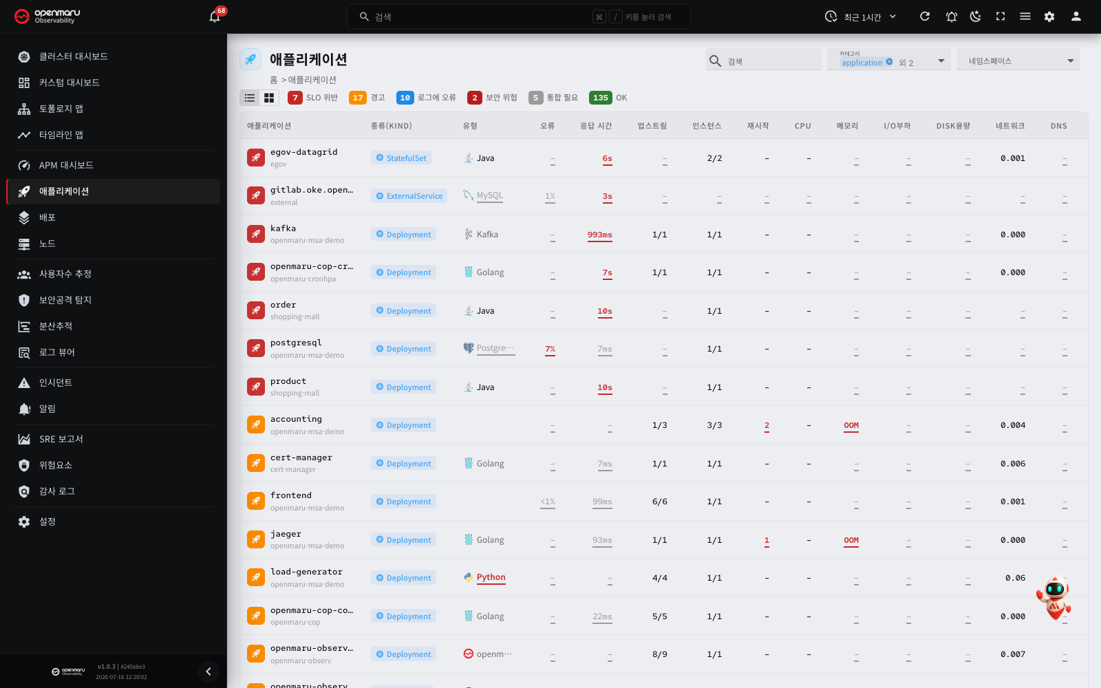
Click the list icon in the view toggle at the left of the toolbar to switch to List view, which suits comparing many applications at once.
Click a column header to sort by it, and click several columns in turn to sort by more than one.
The main columns in list view are as follows.
| Column | Description |
|---|---|
| Application | The name and namespace. Click it to open the detail page. |
| Kind | The Kubernetes workload kind (Deployment, StatefulSet, DaemonSet and so on) |
| Type | The application's technology stack (Java, Python, Redis, Kafka, vLLM and so on) |
| Errors | The error rate against the SLO |
| Latency | The response time against the SLO. For a vLLM application, the value uses the time to first token (TTFT). Move the pointer onto the cell to see the tooltip "Based on time to first token (TTFT) p95" |
| Upstreams | How many upstream services this application calls |
| Instances | How many instances are running |
| Restarts | How many times instances have restarted |
| CPU | CPU usage |
| Memory | Memory usage |
| Disk I/O load | Disk I/O load |
| Disk usage | Disk usage |
| Network | Network state |
| DNS | DNS query state |
| Security | The number of attack types (SQLi, XSS and so on) that are detected now. It shows with a shield icon. Click it to go to the security tab of the detail page. If nothing is detected, the cell shows – |
| Logs | The recent count of log error patterns, with a trend chart |
Note: where a figure such as errors or response time is highlighted in red or orange, that item has passed an inspection threshold. Click the value to jump straight to the relevant detail tab.
Card view
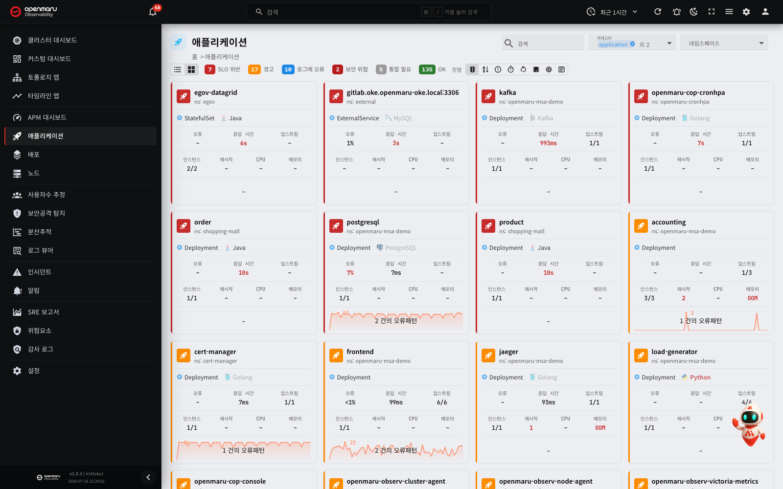
Click the grid icon in the view toggle to switch to Card view, which shows each application's state and headline metrics as a card. Each card carries the application name, a status icon and sparkline charts of the main metrics; click a card to open the detail page.
Your choice of view is remembered for your next visit.
Card view lets you choose the sort order.
| Sort by | Description |
|---|---|
| Status | Critical → warning → log errors → integration required → healthy |
| Application | Alphabetically by name |
| Errors | By error count, descending |
| Latency | By response time, descending |
| Restarts | By restart count, descending |
| CPU | By CPU usage, descending |
| Memory | By memory usage, descending |
| Logs | By log error count, descending |
Below the cards are the page navigation buttons and the items-per-page setting (10 / 20 / 50 / 100 / all).
Tip: sorting by Status puts the applications with problems at the top, where you can take them in at a glance.
Application details
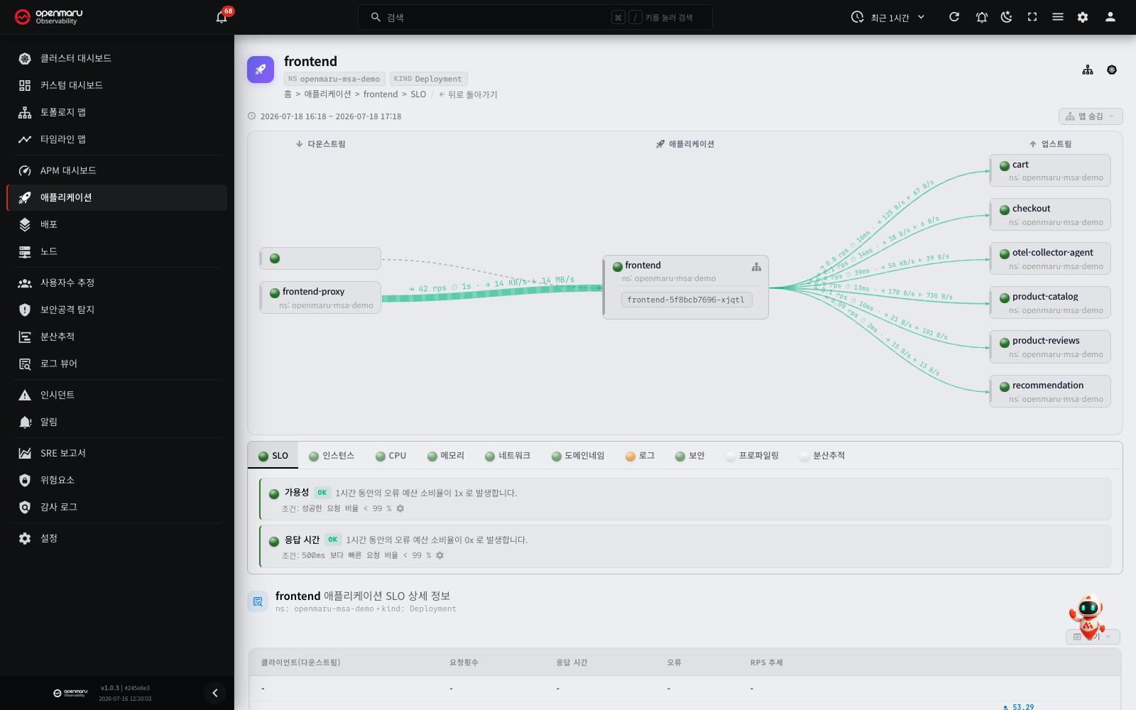
Click an application's name in the list to open its detail page.
Screen layout
The detail page is made up of the following areas.
| Area | Description |
|---|---|
| Top header | Application name, namespace, kind, and a link to the topology map |
| Time range | The time range currently being queried (three days at most) |
| Dependency map (AppMap) | A visualisation of the services this application connects to |
| Report tabs | Per-tab detail: SLO, instances, CPU, memory, logs and more |
| Inspection status | Whether each report's inspection conditions are met |
| Chart dashboard | The metric chart widgets for the selected tab |
The top header carries the following information and features.
- Application name: the name of the monitored target
- ns: the namespace it belongs to
- kind: the Kubernetes workload kind
- Open in Topology Map button: opens the topology map with this application highlighted.
- Open in COP Console button (Kubernetes icon): an external link that takes you straight to the Kubernetes resources in COP Console. This button shows only when the COP Console address is set and the kind is Deployment, StatefulSet, DaemonSet, Job, CronJob, Pod or ReplicaSet. Other kinds, such as SystemdService and ExternalService, have no button.
- Go Back: returns to the previous application list screen.
The query time range
The top of the detail screen shows the time range currently being queried. Where the range is longer than three days, a 3d limit badge appears and only the last three days of data are shown. Hover over the badge to see the range actually being queried.
Where there is no data in the selected range, a dialog appears; View Recent 1 Hour shows you the most recent data, and Go to Application List returns you to the list.
Note: changing the global time range in the time picker in the top bar updates the detail page's data too.
Dependency map (AppMap)
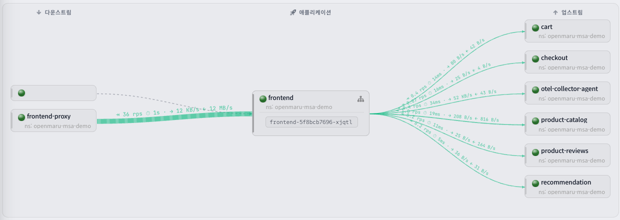
The Show Map / Hide Map button at the top of the detail screen toggles the dependency map, which visualises how this application relates to the services it connects to.
- Upstream: the services this application calls
- Downstream: the services that call this application
Click a service node on the dependency map to see its details or view it on the topology map.
Report tabs
The detail page offers several report tabs. Which tabs appear depends on the kinds of data the agent collected. A status light (LED) before each tab name tells you that report's current state at a glance.
- Green: healthy
- Orange: an anomaly at warning level
- Red: a serious problem
- Grey: no data, or not configured
SLO tab
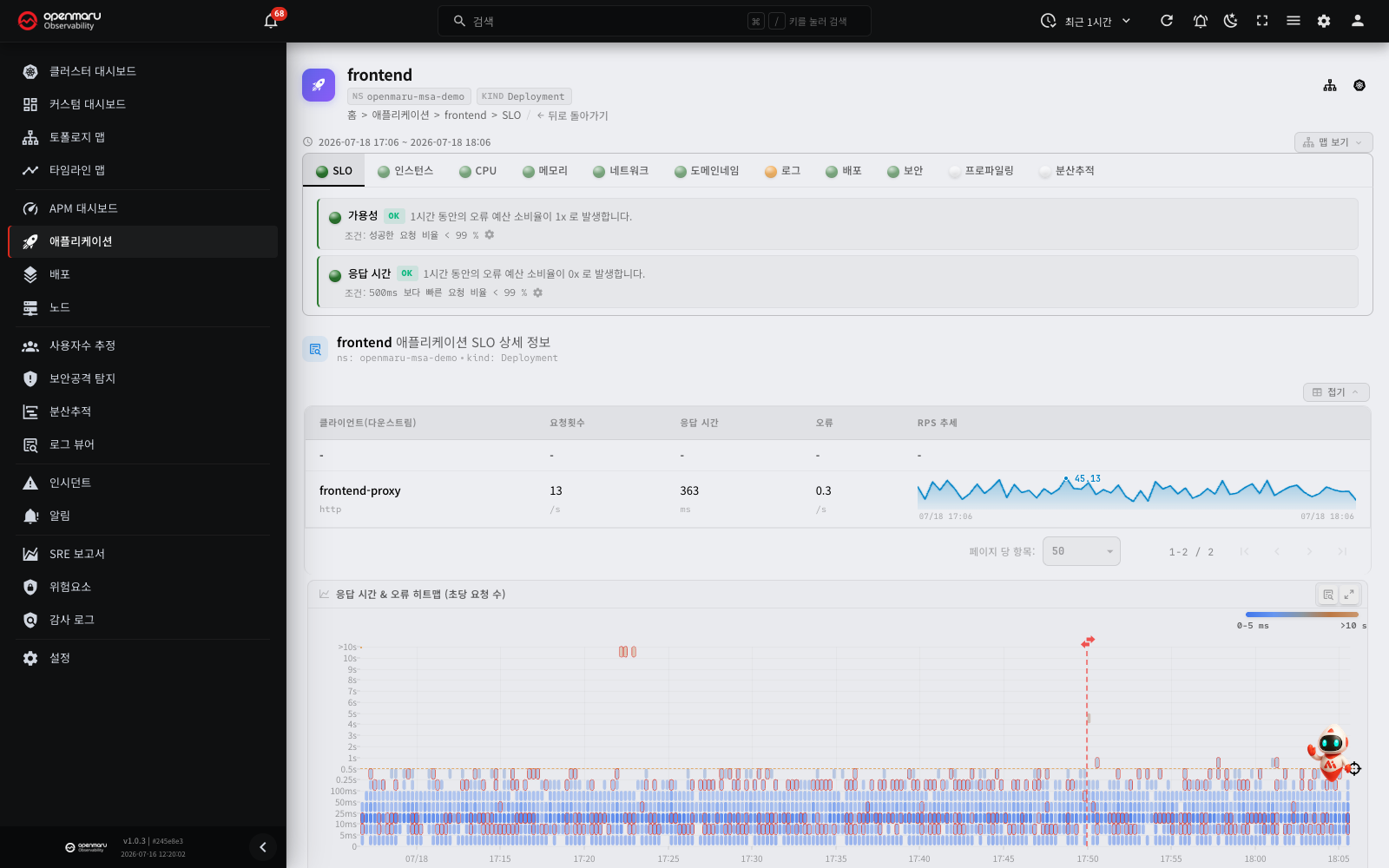
Where SLO data exists, the SLO tab is selected by default when you open the detail page (where the SLO state is unknown — an app with no requests, say — another tab may be chosen instead). It charts current performance against the availability and response time targets.
| Metric | Description |
|---|---|
| Availability SLO | The proportion of requests handled without error, and the target |
| Latency SLO | The proportion of requests handled within the target response time |
| Error budget | How many errors are permitted while still meeting the SLO target |
| Error rate, % chart | The error rate (%) trend is drawn below the Errors, per second chart (periods with no errors appear as a 0% line) |
Check the current state against the configured thresholds and see whether the SLO has been breached.
Response time heatmap:
The heatmap on the SLO tab shows only the requests that this application received. It uses the same data as the SLO values. To see the calls that this application sent (database queries and so on), use the Outbound only filter on the Tracing tab.
The time size of one cell depends on the query period.
| Query period | Cell size |
|---|---|
| 1 hour or less | 15 seconds |
| More than 1 hour | 1 minute |
| More than 6 hours | 5 minutes |
| More than 12 hours | 10 minutes |
| More than 1 day | 15 minutes |
When you drag an area on the heatmap, the Transactions dialog opens in the Inbound direction. The selected range starts at the start of the first cell and stops at the end of the last cell. To see the sent calls, click the Outbound button at the top of the dialog.
Response time SLO of a vLLM application:
For a vLLM inference server application, the response time SLO uses the time to first token (TTFT), not the HTTP response time. The HTTP response time of an LLM request increases with the length of the generated answer.
- The default target is "95% of requests with TTFT of 2.5 seconds or less". If a user saved a different target, the system uses that target.
- The response time chart and the inspection text on the SLO tab show that the value uses TTFT.
- If only a part of the query period has TTFT data, the tab shows "TTFT basis since:
<time>". The system then uses TTFT for the full period. - In the SLO settings dialog, you can select these target times: 0.1, 0.25, 0.5, 0.75, 1, 2.5, 5, 7.5, 10 and 20 seconds.
- The availability SLO uses the HTTP error (5xx) rate, as for other applications.
Note: the APM dashboard uses the HTTP response time. Thus a vLLM application can show as a slow application on the APM dashboard.
Instances tab
Lists the individual instances (pods) that make up this application, along with instance count and restart trends.
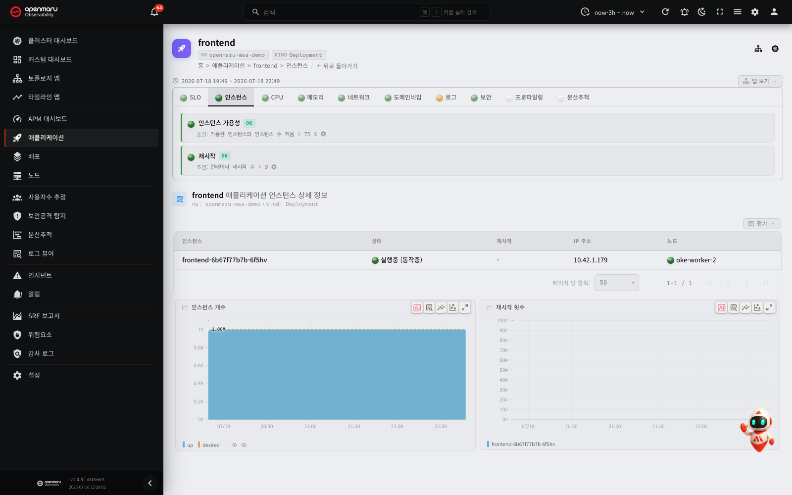
| Item | Description |
|---|---|
| Inspections | Whether the instance availability (too few available instances) and restart (container restarts occurring) conditions are met |
| Instance list | Each instance's (pod's) state (running, pending and so on), restart count, IP address and the node it landed on |
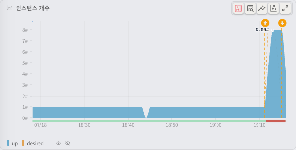
| Instances chart | The trend in actual (up) and desired instances |
| Restarts chart | The cumulative container restart count per instance |
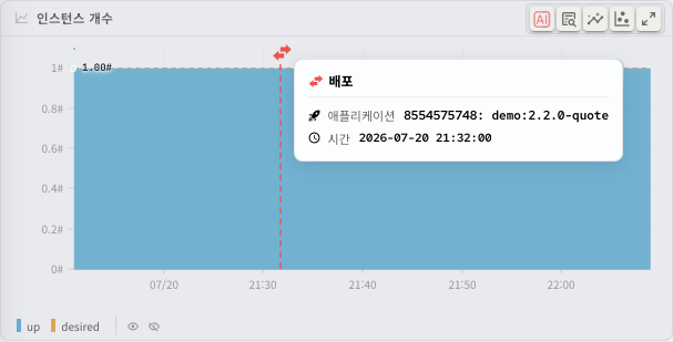
The Instances chart carries deployment marks (vertical dotted lines). A mark is placed wherever a new version is deployed or a rollout occurs; hover over one and a tooltip gives the deployment type, the application and version (ReplicaSet, image tag) and the deployment time. Putting deployment times alongside changes in instance count and performance tells you immediately whether a particular deployment caused a problem.
The Instances chart also marks scale-up (↑) and scale-down (↓) events driven by HPA and CronHPA, together with the reason (a CPU or memory target exceeded, or a schedule). This separates changes caused by autoscaling from manual scaling and redeployments, so you can follow the autoscaler's behaviour.
CPU tab
Several charts covering the application's CPU usage.
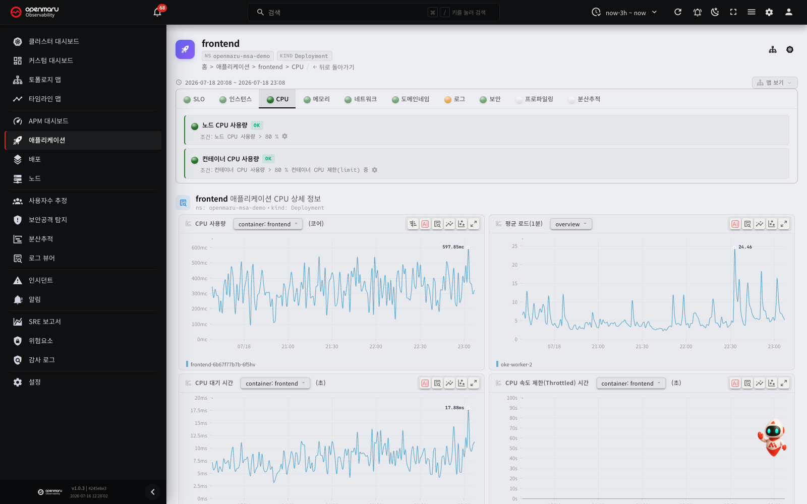
| Metric | Description |
|---|---|
| CPU usage, cores | CPU usage in cores over time, per container and per instance |
| CPU delay | Time spent ready to run but waiting to be given CPU — an indicator of contention on the node |
| Throttled time | Time execution was held back by the CPU limit. A large value suggests raising the CPU limit |
| Node CPU usage | The CPU usage of the whole node this application runs on |
Inspections: warns when node CPU is overloaded, or container CPU usage passes its threshold.
Memory tab
Several charts covering the application's memory usage.
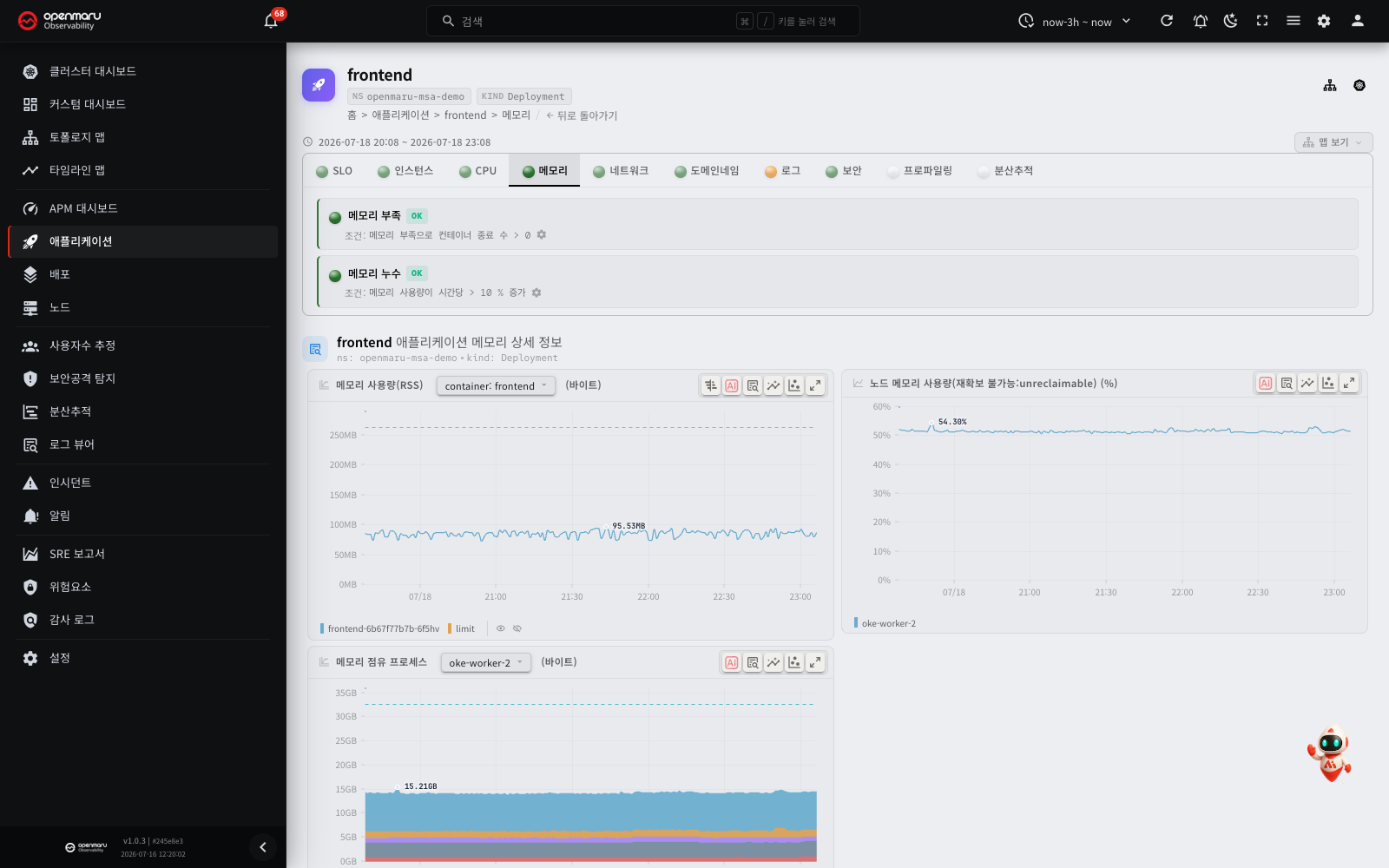
| Metric | Description |
|---|---|
| Memory usage (RSS) | Actual physical memory usage (RSS) over time, per container |
| Node memory usage (unreclaimable) | The memory usage of the whole node it runs on (including unreclaimable areas) |
| Memory consumers | Which processes are consuming the node's memory (a stacked area chart) |
| Out of memory events | How many times a container was killed for running out of memory |
Inspections: warns when containers are killed for lack of memory (OOM), or the hourly growth in memory usage (suggesting a leak) passes its threshold.
Logs tab
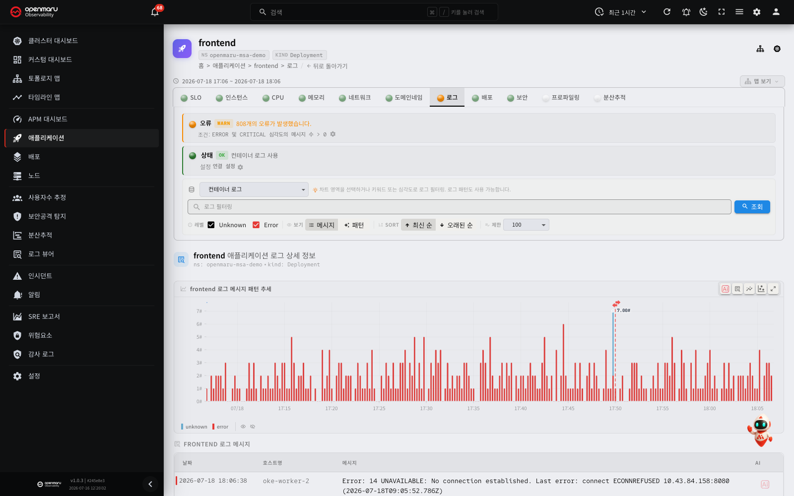
Query the logs this application produced.
What it offers:
- Source selection: choose the log collection source (Container logs or OpenTelemetry) to see each source's logs.
- Keyword search: type a keyword into the search field and press Query to find particular logs.
- Severity filter: use the Error, Warning, Info and other level checkboxes to show only the severities you want.
- Log pattern view: shows log patterns, produced by grouping structurally similar log messages automatically. Useful for taking in repeated error patterns at a glance.
- Full log view: switch from the pattern view to the full view to see individual log messages in time order.
- Sorting: switch between Newest first and Oldest first.
Analysing logs with CogentAI
The logs tab lets you use CogentAI analysis to interpret log messages automatically and get a diagnosis of the cause of an error along with suggested fixes.
Requesting analysis from the log list:
- Click the CogentAI icon beside the log row you want analysed.
- The CogentAI widget opens at the bottom right of the screen and that log message is passed to the AI as an analysis request.
- The AI analyses what the log means, why it occurred and what action it recommends, and shows the result.
Requesting analysis from the log detail dialog:
- Click a log row in the list to open the detail dialog.
- Click the CogentAI Insight button at the top of the dialog.
- A more detailed analysis of that log appears in the CogentAI widget.
Requesting analysis from a log pattern:
- In the log pattern view, click the CogentAI icon on a pattern card, or the CogentAI Insight button in the pattern detail dialog.
- The AI's analysis of that log pattern appears in the widget.
Tip: running CogentAI over WARN and ERROR level logs gets you concrete guidance, including the steps to resolve the problem and the commands involved.
Analysing charts with CogentAI
Each metric chart also carries a CogentAI Insight icon at its top right. Click it and the AI analyses that chart's data, explaining anomalous patterns, interpreting trends and recommending action.
- Click the CogentAI Insight icon at the top right of the metric chart you want analysed.
- The CogentAI widget opens and that chart's metric data is passed as an analysis request.
- The AI interprets the chart data and offers its insight.
- Type a follow-up question into the widget to ask for more.
Note: CogentAI features are available only where an administrator has enabled the CogentAI widget.
Deployments tab
A table of this application's deployment history. The change in metrics either side of each deployment is summarised automatically, so you can see at a glance which deployment affected performance or stability.
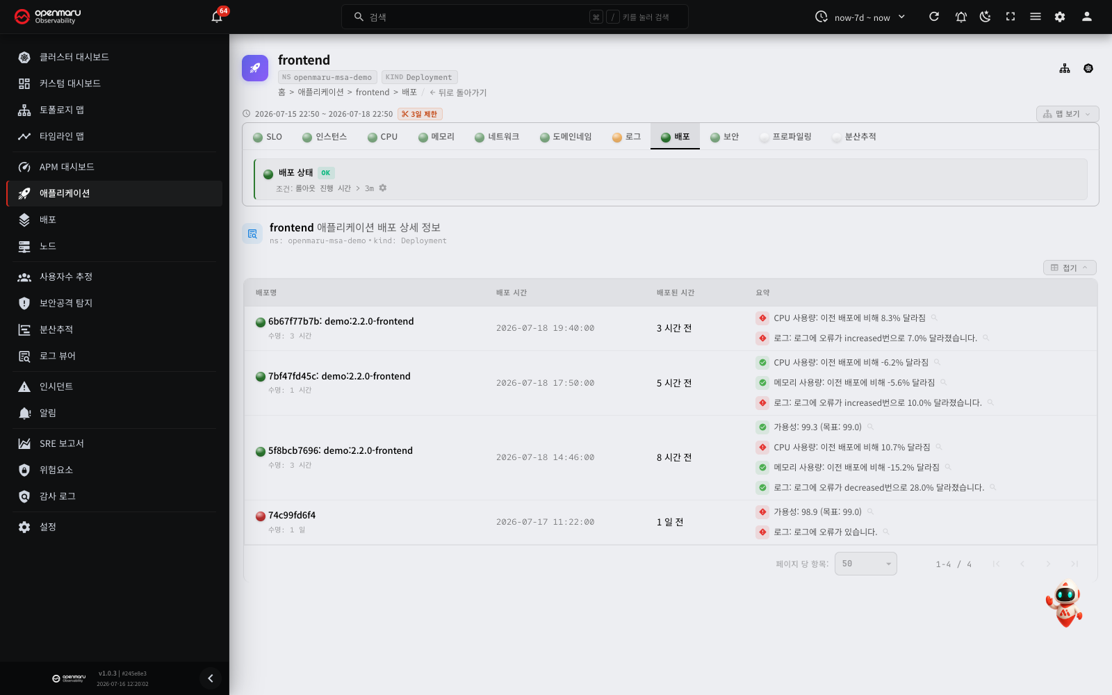
The table has the following columns.
| Column | Description |
|---|---|
| Deployment | The version deployed (ReplicaSet hash, image tag) and how long that version lasted (until the next deployment) |
| Deployed Time | When the deployment was detected |
| Deployed | How long ago it was (for example "3 hours ago") |
| Summary | An automatic summary of how availability, CPU, memory and log errors changed against the previous deployment. Improvements in green, regressions in red |
Inspections: warns when a rollout takes longer than its threshold (a deployment that does not finish).
Tip: click the icon beside an item in the summary to jump to that metric's before-and-after chart and see the change in detail. "CPU usage: 8.3% different from the previous deployment", for instance, means this deployment increased CPU usage.
Profiling tab
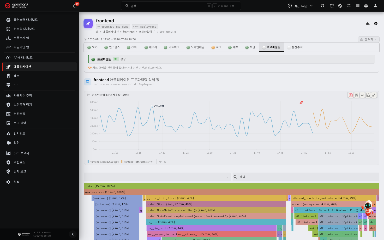
The profiling tab visualises the application's CPU and memory usage patterns as a flame graph — a chart that visualises the function call stack and the time spent in each frame.
What it offers:
- Status: the profiling collection state is shown at the top as OK, WARN or CRIT.
- Profile type: click a profile type button, such as CPU or memory, to switch.
- Time-series chart: shows how profile data trends over time. Drag to select a period on the chart and the flame graph for it appears, which you can compare against the preceding period.
- Flame graph: the wider a block, the more resource that function is using. Click a block to zoom in and inspect the call stack below it.
- Instance selection: select one instance's profile to compare.
Tip: dragging a period on the profile chart not only gives you the flame graph for it but also lets you compare it against the preceding period of the same length.
Profiling Go applications (pprof)
Profiling data is collected along two paths.
- eBPF continuous profiling (automatic): the node agent collects CPU profiles continuously, with no code changes (CPU (eBPF) in the type picker).
- pprof scraping (Go, via annotations): the cluster agent collects the
/debug/pprofendpoint a Go application exposes. As well as CPU, this gives you heap memory, goroutine, mutex and block profiles.
To connect pprof profiling to a Go application, expose net/http/pprof in the app and add the following annotations to the pod.
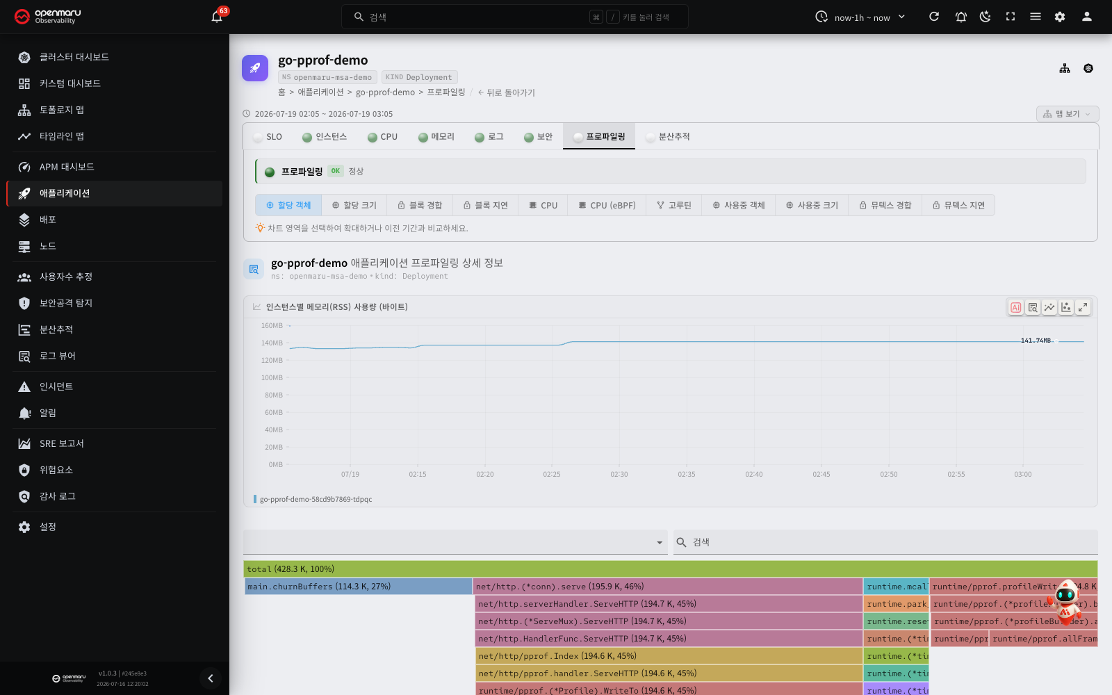
# Pod template (spec.template.metadata.annotations)
openmaru.io/profile-scrape: "true"   # enables profile collection (alias pyroscope.io/scrape)
openmaru.io/profile-port: "6060"     # the port pprof listens on (alias pyroscope.io/port)
The cluster agent collects these five profiles from /debug/pprof/.
| Type | pprof path | Contents |
|---|---|---|
| CPU | profile | The CPU usage profile |
| Memory | heap | Heap allocations and in-use objects and sizes |
| Goroutines | goroutine | Goroutine stacks |
| Mutex | mutex | Lock contention |
| Block | block | Blocking points |
Note: the
mutexandblockprofiles are off by default in Go, so the app has to enable them withruntime.SetMutexProfileFraction(n>0)andruntime.SetBlockProfileRate(n>0). Applications that do not expose pprof (the stock otel-demo Go services, for example) are not collected this way. For a sample that emits all five, seetest/go-pprof-demo/.
Tracing tab
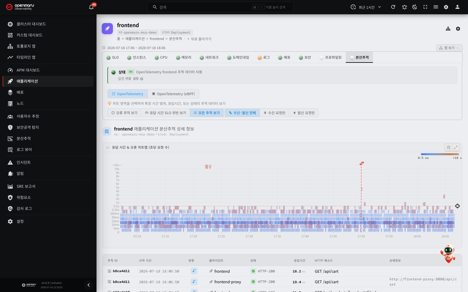
The Tracing tab analyses this application's trace data through a heatmap and a trace list. A trace is a record of the path one request took through the several services of a distributed system. The tab supports the whole workflow: select a region of interest on the heatmap, look at individual traces in the list, then drill down into the detailed call flow with the span waterfall chart.
Step 1: check the trace state and choose a source
When you open the Tracing tab, the collection state of the trace data is shown at the top.
- Status: a badge reading OK (collecting normally), WARN or CRIT, with a message describing the situation.
- Source switching: where the agent supports several sources, a source switch appears.
- agent: eBPF-based automatic trace data, collected without code changes.
- otel: OpenTelemetry SDK trace data, which carries finer-grained span information.
- Connection settings: click the settings (gear) icon in the status area to open the dialog for connecting this application to an OpenTelemetry service.
Step 2: narrow the traces with filters
Two groups of filter toggle buttons sit above the heatmap. The first group selects the kind of trace.
| Filter | Description |
|---|---|
| Show error traces | Shows only traces where an error occurred |
| Show latency SLO violations | Shows only traces that passed the response time SLO threshold |
| Show all traces | Shows all trace data |
Click a filter button to turn it on; the heatmap and the trace list below refresh to match.
The second group selects the request direction. The direction filter applies together with the filter of the first group.
| Filter | Description |
|---|---|
| All directions | Shows both inbound and outbound requests. This is the default |
| Inbound only | Shows only traces of requests that come in to this application |
| Outbound only | Shows only traces of requests that go from this application to other services |
If you click the selected Inbound only or Outbound only again, the filter goes back to All directions. If there are no traces in that direction, the button is disabled, and a tooltip such as "No inbound traces for this application" shows when you move the pointer over it.
Tip: when analysing a spike in errors, turn on Show error traces first to concentrate on the traces involved.
Step 3: select a region of interest on the heatmap
The heatmap visualises the distribution of time (X axis) against response time (Y axis) as colour density. The darker the colour, the more requests in that response time range at that moment.
Selecting a region on the heatmap:
- Click and drag across the region you want to investigate.
- The Transactions dialog opens. The list at the top of the dialog shows the requests in the selected time range and response time range. The direction follows the direction filter that you selected in step 2.
- Click a row in the list. The span tree of that request appears at the bottom of the dialog.
- To see a different region, close the dialog and drag a different region.
A drag does not change the trace list below the heatmap. The filter buttons in step 2 set the scope of the trace list.
Reading the heatmap:
- Points concentrated towards the top mean many requests with long response times.
- Red points at a particular moment mean errors occurred then.
- In a healthy state, most points sit towards the bottom (low response times).
Tip: drag over a region where response times jumped (points concentrated at the top of the heatmap). The Transactions dialog then shows only the requests in that region.
Step 4: look at individual traces in the list
The trace list appears as a table below the heatmap. Where you selected a region on the heatmap, only the traces within it are listed.
| Column | Description |
|---|---|
| Trace ID | The trace's unique identifier (first 8 characters shown). Click it to open the span detail dialog. |
| Started at | When the trace began |
| Direction | Inbound (a request coming into this application from outside) or outbound (a request this application sent out) |
| Client | The name of the service that sent the request |
| Status | OK or error, with the status message |
| Duration | How long the whole trace took (milliseconds) |
| HTTP method | The request's HTTP method or the operation name. Click it to open the span detail dialog. |
| Details | The request URL, query and so on. A copy button copies it to the clipboard. |
Click a column header to sort, including sorting by more than one column. The items per page can be set below the table.
Note: where the result is large, a message about the maximum row limit may appear. Select a narrower region on the heatmap, or add a filter, to reduce the scope.
Step 5: analyse the detailed flow with the span waterfall chart
Click a trace ID or an HTTP method in the trace list and that trace's span waterfall chart opens in a dialog. A span represents a single unit of work within a distributed trace.
The top of the dialog:
The dialog header carries the following.
- Trace: the full trace ID, with a copy button
- Client: the name of the service that sent the request
- Status: a status message badge. It shows a message such as
OK,HTTP-500orERROR, with a green check icon for a normal trace or a red alert icon for an error - Duration: how long the whole trace took (milliseconds)
Reading the span waterfall chart:
The span waterfall chart shows visually the order in which a request passed through each service and how long each step took.
- A horizontal bar starts where the span started, and its length is how long the span took.
- Each span's service name gets its own colour.
- Child spans are indented to express the hierarchy. Click a parent span's name to collapse or expand its children.
- Spans where an error occurred carry an error icon.
- A trace that you open from the Tracing tab starts at the span that you clicked. If that span is not the root, click Show parent trace to see the full trace. Click Show from selected span to go back to the first view.
- A trace that starts at the root span has a Main steps only button. This button keeps only the steps directly below the root and collapses the spans below them. Click Expand all to expand all spans again. If no span has children, this button does not show.
Span details:
Click a span to see its details.
| Item | Description |
|---|---|
| Name | The span's operation name |
| Service | The service the span belongs to |
| Timestamp | When the span started |
| Duration | How long the span took (milliseconds) |
| Status | OK or error, with the message |
| Span ID | The span's unique identifier (copyable) |
| Attributes | The attributes attached to the span (HTTP URL, database query and so on) |
| Event | Events that occurred while the span ran (an exception stack, for example) |
The span type is shown as a badge (HTTP, gRPC, Kafka, Redis, MongoDB, PostgreSQL, MySQL and so on).
Worked examples with distributed tracing
Here are the common ways to analyse a problem with the Tracing tab.
Finding slow requests:
- Turn off Show error traces and turn on Show all traces.
- Drag across the region of high response times (the upper part) on the heatmap. The Transactions dialog opens.
- The list in the dialog first shows the slowest requests at the top. If you changed the order, click the Duration column header to sort again.
- Click the slowest row to see its span tree at the bottom of the dialog.
- Click the span with the longest bar to see which service and which operation is the bottleneck.
Analysing error traces:
- Turn on Show error traces.
- Drag across the period where the errors are concentrated on the heatmap. The Transactions dialog opens.
- Click Errors only at the top of the dialog, then click a row with an error status.
- Find the span carrying an error icon in the span tree at the bottom of the dialog and click it.
- Read the exception stack under Event in the span details to establish the cause.
The distributed tracing workflow in summary
Here is the whole flow for analysing a problem from the Tracing tab of the application details.
- Check the status: read the trace collection state from the status badge at the top.
- Choose a source: select agent (eBPF) or otel (OpenTelemetry) as the source to analyse.
- Apply filters: turn on the filters you need — error traces, SLO breaches — to narrow the scope.
- Select a heatmap region: drag across the region with high response times or errors. The Transactions dialog opens.
- Look at the request list: find the slow requests and the error requests in the list of the dialog.
- Analyse the span tree: click a row. In the span tree at the bottom of the dialog, find which service and which span took the time, or where the error occurred.
- Check the span details: click the problem span and read its detailed attributes — HTTP URL, database query, error message.
Tip: to analyse traces across everything, use the Distributed tracing menu in the sidebar. The Tracing tab in the application details shows only traces involving that application.
DNS tab
The DNS lookup metrics this application produced.
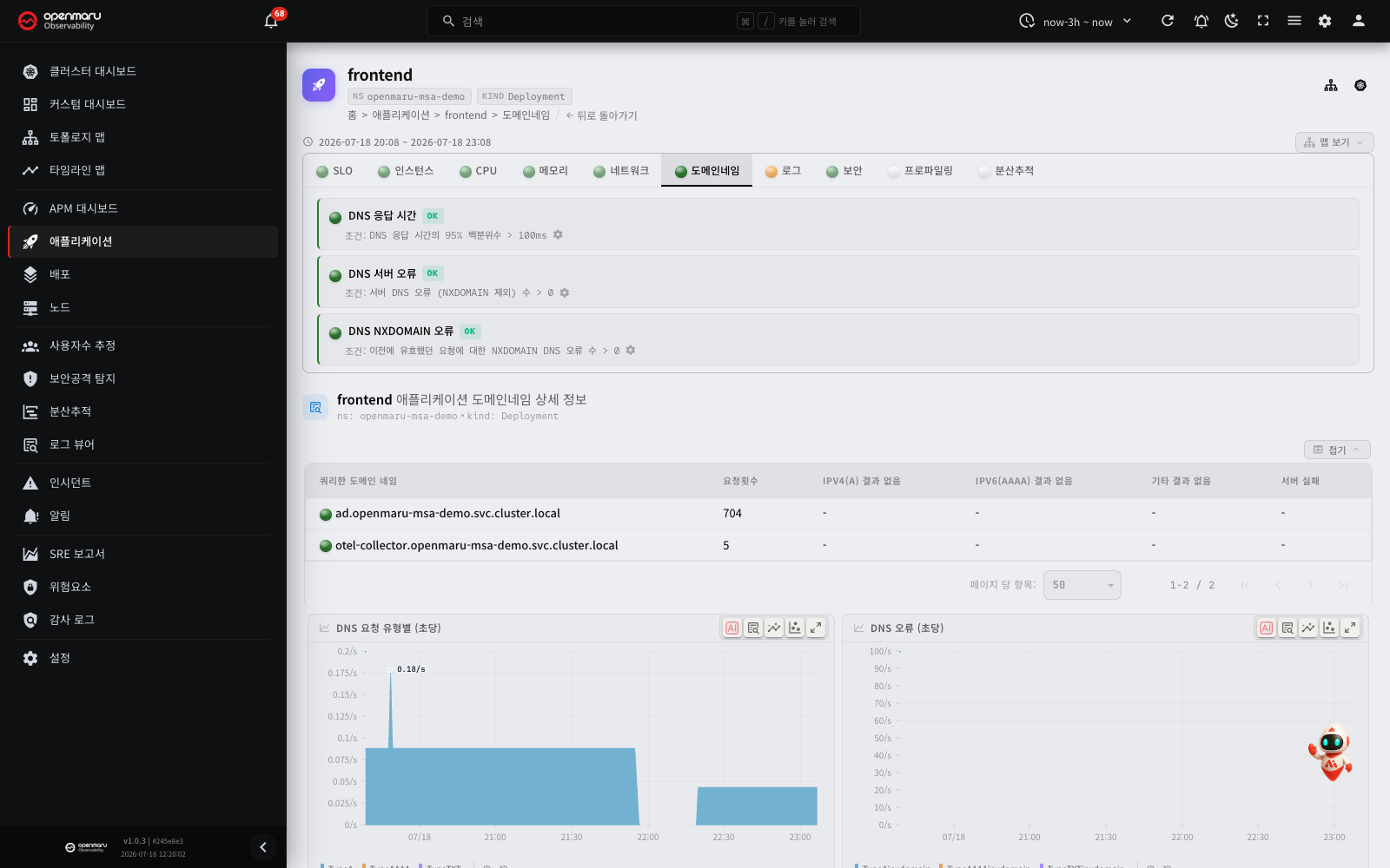
| Metric | Description |
|---|---|
| DNS latency | The average response time of domain lookups |
| DNS errors, per second | Failed lookups per second (NXDOMAIN, SERVFAIL and so on) |
| DNS requests by type, per second, and the domain table | The record types looked up (A, AAAA, CNAME and so on) and the request volume per target domain |
DNS latency and errors are an early signal of latency in external service integrations, or of a service discovery failure.
Network tab
L4 (TCP) network metrics for this application's upstream and downstream connections.
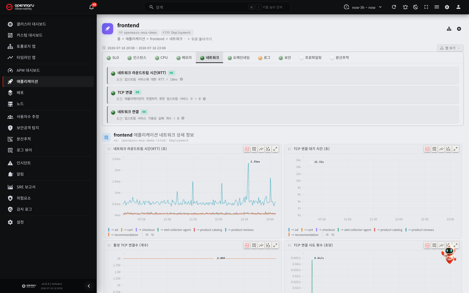
| Metric | Description |
|---|---|
| Network round-trip time | The round-trip latency to the peer service |
| TCP connection latency | How long establishing a new TCP connection took |
| Active TCP connections | How many connections are currently held |
| TCP connection attempts, per second / Failed TCP connections, per second | Connection attempts and failed connections per second — a spike in failures signals a fault in the target service |
| Traffic | Inbound and outbound bandwidth |
| TCP retransmissions, segments/second | Retransmissions caused by packet loss — an indicator of degraded network quality |
| DB connection utilization | For each DB destination, the average number of queries in progress divided by the number of open TCP connections. Use the menu next to the title to select utilization, concurrent queries or open connections. It is shown only for apps that have a DB destination |
How to read the DB connection utilization:
The number of concurrent queries is the per-second increase of the sum of the query times (queries per second × average query time). The server calculates it from values that it already has, so the app and the node agent do not change. The protocols are PostgreSQL, MySQL, MongoDB, Redis, Memcached, Kafka, Cassandra, ClickHouse and ZooKeeper.
- For protocols that process one query at a time on a connection, such as PostgreSQL and MySQL, a value near 1 can mean that there are not sufficient connections.
- For protocols that send many requests on one connection at the same time, such as Redis, MongoDB and Kafka, the value can be more than 1. For these protocols, a value more than 1 does not mean that there are not sufficient connections.
- The number of open connections includes connections outside the connection pool, and connections that the same app opened to other ports of the destination.
- For connections encrypted with TLS, the node agent cannot read the query time, so there can be no value.
- When there are no open connections, the value is empty.
- The maximum size of the connection pool and the time spent waiting for a connection are visible only in the app. This chart does not show them.
DB connection utilization inspection:
Apps that have a PostgreSQL or MySQL destination show the DB connection utilization inspection. It warns when the last utilization value of a destination is more than the threshold (default 90%). The builtin alerting rule High DB connection utilization uses this inspection.
- The inspection does not include protocols that send many requests on one connection, such as Redis. The chart still shows them.
- This inspection examines the connection utilization as the app sees it. The connections inspection of the PostgreSQL and MySQL tabs compares the number of connections on the DB server with
max_connections. The two inspections examine different values. - If there is no PostgreSQL or MySQL utilization value in the last hour, the inspection is not shown.
Find the failed connection targets:

When the TCP connections inspection is in the warning state, the inspection status area shows the failed targets on one line. It shows up to 3 target names and shows the remaining count as "and N more". Example: rke2-canal, cloud-controller-manager, etcd and 3 more
Find the real addresses of the targets in the legend of the Failed TCP connections, per second chart. Only the legend of this chart shows these addresses.
If all failed connections went to the IPv6 loopback address ([::1]) and the IPv4 connections to the same ports succeeded, an information icon and this text show:
All failed connections went to the IPv6 loopback address while the same ports succeeded over IPv4. This is likely an IPv6-first name resolution order issue rather than an outage.
This text does not change the inspection state. The inspection stays in the warning state. Read the text and decide if there is an outage.
Security tab
Shows the HTTP intrusion and attack attempts detected against this application. The node agent detects attack patterns in eBPF L7 traffic — SQL injection, XSS, path traversal, remote code execution (RCE), scanners — and shows them with the attack type, severity and source IP address.
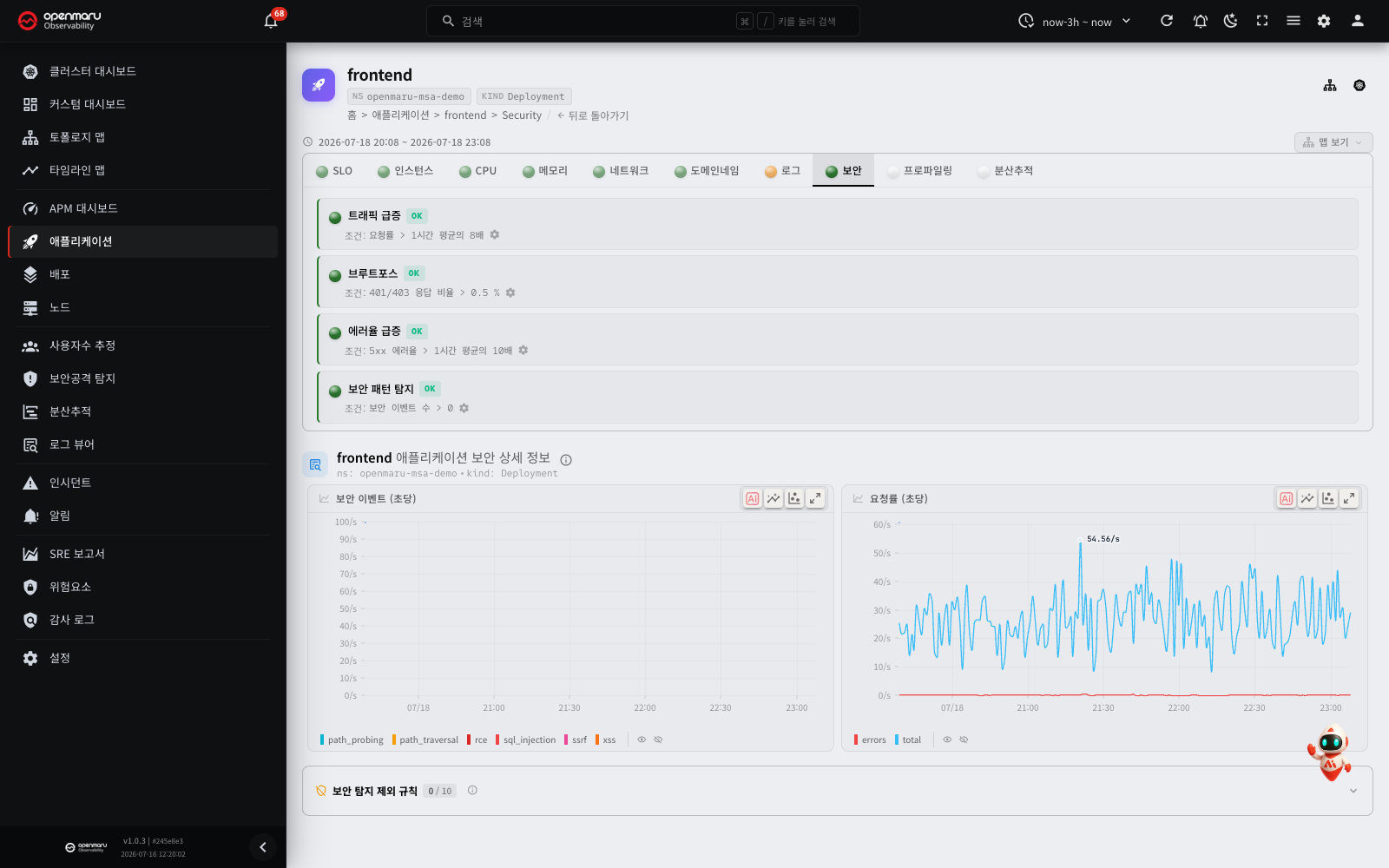
| Item | Description |
|---|---|
| Inspections | Traffic spike (request rate N times normal), brute force (the proportion of 401/403 responses), error rate spike (5xx), security pattern detection (attack event count) |
| Security events, per second | Detections per second by type (SQLi, XSS, RCE, path traversal and so on) — the example above is a healthy state with no attacks; where attacks are detected the chart fills with a colour per type |
| Request rate, per second | All requests per second (total) and failed requests per second (errors) |
| Auth failure ratio (401/403) | The percentage of 401 and 403 responses in all requests. Use it together with the brute force inspection |
This tab shows security events from one application's point of view. For live threat status across the whole cluster, the distribution of attack sources by country, and security threat reports, see the Security attack detection screen.
Database and middleware tabs
Where a database or cache type is detected, a dedicated report tab is added. The basic metrics collected from eBPF L7 traffic (query response time, throughput, error rate) appear from installation alone; complete the additional database monitoring integration described below and the internal database metrics appear as well.
PostgreSQL tab
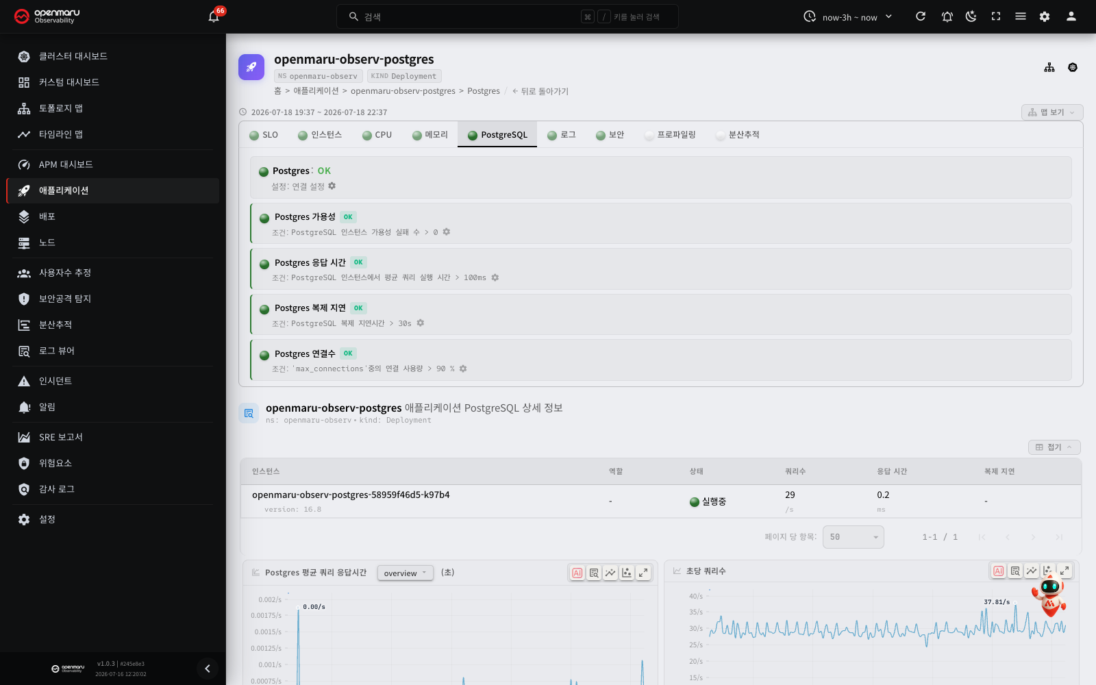
| Metric | Description |
|---|---|
| Postgres average query latency | The average query response time |
| Queries per second | Throughput |
| Postgres connections | Connections by state |
| Idle transactions | Transactions left open and idle |
| Locked queries | Queries waiting on a lock |
| Blocking queries | Queries making others wait (sorted by the number waiting) |
| Queries by total time | Queries with the largest cumulative execution time |
| Queries by I/O time | Queries with the largest disk I/O time |
| Replication lag | The lag behind the replica (bytes) |
Inspections: warns when availability, query latency, replication lag or connection count passes its threshold.
MySQL tab
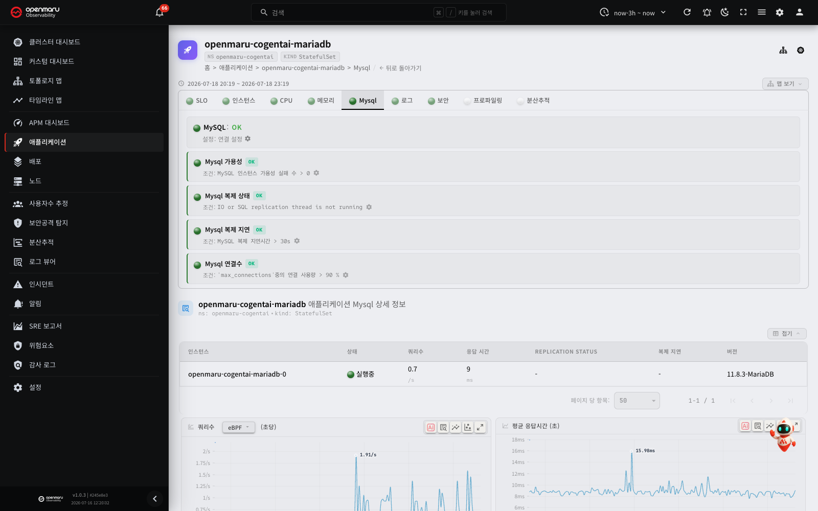
| Metric | Description |
|---|---|
| Queries per second | Throughput |
| Average latency | The average query response time |
| Queries by total time | Queries with the largest cumulative execution time |
| I/O time by table | Disk I/O time per table |
| Traffic | Bytes sent and received per second (read/write) |
| Slow queries | Slow queries per second |
| Connections | Connections by state |
| New connections | New connections created per second |
| Replication lag | The lag behind the replica (seconds) |
The same applies to MySQL-compatible databases such as MariaDB.
Inspections: warns when availability, replication state, replication lag or connection count passes its threshold.
Redis tab
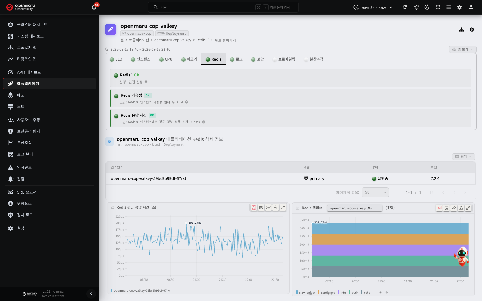
| Metric | Description |
|---|---|
| Redis average latency | The average command response time |
Redis queries on <command> | Throughput per second by command type (GET, SET and so on) |
The same applies to Redis-compatible caches such as KeyDB, Valkey and Dragonfly.
Inspections: warns when availability or latency passes its threshold.
MongoDB tab
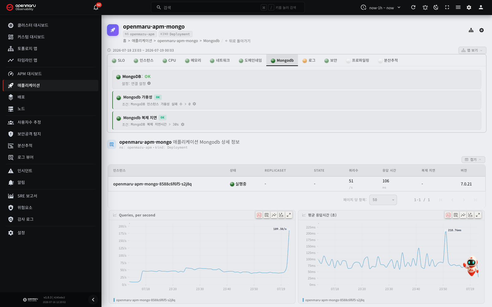
| Metric | Description |
|---|---|
| Queries per second | Throughput |
| Average latency | The average query response time |
| Replication lag | The lag behind the replica set (seconds) |
Inspections: warns when availability or replication lag passes its threshold.
Memcached tab
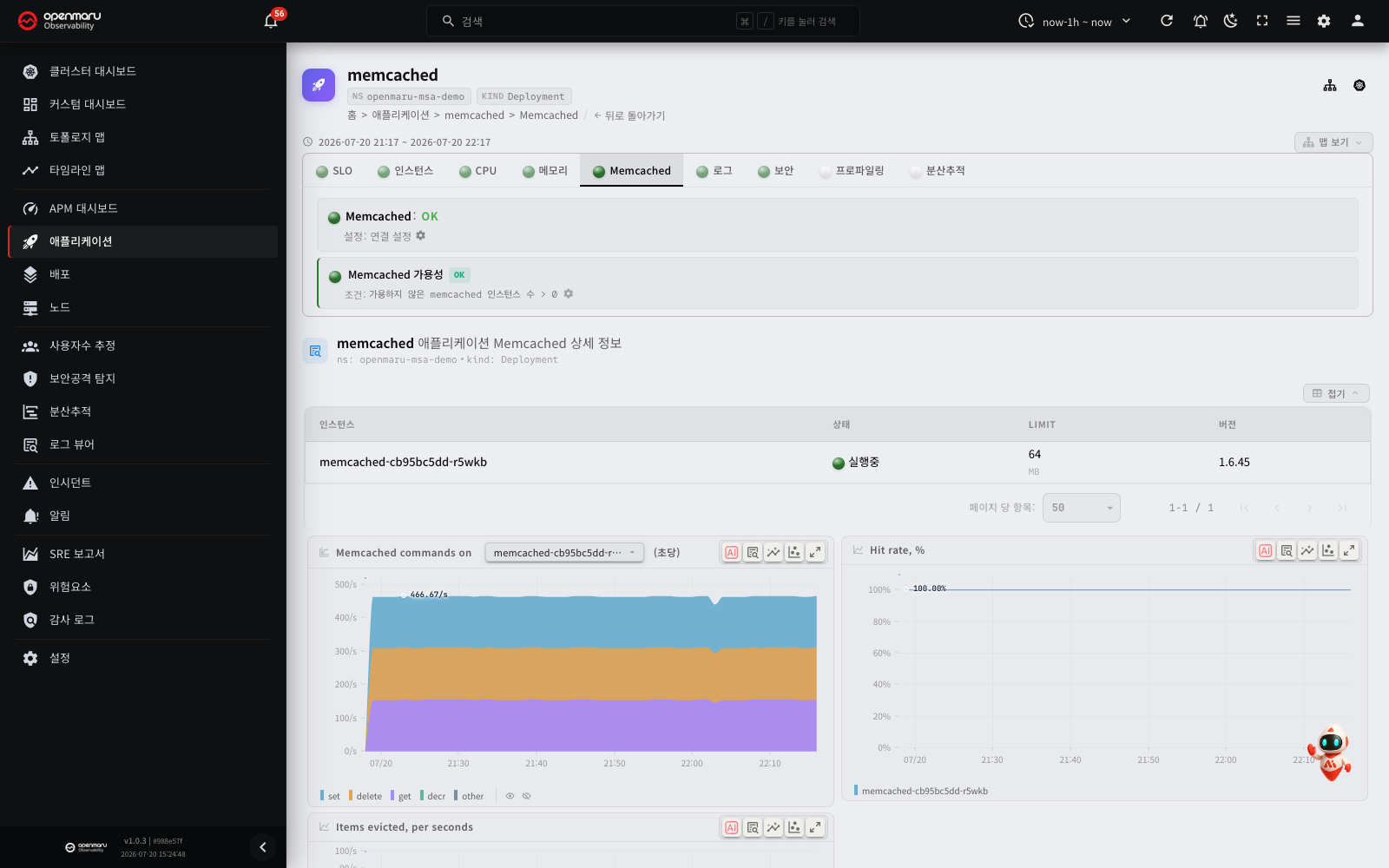
| Metric | Description |
|---|---|
| Memcached commands | Throughput per second by command type (get, set and so on) |
| Hit rate | The proportion of cache lookups that succeeded (%) |
| Items evicted | Items evicted per second for lack of memory |
Inspections: warns when availability is impaired.
Note: dedicated database tabs are created only for the PostgreSQL, MySQL, Redis, MongoDB and Memcached types. Other data stores such as Cassandra, Elasticsearch and Kafka get no dedicated tab; their eBPF L7 traffic metrics (response time, throughput, errors) can be seen in the general request charts on the SLO tab and elsewhere.
Runtime tabs
Where an application's technology stack (its runtime) is detected, a dedicated runtime report tab is added showing the runtime's internal metrics. The tab is enabled either by the agent's automatic runtime detection or by OpenTelemetry instrumentation.
JVM tab — Java applications
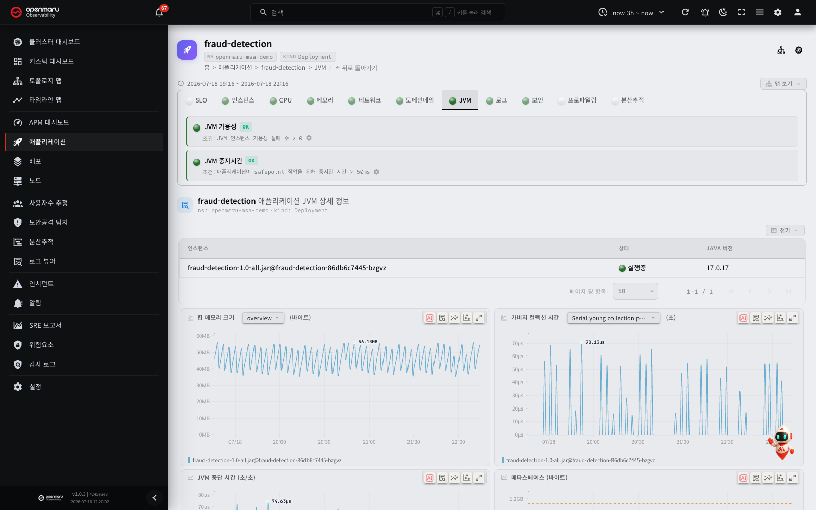
| Metric | Description |
|---|---|
| Heap size | Heap memory used and its ceiling (total). Used approaching total risks OutOfMemory |
| GC time | Time spent in garbage collection (seconds per second), broken down by GC type |
| Safepoint time | Time spent at safepoints, where every thread stops. Long safepoints mean stop-the-world pauses |
| Metaspace | The size of the class metadata area |
| Live threads | Live, daemon and peak thread counts |
| Threads started | New threads created per second |
| Lock contention | Thread lock contention events per second |
| Loaded classes | How many classes are loaded |
Inspections: warns when JVM availability or safepoint time passes its threshold.
.NET tab
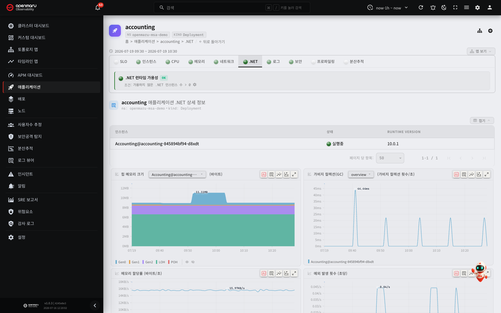
| Metric | Description |
|---|---|
| Heap size | Heap size per generation (cumulative) |
| GC | Garbage collections per second |
| Memory allocation rate | The amount of memory allocated |
| Exceptions | Exceptions raised per second |
| Heap fragmentation | The heap fragmentation ratio (%) |
| Thread pool queue size | The size of the thread pool's waiting queue |
| Thread pool size | How many threads are in the pool |
| Thread pool completed work items | Work items completed per second |
| Monitor's lock contentions | Monitor lock contention events |
Inspections: checks .NET availability.
Python tab
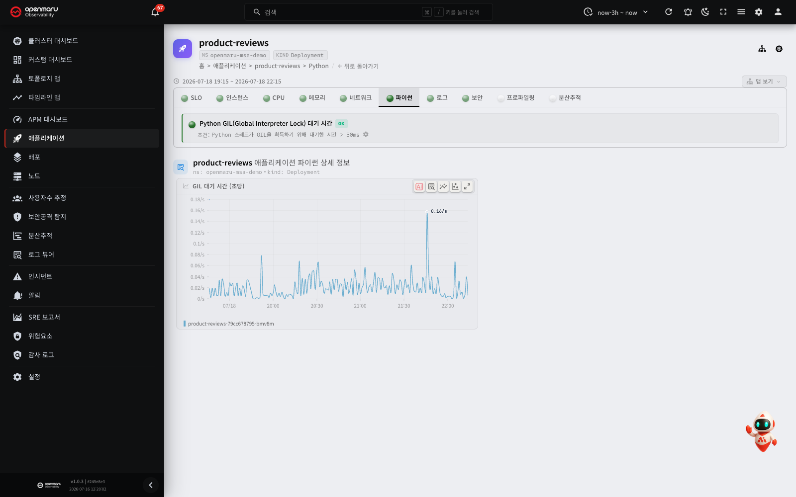
| Metric | Description |
|---|---|
| GIL waiting time | The sum of the time that Python threads waited to acquire the GIL (global interpreter lock), in seconds per second. Only the GIL of the main interpreter is measured. Because the waits of all threads are added, the value can be more than 1 second per second when many threads compete for the GIL. A high value means that CPU-bound threads compete for the GIL and parallel throughput decreases |
| Python processes | The number of Python processes in the container. Masters, workers and multiprocessing helper processes (for example resource_tracker) are all counted. A drop from the usual value means that a worker stopped and did not start again |
| Python process exits (ran 60s or more), per minute | The number of Python processes that ran for more than 60 seconds and then exited (per minute). Short-lived processes such as health checks are not counted. It also increases with periodic worker replacement (gunicorn max_requests), redeployment and container restarts |
| Python threads | The sum of the thread counts of the Python processes. If it continues to increase while the load is constant, suspect a thread leak. Threads of native libraries such as torch and CUDA are included |
| Python open file descriptors | The sum of the file descriptors (files, sockets and pipes) opened by the Python processes. If it continues to increase while the load is constant, suspect a leak of files or connections that are not closed |
| Python GC collections, per second | The number of Python GC (garbage collection) runs per second. An app that makes and drops many objects can run the GC hundreds of times per second. Do not use the count alone. Examine the pause time at the same time |
| Python GC pause time, seconds/second | The sum of the GC run times (seconds per second). A value of 0.01 means that the GC ran for 10 ms in 1 second. The values of the processes in the container are added, so the value can be more than 1 |
| Python longest GC pause, seconds | The run time of the longest single GC. If this value is near the latency objective of the requests, the GC can be a cause of slow responses |
| Python event loop longest busy time, seconds | The longest time that the event loop, such as asyncio or uvloop, ran callbacks without a pause. During this time, the loop does not process other requests. If this value is near the latency objective of the requests, examine the code that blocks the loop (synchronous I/O or long calculations) |
Inspections: warns when GIL wait time passes its threshold. When there are event loop or GC values, the three inspections below are also shown.
| Inspection | Condition (default threshold) | Builtin alerting rule |
|---|---|---|
| Python event loop blocking | Largest event loop longest busy time in the last 5 minutes > 2 s | High Python event loop blocking (pending period 1 minute) |
| Python GC pause | Largest longest GC pause in the last 5 minutes > 0.5 s | Long Python GC pause (pending period 1 minute) |
| Python GC time | Average GC time percentage per process in the last 5 minutes > 5% | High Python GC time (pending period 5 minutes) |
- The event loop and longest GC pause inspections use the largest value in the last 5 minutes. Thus they report a single long block. When the blocks stop, the inspection becomes normal after 5 minutes.
- At each point, the GC time percentage is the GC pause time (sec/sec) divided by the number of Python processes. If only one worker has a long GC time, the average can hide it. For example, if 1 of 8 workers is at 20%, the average is 2.5%.
- The event loop warning message also shows the longest GC pause in the same 5 minutes. For example:
(GC pause up to 1.10 sec). If the two values are equal, the GC possibly blocked the loop. - If an app does not use an event loop and gets the event loop warning, set a high threshold for that app to stop the warning. Click the gear icon of the inspection to change the application-level threshold.
- If there is no value in the last hour, the inspection is not shown. Apps without event loop metrics do not show the event loop inspection.
Note: The node agent reads the process count, exits, threads, open files and the Python version from
/procand the executable, without changes to the app. Threads and open files are updated every 15 seconds. These values are shown only for apps that have a Python process that has run for more than 60 seconds. The version is shown as3.12.3for Python 3.11 and later, and as3.10for Python 3.10 and earlier. There is no inspection (warning) for these metrics.
Note: The Python GC runs while it holds the GIL. Thus the other Python threads of the same process stop while the GC runs. The node agent measures the GC with eBPF, without changes to the app. It can measure distribution Python (Ubuntu and Debian packages) and the full official Python images (for example
python:3.12). The official slim images (for examplepython:3.12-slim) have no point to measure, so the GC charts are not shown for them. The Python GC measurement table shows the measured instances and the method (usdtorsymbol). Generations (0, 1 and 2) are not counted separately.
Note: The node agent measures the event loop longest busy time with eBPF. It measures the interval between the
epoll_pwaitcalls of the main thread of the process. The app does not change. If an app runs its event loop in a thread that is not the main thread, there can be no value or the value can be incorrect. If an app does not use an event loop but its main thread uses epoll, there can be a value. In this case, the value does not show a blocked loop. When a block continues for longer than the measurement window, the value shows only after the block ends. The value is the longest value in the last collection interval plus 15 seconds, so the same large value can show at two points in a row. When the time range is long, each chart point is the largest value in its interval.
Note: a runtime tab appears only on applications where that runtime was detected (by the agent, or through OpenTelemetry instrumentation). For how to integrate OpenTelemetry, see distributed tracing.
Storage tab
Shown conditionally on applications that use persistent volumes (PVs, PVCs and so on). It carries storage metrics such as volume usage, I/O throughput and I/O latency.
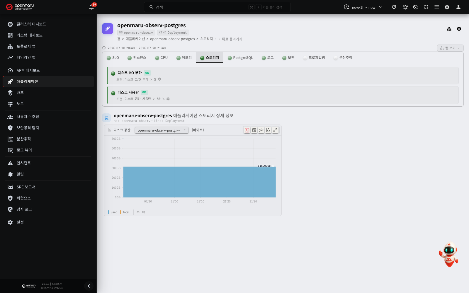
The following metrics are provided per volume (mount).
| Metric | Description |
|---|---|
| Disk space | Used and total capacity per volume. Warns when the usage ratio (%) passes its threshold |
| IOPS | Read and write operations per second, per volume |
| Bandwidth | Read and write throughput per second (bytes/s), per volume |
| Average I/O latency | The average wait for I/O to complete (await), per volume |
| I/O load (total latency) | The volume's total I/O latency (seconds per second). The higher the value, the closer the disk is to saturation |
| I/O utilization | The proportion of time the disk is busy with I/O (%) |
The volume list table summarises latency, I/O load, space and device per volume.
Inspections: warns when disk space usage (above 80% by default) or disk I/O load passes its threshold.
How NFS volumes are shown (important): for NFS volumes (and other network filesystems such as CephFS), only disk space (capacity and usage) is shown; per-block-device I/O throughput metrics are not, because a network volume has no local block device. Furthermore, the capacity and usage shown are for the whole NFS server export (the shared storage), not for the individual PVC. A PVC requested at 1Gi will still show the export's whole capacity (536 GB, say) and the total usage stored in it. This is because subdirectory-style NFS provisioners (nfs-client and others) do not apply a per-PVC quota, so the operating system can only report the shared export's statistics for the mount; other tools such as kubelet behave the same way. For block-device-backed PVCs (local volumes and most CSI storage), the mount is the PVC, so capacity and usage are exact.
Note: the storage tab appears only on applications that use persistent volumes. Applications that do not use them have no such tab.
GPU tab
Shown conditionally on applications that use a GPU. It carries GPU metrics such as GPU utilization and GPU memory usage.
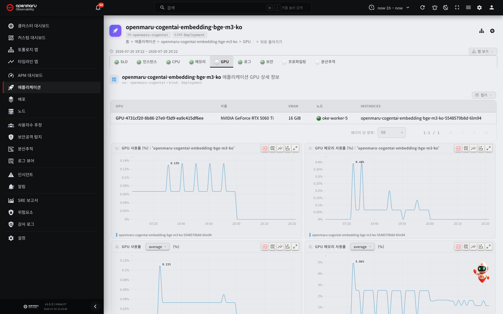
The table at the top lists the GPUs the application uses (GPU, name, vRAM, node, instance), and the following metrics are provided.
| Metric | Description |
|---|---|
GPU usage by '<app name>', % | The GPU compute utilization the application holds (%) |
GPU memory usage by '<app name>', bytes | The GPU memory that the application holds (bytes) |
| GPU Utilization — average/peak | The average and peak GPU utilization across several GPUs and instances |
| GPU Memory Usage (%) | The used part of the GPU memory. Used bytes ÷ total size |
| GPU Consumers | Each container's share of the same GPU's utilization (stacked) |
| GPU Memory Consumers | Each container's use of the same GPU's memory (bytes, stacked) |
| GPU Temperature (℃) · GPU Power (W) | The temperature and the power use of each GPU |
| GPU Memory Bandwidth Utilization — average/peak | The part of time in which the GPU memory bandwidth was in use. This is a different value from the memory usage. It shows as a secondary chart at the end of the tab |
GPU Memory Usage shows how much GPU memory is occupied. To see how busy the memory bandwidth was, use the GPU Memory Bandwidth Utilization chart.
A unified memory device, such as NVIDIA GB10, shares one memory between the CPU and the GPU. For such a device:
- The vRAM cell of the GPU table shows "(unified)". The size is the full node memory.
- The GPU memory usage uses the full node memory as the denominator. The CPU part is also in the denominator, so the value can look low.
- The memory bandwidth chart does not show. In its place, a table with the GPU UUID and Memory bandwidth columns shows "Not supported on this device" in the memory bandwidth cell.
Note: the GPU tab appears only on applications that use a GPU. Applications that do not use one have no such tab.
vLLM tab
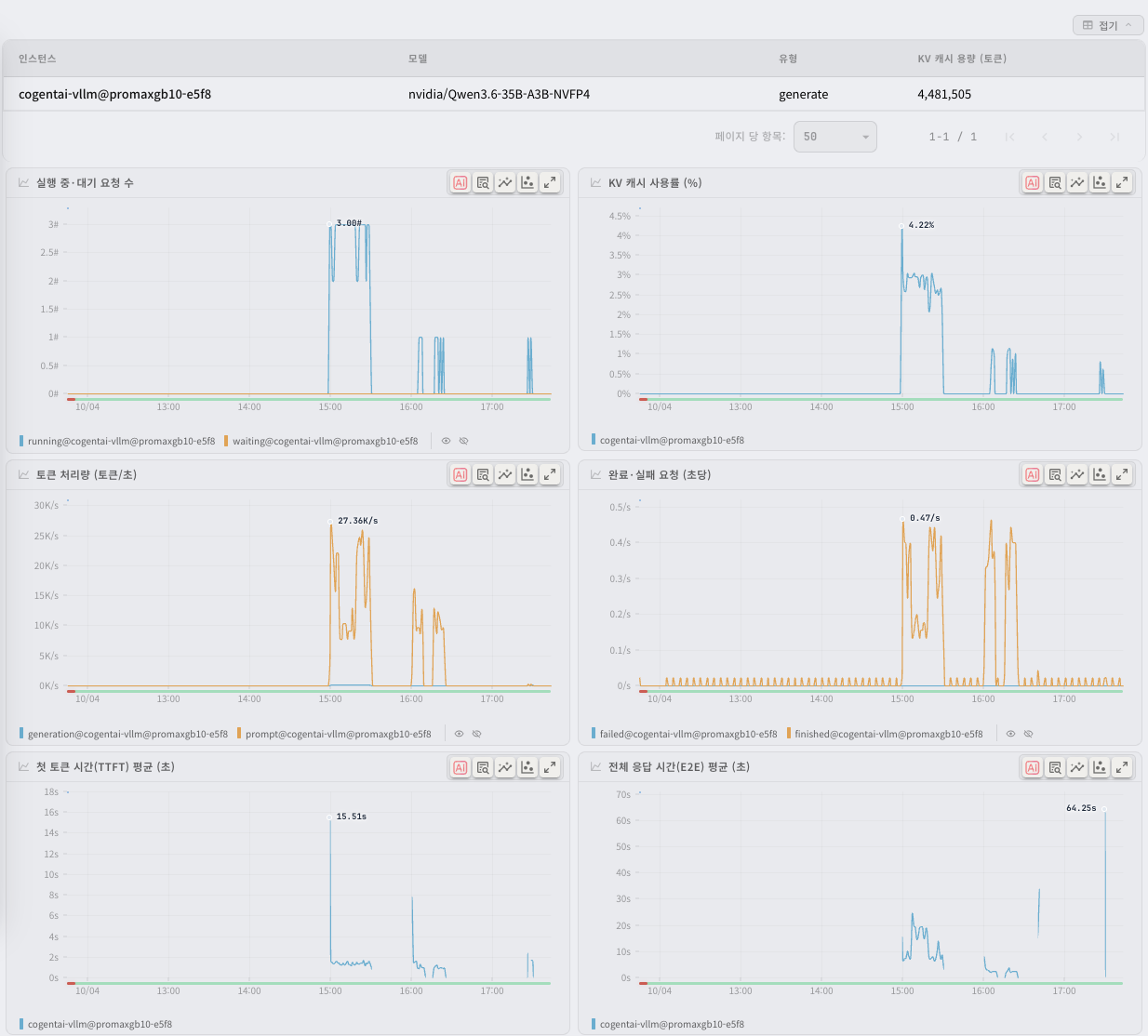
If the application is a vLLM inference server, a vLLM tab shows. The node agent collects the /metrics data of vLLM automatically. No configuration is necessary. In the application list, the Type column shows vLLM.
Use this tab to answer these three questions:
- Do the requests wait in a queue? (running and waiting requests, KV cache usage)
- How much work does the instance do? (token throughput, finished and failed requests)
- How fast is the response for the user? (time to first token, end-to-end latency)
The table at the top of the tab shows the configuration of the vLLM instances.
| Column | Description |
|---|---|
| Instance | The instance that runs vLLM |
| Model | The name of the model that vLLM serves. This is the value of the vLLM argument --served-model-name |
| Type | generate (text generation) or pooling (embedding and rerank) |
| KV cache size, tokens | The size of the KV cache of the instance (number of tokens). For a pooling instance, the value is None |
Below the table, these 6 charts show. Each chart has one series for each instance.
| Chart | Description |
|---|---|
| Running and waiting requests | The number of requests in progress and the number of requests in the queue. If the waiting requests stay above 0, the capacity is not sufficient |
| KV cache usage, % | The used part of the KV cache. Near 100%, vLLM moves running requests back to the queue (preemption) |
| Token throughput, tokens/second | The input tokens and the generated tokens per second. If the throughput decreases and the waiting requests increase, the instance is slow |
| Finished and failed requests, per second | The number of requests per second that finished normally and that failed (abort or error) |
| Time to first token (TTFT), average, seconds | The average time from the request to the first token. This is the delay that the user sees before the response starts |
| End-to-end request latency, average, seconds | The average time from the request to the end of the response. This value changes much with the output length, so read it together with TTFT |
An instance of the pooling type (embedding and rerank) does not use a KV cache or generated tokens. Thus a pooling instance shows as follows:
- It does not show in the KV cache usage chart and in the TTFT chart. If all instances of the application are pooling instances, these two charts do not show.
- The token throughput chart shows only input tokens.
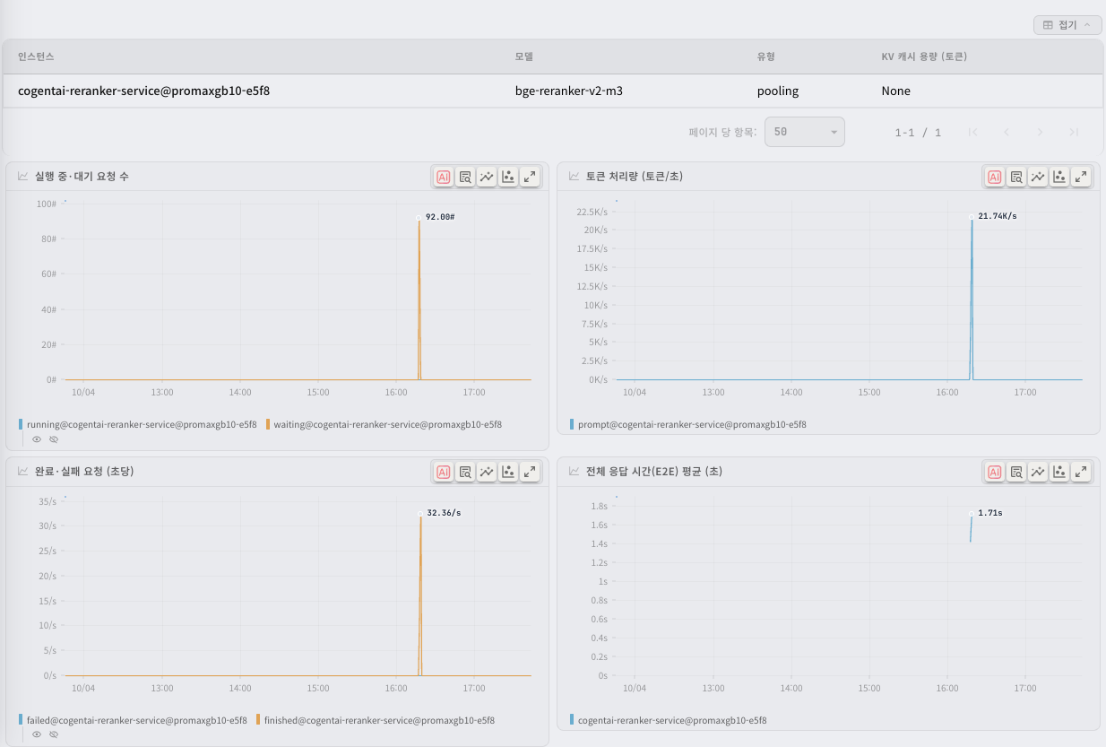
In these cases, a chart has no values:
- If vLLM runs in multiprocess metrics mode (
PROMETHEUS_MULTIPROC_DIRis set), an instance that has not received a request yet does not send the running requests, waiting requests and KV cache usage values. These values are empty, not 0, until the instance receives its first request. This is how vLLM operates. It is not a collection error. - If the query period has no requests, the system cannot calculate the average charts (TTFT and E2E). A chart with no values does not show on the tab.
The inspection status at the top of the tab shows the vLLM request errors, vLLM KV cache usage and vLLM waiting requests inspections. If all instances of the application are pooling instances, the vLLM KV cache usage inspection does not show. For the alert rules of these inspections, see the alert rules tab in the incidents chapter.
Note: the vLLM tab shows only where the node agent is installed. If you start vLLM with the
--disable-log-statsoption, vLLM sends no metrics and the tab does not show. If you set the node agent environment variableSCRAPE_VLLM_METRICStofalse, the agent does not collect the metrics (the default istrue). An application that contains vLLM as a library, and an inference server that is not vLLM (Hugging Face TEI and so on), are not in scope.
Inspection status
The top of each report tab shows whether that area's inspection conditions are met. Where an item has passed a threshold, it is marked warning or critical, and you can look at the inspection condition in detail or adjust its settings.
- Green left border: the inspection criteria are met (OK)
- Yellow left border: a threshold passed at warning level
- Red left border: a threshold passed at critical level
Additional database monitoring integration (instrumentation)
For databases such as PostgreSQL, MySQL, Redis, MongoDB and Memcached, eBPF-based L7 traffic (query response time, error rate) is collected automatically from installation alone. Collecting the internal database metrics as well — connection counts, active queries, cache hit rates, replication lag, slow queries — requires an instrumentation step that tells the system how to connect to the database.
Where an application is detected as a database type, an instrumentation notice appears in the inspection status area of the detail screen. Click Connection Configure and a dialog opens offering the two approaches below.
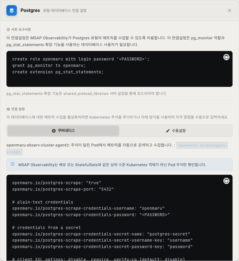
Prerequisite — a dedicated monitoring account
Prepare an account on the database with monitoring privileges first.
-
PostgreSQL: requires the
pg_monitorrole and thepg_stat_statementsextension (the extension must be loaded through theshared_preload_librariesserver setting).create role openmaru with login password '<PASSWORD>';grant pg_monitor to openmaru;create extension pg_stat_statements; -
MySQL: requires an account with the following privileges.
GRANT SELECT, PROCESS, REPLICATION CLIENT ON *.* TO 'openmaru'@'%'; -
Redis / MongoDB / Memcached: prepare an account (or password) with read access.
Approach 1 — Kubernetes pod annotations (recommended)
openmaru-observ-cluster-agent discovers pods carrying the openmaru.io/<type>-scrape: "true" annotation automatically and collects their metrics. The annotation has to go on the pod template (spec.template.metadata.annotations), not on a parent object such as a Deployment or StatefulSet.
A PostgreSQL example:
openmaru.io/postgres-scrape: "true"
openmaru.io/postgres-scrape-port: "5432"
# Credentials — (A) inline
openmaru.io/postgres-scrape-credentials-username: "openmaru"
openmaru.io/postgres-scrape-credentials-password: "<PASSWORD>"
# Credentials — (B) referencing a Kubernetes Secret (an alternative to A)
openmaru.io/postgres-scrape-credentials-secret-name: "postgres-secret"
openmaru.io/postgres-scrape-credentials-secret-username-key: "username"
openmaru.io/postgres-scrape-credentials-secret-password-key: "password"
openmaru.io/postgres-scrape-param-sslmode: "disable"
Other databases differ only in the prefix and the default port; the remaining keys (-credentials-*, -secret-*) follow the same rules.
| Type | Scrape annotation | Default port | Extra parameters |
|---|---|---|---|
| PostgreSQL | openmaru.io/postgres-scrape | 5432 | -param-sslmode (for example disable) |
| MySQL | openmaru.io/mysql-scrape | 3306 | -param-tls (true/false/skip-verify/preferred) |
| Redis | openmaru.io/redis-scrape | 6379 | The username is optional (set -credentials-username where ACLs are in use); password |
| MongoDB | openmaru.io/mongodb-scrape | 27017 | — |
| Memcached | openmaru.io/memcached-scrape | 11211 | — |
Approach 2 — manual configuration (UI)
Where Kubernetes annotations are unavailable, or the database sits outside the cluster, enter the port, username and password directly on the Manual Configuration tab of the connection settings dialog (including sslmode for PostgreSQL and the tls option for MySQL) and save.
Note: it can take several minutes after configuration for the database-specific metrics to appear. The cluster agent inspects pod annotations only, so annotations placed on a parent object (Deployment or StatefulSet) are not picked up.
Related documents
- Topology map — see dependencies between services visually.
- Incidents — the incidents raised by SLO breaches.
- Distributed tracing — explore all trace data.
- Log viewer — search all logs together.
- Deployments — deployment history.
- Using charts — how to read charts, zoom, overlay and the other shared chart features.
- Settings — configuring inspection conditions and managing application categories