9.2. Monitoring Integration
When to Look at This
- When you need to know "since when has it been slow"
- When searching the logs of several pods at once
- When retracing a past failure
- When you need to see which code inside the application is slow
The Limits of What the Console Shows
The Console is the Kubernetes API wrapped in a screen. The API reports the current state; it does not retain past records.
| Information | In the Console |
|---|---|
| Current CPU and memory usage | Available |
| Usage an hour ago | Not available |
| Logs of pods currently up | Available |
| Logs of deleted pods | Not available |
| Recent events | Available (within the retention period) |
| Last week's events | Not available |
| Which services one request passed through | Not available |
| Which SQL statement is slow | Not available |
Seeing the past, or seeing inside the application, requires a separate system that collects and retains the data.
COP's Two Monitoring Products
COP provides two products of different character. They are separate products with separate screens.
| Product | What it covers | The question it answers |
|---|---|---|
| OPENMARU Observability | The cluster and the workloads on it | "Is the cluster healthy, and which service has a problem" |
| OPENMARU APM | Inside the application | "What is slow inside that service" |
The usual order is narrowing the scope with Observability and finding the cause with APM.
OPENMARU Observability
This is the cluster observation product. It retains and displays Kubernetes resources such as nodes, pods, and services, and the relationships between them, over time.
What differs from the Console is that it has a time axis. The Console shows the current value; Observability shows how that value has changed.
The main screens are as follows.
| Screen | What it shows |
|---|---|
| Cluster dashboard | Resource usage trends, pod placement, events |
| Topology map | Call relationships between services |
| Applications | Response time, error rate, and throughput per service |
| Distributed tracing | The path one request took through several services |
| Log viewer | Searching the logs of several pods at once |
| Incidents | Failure history and cause analysis |
| SRE report | Stability metrics per period |
The Observability Dashboard
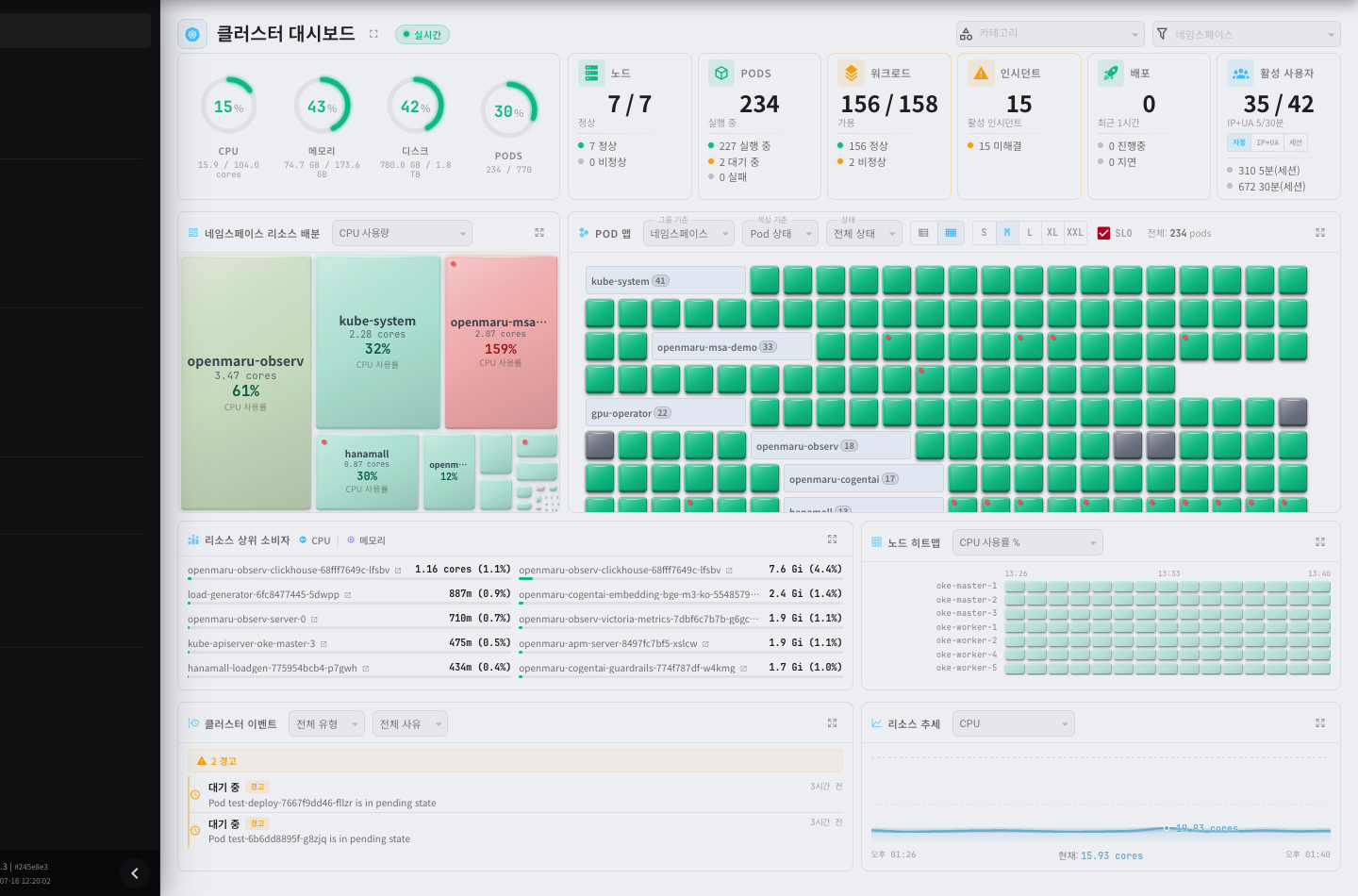
It looks similar to the Console overview screen (see 2.1), but it holds different things.
| Element | Description |
|---|---|
| Resource gauges | CPU, memory, disk, and pod utilization |
| Cluster summary | Counts of nodes, pods, workloads, and incidents |
| Namespace resource distribution | How much each namespace uses, shown by area |
| POD map | Each pod drawn as one rectangle, showing the whole state at a glance |
| Top resource consumers | A ranking of the heaviest pods |
| Cluster events | Recent events |
| Resource trends | Usage change over time |
The namespace resource distribution and the POD map are what the Console lacks. You can check the state of hundreds of pods on one screen, and which team uses the most resources is immediately visible by area.
Distributed Tracing
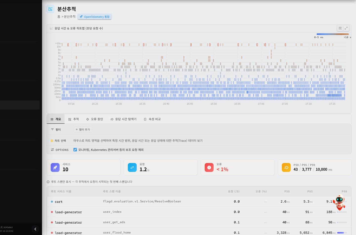
It shows the path one request took through several services and how long each segment took.
Use it in a microservices environment when a "it is slow" report comes in and you have to find which service segment is the cause. The Console's pod logs cannot show a flow that crosses services.
| When to use it | Description |
|---|---|
| When you do not know which service is the bottleneck | Compare the time per segment |
| When only certain requests are slow | Find that request's trace and look at its path |
| Where an error started | Pinpoint the segment where the error occurred |
OPENMARU APM
This is the application performance management product. It looks at what happens inside the application.
Where Observability tells you "which service is slow", APM tells you what is slow inside that service.
| What it shows | Example |
|---|---|
| Transactions | The processing time and status of each individual request |
| SQL | Which query took how long |
| JVM | Heap usage, GC occurrences, thread state |
| External calls | Time spent calling other systems |
| Errors | Where the exception occurred |
The APM Dashboard
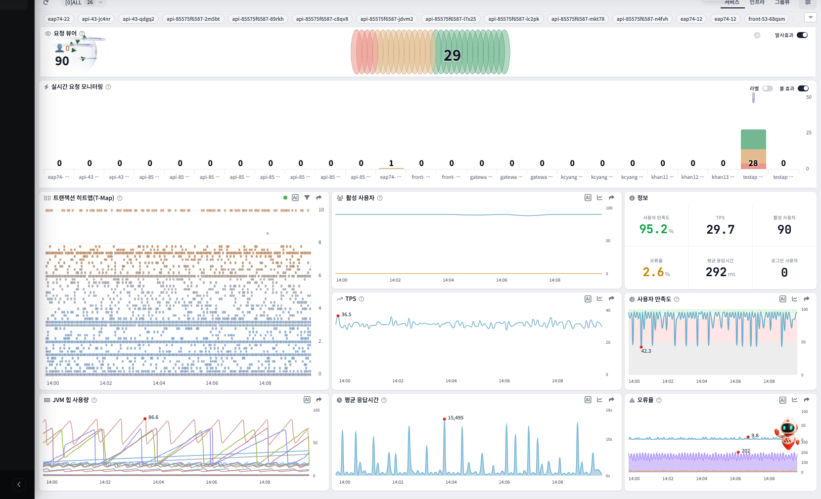
| Element | Description |
|---|---|
| Real-time active users | The number of requests being processed now |
| Transaction heat map (T-Map) | Response time and throughput scattered as points |
| TPS | Transactions per second |
| Average response time | The response time trend |
| JVM heap usage | Memory state |
| Error rate | The proportion of failed requests |
The T-Map is APM's distinctive screen. Each point is one request, and its vertical position is the response time. Slow requests gather at the top, so patterns can be recognized by eye.
Transaction Detail
Opening one slow request shows what happened inside that request. This is the screen where APM differs most from other tools.
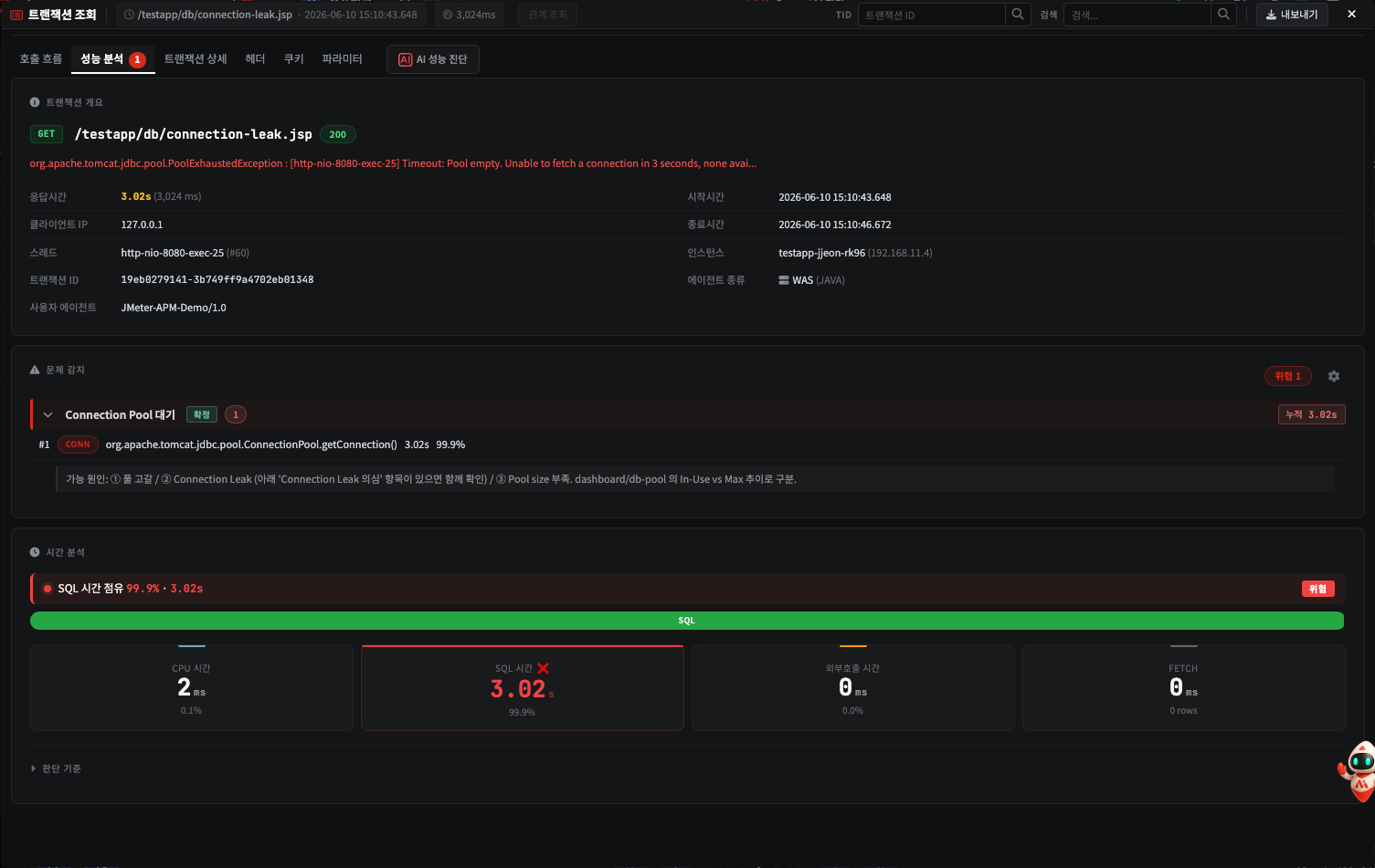
| Section | What it shows |
|---|---|
| Transaction overview | Which request it was, the response time, the caller, the start and end times |
| Problem detection | The cause APM identified on its own, and the grounds for it |
| Time analysis | The response time broken down by CPU, SQL, external calls, and data retrieval |
The tabs at the top of the screen give more detail.
| Tab | Content |
|---|---|
| Performance analysis | Candidate causes and the time breakdown |
| Call flow | The order of method calls and the time each step took |
| Headers · cookies · parameters | The values carried in the request |
| AI performance diagnosis | Cause estimation and suggested remedies |
The time analysis narrows the cause. For example, if SQL accounts for 99.9% of a three-second request, you have to look at the database rather than the application code. If most of it is CPU time, the reverse.
This level of information cannot be obtained from the Console or Observability. It requires an agent inside the application.
How to Divide Work Between Them
This is the order when a failure occurs.
| Order | Where | What you learn |
|---|---|---|
| 1 | Console | Whether the pod is up, whether it restarted recently |
| 2 | Observability | Since when, and which service is slow |
| 3 | APM | What is slow inside that service (SQL, GC, external calls) |
You descend, narrowing the scope. Starting with APM leaves you unable to decide which application to look at.
Moving There From the Console
Move there from Tools in the Console's left menu (see 9.3). Selecting a card opens it in a new tab.
Because they use the same integrated authentication, you do not have to sign in again. Keep all three screens open as tabs and move between them.
Both products are configured when COP is installed. No separate installation is required.
What to Look at Where
| What you want to know | Where to look |
|---|---|
| Whether a pod is up now | Console (see 3.1) |
| Why it terminated just now | Pod logs and events in the Console |
| Whether to roll back a deployment | Console (see 3.2) |
| Since when it has been slow | Observability resource trends |
| The logs of a pod that terminated yesterday | Observability log viewer |
| Which service is the bottleneck | Observability distributed tracing |
| How much to increase resources | Observability resource trends |
| Which SQL statement is slow | APM |
| Whether memory is leaking | The APM JVM screen |
| Why only certain user requests are slow | APM transactions |
Start with the Console for a failure in progress, and with Observability for a past one — that is faster.
Event Retention
Kubernetes events disappear after about an hour by default. This keeps events from filling the cluster store.
To see events from a failure later, check them at the time, or collect them with cluster diagnostics (see 2.3). Observability collects and retains events separately, so they can be queried after the period has passed.
For detailed usage, see each product's user manual.