1.2. Using the Common Screens
When to Read This Chapter
Every resource screen in the Console uses the same structure. Whether it is a pod, a Service, or a certificate, the list to detail to edit flow is identical. If you read this chapter first, the remaining chapters only have to cover what is specific to each resource.
The Announcement Banner at the Top
A colored banner sometimes appears at the very top of the Console.
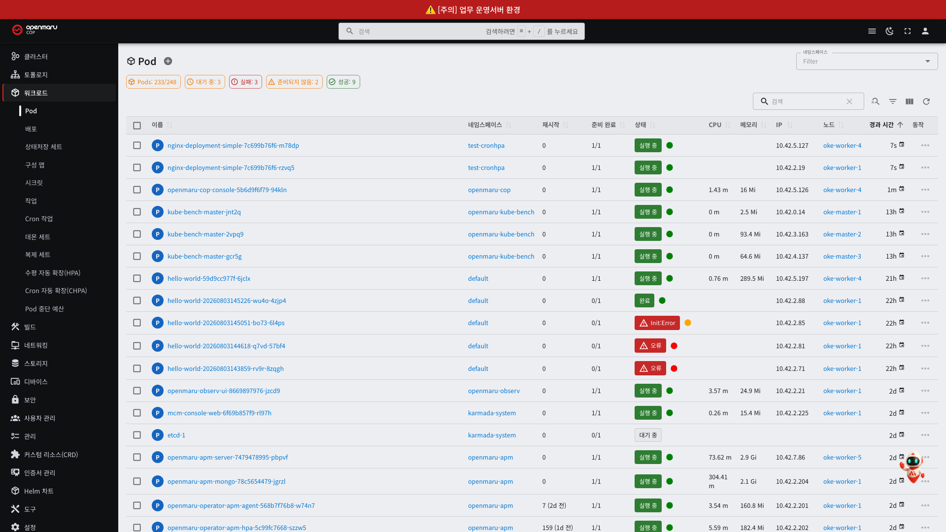
This banner is an announcement registered by operations staff. It sits above every screen, so it stays visible no matter which menu you move to.
When It Is Used
The most common use is telling apart several Consoles that look the same. The Consoles for development,
staging, and production clusters look identical, and the address alone makes them hard to distinguish. Putting a red
banner on the production Console shows at a glance which environment you are looking at, and prevents the accident of
deleting production resources while thinking you are in development. The figure above is that case: the production
Console carries [Caution] Business production environment in a red banner.
Other uses include the following.
| Situation | Example |
|---|---|
| Distinguishing environments | [Production] Work with care — green for development, orange for staging, red for production |
| Maintenance notice | Server maintenance: March 15, 02:00-04:00 — posted several days in advance |
| New version notice | COP 1.0.4 has been released — include a link to the release notes |
| Policy notice | From April, the latest tag may not be used on images |
How to Read the Banner
| Element | Meaning |
|---|---|
| Color | The nature of the announcement. Usually blue = information, orange = caution, red = urgent or production environment |
| Text | The announcement content |
| Link | If present, goes to a detailed document. It opens in a new window |
| × on the right | If present, you can select it to close the banner |
An announcement without an × cannot be closed. For announcements that must always be visible, such as a production environment marker, operations staff disable closing.
An announcement you have closed does not appear again. The record of closing it stays in the browser you are using, so it appears again in another browser or on another PC. Conversely, if operations staff change the content and also change the announcement number, it reappears as a new announcement even if you closed the previous one.
When the Announcement Does Not Appear
Announcements are registered in a config map (ConfigMap) named openmaru-cop-announcement (see 3.4).
Registering and editing is done by cluster operations staff; it is not something a general user can change from the
Console screen. If you need an announcement posted, or you see an incorrect one, ask your operations staff.
If operations staff registered an announcement and it does not appear on screen, tell them to check the following.
| What to check | Description |
|---|---|
| Display setting | If enabled is off, it does not appear even after registration |
| Content format | If the registered content does not match the JSON format, the entire banner fails to appear. No error is shown, so check the format first |
| Console restart | The Console must be restarted after changing the config map for the change to take effect |
| Already closed | You may have closed a closable announcement earlier. Check in another browser |
List Screens
Selecting a resource in the left menu shows a list in a table.
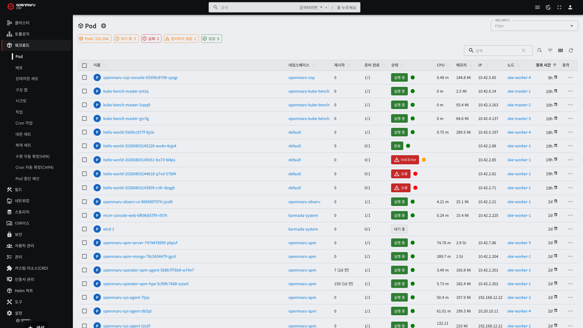
The screen is laid out from top to bottom as follows.
| Position | Element | What it does |
|---|---|---|
| Top | Resource name and count | The resource you are viewing and the total count |
| Below that | Status summary chips | Counts by status. Selecting one filters to that status |
| Top right | Search and filter tools | See "Search and Filters" below |
| Center | Table | The resource list |
Status summary chips are the fastest route to finding a failure. On the pod screen, for example, selecting the
Warnings chip leaves only the pods with problems, so you do not have to check hundreds of rows one by one.
Selecting a column heading sorts by that column. Selecting it again reverses the order. Sorting by "Age" brings the most recently created resources to the top.
Search and Filters
There is a search box and icons at the top right of the table.
| Element | What it does | When to use it |
|---|---|---|
| Search box | Shows only items containing the text you enter | Finding a resource when you know part of its name |
| Magnifier icon | Specifies search conditions in detail | Finding by label or a particular column |
| Funnel icon | Filters by status or type | When you want to see only what failed |
| Three-column icon | Chooses which columns to show | When the screen is narrow and columns are cut off |
| Arrow icon | Reloads the list | When something you just deployed is not visible |
Use the namespace selector to narrow the scope. Left empty, it shows all namespaces. Setting it to your own team's namespace makes the list far shorter.
The namespace selection returns to its initial state when you refresh the screen. It is not saved in the browser.
Global search is in the middle of the top bar. It finds resources by name regardless of resource type, so use it
when you do not know which menu holds them. Ctrl + / (⌘ + / on macOS) focuses it directly.
Reading Badges and Chips
Pill-shaped markers appear in several places on list screens. Their meaning differs by position.
| Position | Name | What it does |
|---|---|---|
| Above the table | Summary chip | Shows counts by status; selecting one filters the list |
| Status column in the table | Status badge | The status of that one resource |
| Other columns in the table | Category chip | Groups values such as node name or type |
What the Colors Mean
Color is used only for status. This rule is applied consistently across the whole screen.
| Color | Meaning |
|---|---|
| Green | Normal |
| Orange | Warning. Not yet a failure, but it needs checking |
| Red | Error |
| Gray | Cannot be determined, or not applicable |
Warm colors (orange and red) on screen mean there is a problem. Category chips do not convey meaning through color, so looking only where there is color finds problems quickly.
Summary Chips
Counts by status appear above the table. Taking the pod screen as an example:
| Chip | What it counts |
|---|---|
| Pods | Total count |
| Pending | Pods waiting to be scheduled |
| Failed | Pods that failed to run |
| Not Ready | Pods that are up but not ready |
| Succeeded | Pods that finished their work |
| Unknown | Pods whose status cannot be determined |
A chip with a count of 0 does not appear. This keeps red chips off a healthy screen. Conversely, a chip that is visible means there is that much to check.
Selecting a chip leaves only resources in that status. You can select several at once, in which case anything matching at least one of them remains. Selected chips change to a filled shape. Selecting again clears them.
This is the fastest way to find problems in a list of hundreds. Do not check the list row by row — start with the chips.
Status Badges
These are the badges in the status column of the table. They show the status of a single resource.
The wording differs by resource type.
| Resource | Example badges |
|---|---|
| Pod | Running, Pending, Failed, CrashLoopBackOff |
| Build | Complete, Running, Failed, Pending |
| Helm release | deployed, failed, pending-install |
| Certificate | Ready, Not Ready |
| Node | Ready, NotReady |
Hovering over a badge shows the detailed reason. A pod that is Running but orange means it is not in the ready
state, and the reason is visible only on hover.
States that are in progress carry a spinning marker. While a build is running, the green badge appears with a spinner.
Category Chips
These are chips holding values that are not statuses, such as node names and certificate types.
They use only calm colors (gray, blue, teal). There are reasons for not using status colors (green, orange, red).
- If green means both "normal" and "a particular type" on the same screen, the reader has to decide which each time.
- When the same value repeats across many rows (20 certificates from the same node), that color becomes the first thing read on the screen, burying the status that actually needs attention.
Category chips are distinguished by icon shape and text, not by color. Color only makes it easier to follow a row while reading the list.
Count Chips
On screens that count things, such as the CIS benchmark, numeric chips appear.
- A value of 0 carries no color. If "Failed: 0" were red, a healthy node would look like a problem node.
- The chips have a fixed width so rows can be compared vertically. Use this when comparing failure counts across nodes.
CogentAI Integration
The Console integrates with CogentAI, so you can ask the AI about exactly what you are looking at on screen. You do not have to move between screens or copy content over.
The integration appears in two forms.
| Form | Where | What it does |
|---|---|---|
| AI insight button | Beside events, above resource details | Requests analysis of that one target directly |
| CogentAI widget | Bottom right of the screen | Free conversation |
This feature appears only if it was enabled at installation. If the button and widget are not on screen, ask your operations staff to check the CogentAI integration settings.
Why Ask the AI
Investigating a Kubernetes failure usually goes like this. You see that a pod is in CrashLoopBackOff, you open the
events, you dig through the logs, you check the configuration, and you search for similar cases. It is piecing
things together across several screens, and if you are not used to it, just deciding where to start takes time.
The integration shortens this.
| Doing it by hand | Using the integration |
|---|---|
| You find and read the resource status, configuration, and events on each screen | One button gathers and sends them all |
| You search the error message for similar cases | The answer is grounded in that resource's actual values |
| You have to judge which item is the problem | It points to the angle that fits the resource type |
| You look up the command to fix it separately | It gives the command as well |
The following points help in practice.
No copying over. Selecting the button sends the resource type, name, namespace, current status, full configuration, and related events together. Copying only the error message into a search leaves the answering side blind to the configuration and state that produced it; here that context travels with it.
Scattered information is seen at once. Whether a pod fails to start because of resource requests, probe settings, volumes, or the image — a person checks these one at a time, but because this information is sent together, the relationships are weighed all at once.
Each resource type has a fixed set of angles. For a pod it looks first at container status and restart counts; for a Service, at whether the selector matches the target pods (see the table below). Even if you do not know what to ask, it points to what commonly goes wrong for that resource.
Answers are limited to what is usable in this environment. Answers stay within Kubernetes' own features and
kubectl commands. You will not be told to install a separate monitoring product or an external tool, so you are
never guided toward a remedy that cannot be used in an air-gapped environment.
Immediate actions come first. Things that need attention right away, such as warning-level events, are reported first, followed by things that would be good to improve.
You learn while using it. Because it also explains why a given setting is a problem, you are not just handed a remedy — you keep the grounds to judge for yourself the next time you meet the same symptom. If you are still learning Kubernetes, this matters.
What It Cannot Do
It is better to set expectations precisely.
| What it cannot do | Why |
|---|---|
| Change resources directly | It only analyzes and advises. You perform the action |
| Analyze resources you cannot see | It answers only within the permissions of the signed-in account (see 7.1) |
| Analyze past records | It looks at what is on screen now. Past trends are on the monitoring screen (see 9.2) |
| Problems inside application code | It answers from the cluster resource perspective |
| Guarantee a definitive answer | It is a reference opinion. See "How to Treat the Answers" below |
The AI Insight Button
A red AI marker appears beside event messages and on resource detail screens.
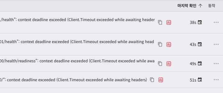
The button appears in these places.
| Place | Analysis target |
|---|---|
| Event list on the cluster overview | That event message |
| Event list on a resource detail | That event and the target resource |
| Top of a resource detail screen | That resource as a whole |
Selecting the button sends the information visible on screen along with it. The resource type, name, namespace, current status, configuration, and related events are gathered and sent, so you do not have to write a question.
Analysis Tailored to the Resource Type
The analysis criteria differ by resource type. A pod, for example, is viewed from these angles.
| Resource | Angles it looks at |
|---|---|
| Pod | Container status, whether resource requests and limits are appropriate, restart counts, sidecar container layout |
| Deployment | Replicas versus available replicas, deployment strategy, maxSurge and maxUnavailable |
| StatefulSet | Pod ordering guarantees, storage templates, update strategy |
| Service | Whether the selector matches the target pods, consistency of port settings |
| PVC | Capacity, access modes, whether the storage class is appropriate |
Beyond these, 22 kinds in total have their own criteria, including DaemonSet, ReplicaSet, Ingress, ConfigMap, Secret, PV, Namespace, Node, Job, CronJob, service account, role, role binding, network policy, and HPA.
Answers are given only within the scope of Kubernetes' own features and kubectl commands. It does not recommend
a separate monitoring product or an external tool.
The CogentAI Widget
Selecting the button at the bottom right of the screen opens a conversation window.
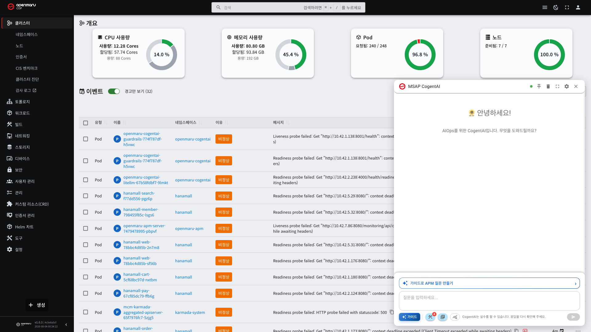
| Element | Description |
|---|---|
| Input box | Write your question freely |
| Guide | Builds a question by choosing from frequently used ones |
| Window controls | You can drag it, resize it, and maximize it |
| Pin | Keeps the window from closing when you move to another screen |
You can keep using the Console with the window open. You can go back and forth — asking while looking at a list, then checking a resource while reading the answer.
Because it is authenticated with the signed-in account, it answers only within the range of resources you can view (see 7.1).
When to Use It
| Situation | What to ask |
|---|---|
| You do not understand what an event message means | The AI button beside that event |
| You do not know why a pod will not start | The AI button on the pod detail |
| You cannot judge whether a setting is appropriate | The AI button on the resource detail |
| You do not know which command to use | Ask the widget directly |
How to Treat the Answers
Check before running anything as given. An AI answer is a reference, not a verified procedure.
| Answer type | How to treat it |
|---|---|
| Cause explanation | Recheck the actual values on screen |
Read commands (get, describe, logs) | Safe to run right away |
Change commands (apply, patch, scale) | Check the scope of impact first. Even more so in production |
Delete commands (delete) | Check first whether it can be undone. PVCs and Secrets are hard to recover once deleted |
If you are unsure, try it in a staging environment first. If environments are distinguished by an announcement banner, you can confirm which one you are in from the top of the screen (see "The Announcement Banner at the Top" above).
Choosing Which Columns to Show
When the table has many columns and the screen is narrow, keep only the ones you need.
- Select the three-column icon at the top right of the table.
- Select column names in the list to toggle whether they are shown.
- Select outside the list to close it.
Detail Screens
Selecting a name in the list opens the detail screen.
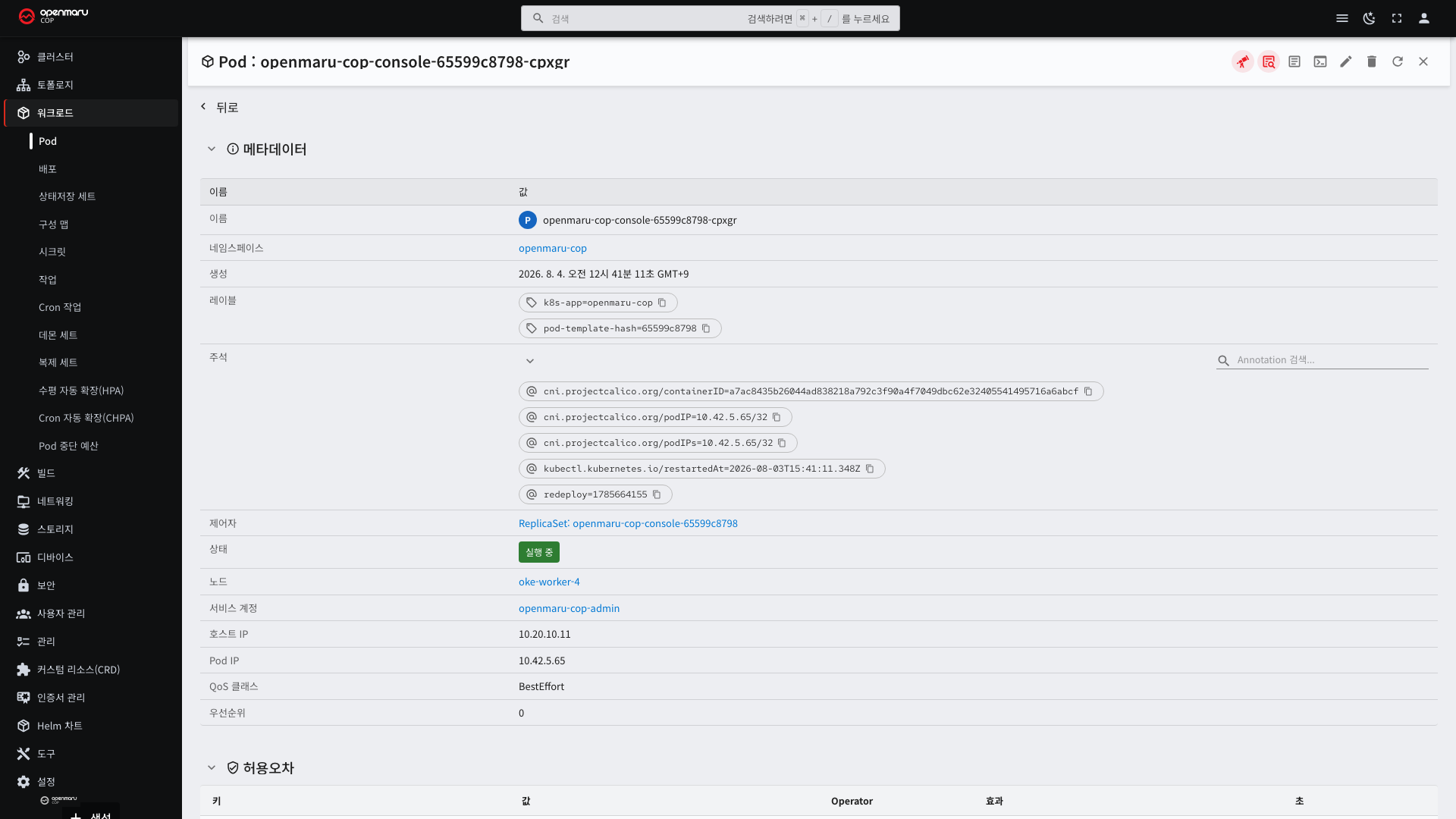
The detail screen is divided into collapsible sections. Select the arrow to the left of a section title to collapse it.
| Section | What it holds | When you look at it |
|---|---|---|
| Metadata | Name, namespace, creation time, labels, annotations, status | Always |
| Labels | The name tags attached to this resource | When checking why a Service cannot find this pod |
| Annotations | Extra information left by tools | When checking the history left by a deployment tool |
| Owner | The parent resource that created this one | When tracing back who created a pod |
| Related resources | Other connected resources | When checking the scope of impact |
| Events | What happened recently | First of all when a problem occurs |
Blue text is a link. You can select the namespace, node, owner, or service account to go straight to that resource's detail. You do not have to return to the list while tracing a failure.
Action Buttons on Detail Screens
Buttons are grouped at the top right of the detail screen. Which buttons appear depends on the resource type and your permissions.
| Button | What it does |
|---|---|
| Logs | Views container logs (pod family) |
| Terminal | Runs commands inside the container (pod family) |
| Edit (pencil) | Opens the YAML editor |
| Delete (trash can) | Deletes the resource |
| Refresh | Reads the current state again |
| Close | Returns to the list |
The YAML Editor
Selecting the edit button opens the YAML editor.
- Line numbers appear on the left, and a marker appears on any line with a syntax error.
- Selecting Save applies the change to the cluster immediately.
- Selecting Cancel changes nothing.
There is no undo after saving. Before editing a resource in production, copy the current content and keep it somewhere separately.
Some items cannot be changed after creation. For example, a pod's container image can be changed but its name cannot. Editing an unchangeable item is rejected on save.
Creating Resources
Selecting the Create button below the left menu opens a screen for creating a new resource. You paste YAML directly, or fill in the input form provided for that resource type.
To model a new resource on an existing one, it is faster to copy the YAML from that resource's detail screen and
change only the name. When you do, remove metadata.uid, metadata.resourceVersion, and status before
submitting — the cluster fills those in itself.