T2. Finding and Tracing a Problem from the Dashboard
Diátaxis: Tutorial · Audience: operators (beginner to intermediate) ← Back to contents · ← T1 Quick Start
Finishing this exercise leaves you able to judge "is there a problem now" by colour from the WAS dashboard alone, and to follow a slow request from a drag on the T-Map through to the transaction detail (the patterns). It takes about 5 minutes.
What to know first
- It assumes you have finished T1. Quick Start in 5 Minutes (you can sign in and choose a target).
- If you want the metric concepts, keeping E3. What the Metrics Mean beside you helps (you can follow along without it).
How to open it -- left menu ▸ WAS ▸ Dashboard
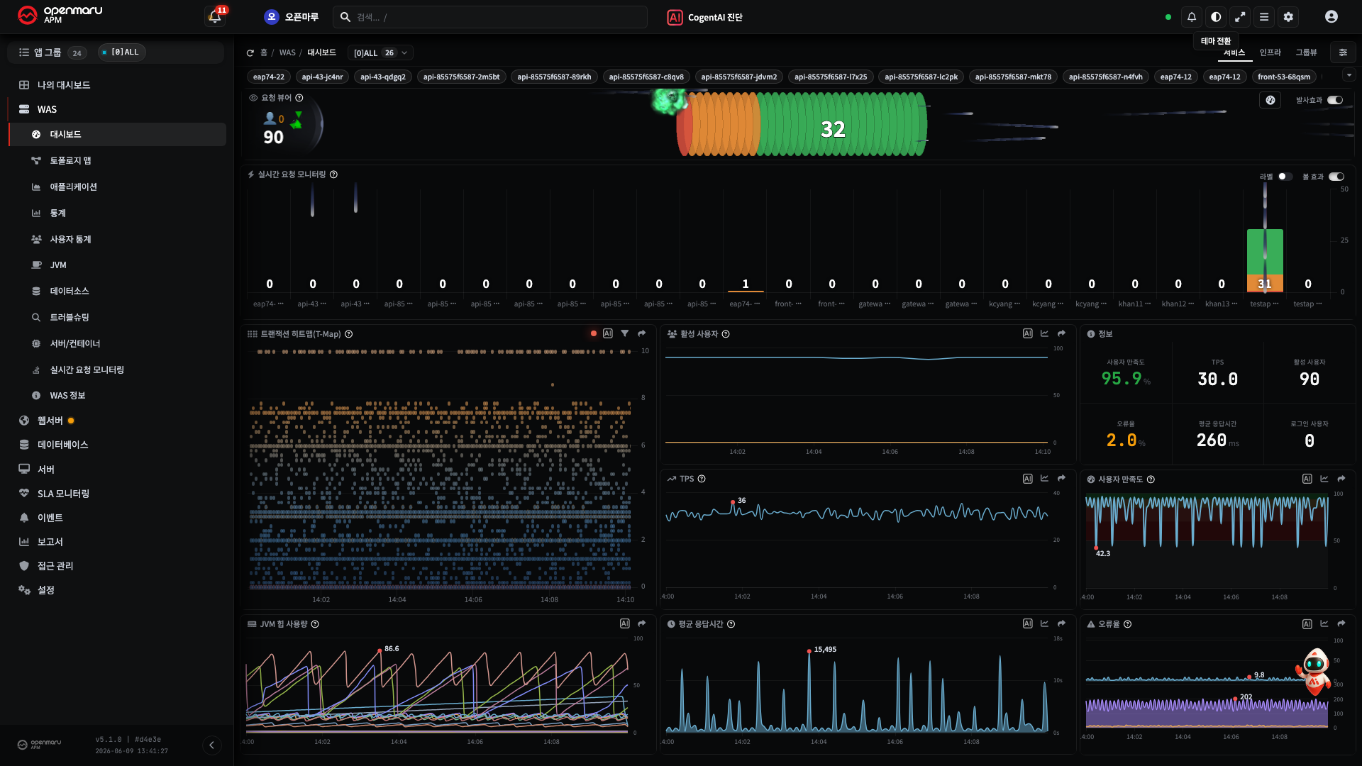
The dashboard gathers TPS, response time, APDEX, error rate, live requests (Request Velocity and Viewer), the T-Map, the JVM, and resources onto one screen. This exercise uses only this screen.
Step 1 — Finding "Red" in the Live Request Widgets at the Top of the Dashboard (Request Viewer and Request Velocity)
There is no need to go to another menu. At the very top of the WAS dashboard you just opened are two widgets showing live requests side by side -- the Request Viewer and Request Velocity (the top area of the dashboard capture above). On these two widgets the colour is the signal, so look at the colour before reading any number.
| Widget (top of the dashboard) | Normal | Problem signal |
|---|---|---|
| Request Viewer | The circular wall in the middle is small and calm | The wall grows orange or red = a larger share of slow responses. The number on the left = the concurrent user count |
| Request Velocity | Mostly in the Satisfying (green) band | The Tolerating (orange) and Frustrating (red) bands growing = requests in flight are slowing |
- See whether the circular wall of the Request Viewer is swollen and red.
- See whether the orange and red bands are growing in the stacked bar of Request Velocity.
Result -- if red stands out in either of them, it is the signal that "slow requests are piling up right now".
Note These two widgets are part of the dashboard. The same screen also exists as a dedicated page at left menu ▸ WAS ▸ Request Velocity, but the dashboard widgets are enough for this exercise. Note Red = requests whose response time has entered the Frustrating band (over 4T by the APDEX criteria). The colour alone separates normal, watch, and danger immediately, so there is no need to read every number.
Caution Red being visible does not yet tell you the cause. There are several possibilities -- slow queries, external API delays, thread pool exhaustion. Narrowing the cause continues in steps 3 and 4 (the T-Map) and in T3 (AI).
Step 2 — Reading the Active User Count (How It Is Counted)
The active user count on the dashboard is the scale of users actually using the service now. It is the baseline for gauging traffic anomalies (a surge, or abnormal traffic in the small hours).
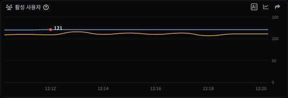
How it is calculated -- understanding it exactly avoids misreading the value.
- It is the distinct user count. The same user making several requests is counted as one.
- It is collected every minute and aggregates the active users over a 5-minute range by default (the range is configurable).
- Users spread across several instances are also combined and counted without duplicates. This "deduplicate and combine" is handled with HyperLogLog (approximate distinct counting) so that it stays fast at scale -- which means the value is a very close estimate rather than an exact integer.
Active users vs signed-in users -- the chart on this card draws two lines. What they count differs.
| Metric | Who it counts | How they are identified |
|---|---|---|
| Active users | Every visitor who made at least one request in the last 5 minutes -- signed in or not, including anonymous | A cookie (default), session, IP, and so on, per the agent settings |
| Signed-in users | Authenticated users, aggregated separately by login ID | The login ID (extracted from the session, header, or cookie) |
- The signed-in user count is collected only when the agent's login tracking is turned on.
- A large gap between the two means a large share of unauthenticated traffic -- anonymous visits, bots. If active users alone spike while signed-in users stay flat, suspect that it is not a real growth in customers.
Caution The two metrics count on different bases -- active users by device (cookie/session/ IP), signed-in users by account (login ID). Signing in with several accounts on one device can make the signed-in user count larger than the active user count. Read them as measurements on different dimensions rather than one containing the other.
- Look at the value on the active users tile of the dashboard.
- Compare it with the usual figure for the same time of day -- what matters is the comparison, not the absolute value.
The card helps with "comparing with usual" directly -- pressing the chart icon in the card header (compare with yesterday or last week) opens a Real time / Compare with yesterday / Compare with last week menu.

Choosing compare with yesterday (or last week) overlays yesterday's trend for the same time of day, so you can read at a glance whether the current value is high against usual.
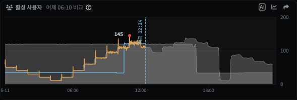
Result -- you can read "how many people are using it now" and how that differs from usual.
Note An abnormally high active user count outside business hours suggests bots or abnormal traffic.
Step 3 — Seeing What Is Slow, the Errors, and the Patterns in the Dashboard T-Map
The T-Map (transaction heatmap) seen here is not the topology map but a widget inside the WAS dashboard ("Transaction Heatmap (T-Map)"). It scatters the transactions of a period with horizontal = time and vertical = response time; one point (cell) is a bundle of transactions, and position shows slowness while colour shows errors.
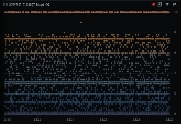
- Cells rising towards the top = transactions with a long response time (the 0 to 1 second band at the bottom is normal).
- Red cells = HTTP errors (4xx/5xx).
Result -- "the slow at the top, the errors in red" is visible at a glance.
The T-Map Detects Patterns by Itself — the Circular Indicator (●)
A circular dot (●) indicator always sits at the top right of the widget. The system analyses the T-Map automatically about every 10 seconds and, when a risky shape (pattern) appears, tells you first by changing the colour of that dot. Before reading the cells one by one, look at the colour of this dot first.
| Dot (●) colour | Meaning | Typical patterns |
|---|---|---|
| Green | Normal -- no pattern detected | — |
| Yellow | A weak pattern (information) -- for reference only | A horizontal line, response time stagnation, a gradual P95 rise |
| Orange (blinking slowly) | A pattern to watch -- worth a look | A vertical line (a momentary delay spreading), a 4xx cluster, a bimodal distribution |
| Red (blinking quickly) | A dangerous pattern -- check immediately | A 5xx cluster, a traffic break, a cascading failure |
Hovering over the dot brings up the list of patterns detected now, with their severity (critical, warning, information) and a short description. Orange and red blink to draw attention (red faster).
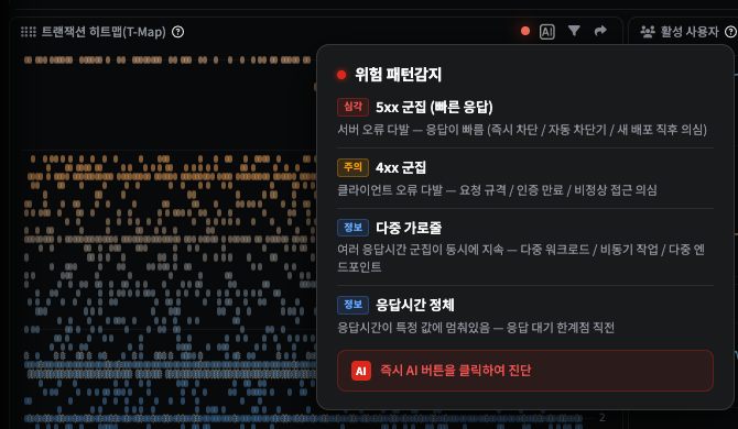
Analysing a Detected Pattern with AI
When the dot is orange or red, press the AI button (CogentAI) at the top right of the widget.
The T-Map's statistics (P50 to P99, the 4xx/5xx ratio), response time density, slowest interval
(hot spot), and detected patterns are passed to the AI together, and the AI reports in plain
language "what is wrong and why, and where to look next". This is what the "Click the AI button
to diagnose immediately" prompt in the popup refers to when it is red.
Result -- the colour gives you whether something is wrong, the popup what the pattern is, and the AI a hypothesis for the cause, all in one widget.
Note The meaning of the T-Map patterns (vertical lines, horizontal lines, 5xx clusters, bimodal distributions, traffic breaks, and so on) and what to do about them are in H5. Diagnosing with T-Map Patterns; the AI diagnosis tutorial is in T3. Analysing a Cause with AI. Caution An AI answer is a starting point -- cross-check the metric it points at against the actual cells and charts before deciding on an action.
Step 4 — Dragging to Open the Transaction Detail (the Patterns)
Now the main part. Dragging over the suspect interval takes you straight into the detail of those transactions.
- Drag with the mouse over the area on the T-Map where the slow cells (at the top) or red cells (errors) gather.
- The transaction trace dialog for that time × response time interval opens.
- In the dialog, check the following.
- The list of slow traces -- the slowest transactions
- The call flow (waterfall) and stack trace -- where the time went
- "Problem detection" on the Performance Analysis tab -- the cards where the system has already pointed out slow SQL, SQL errors, external calls, and error patterns
"Problem Detection" on the Performance Analysis Tab — Start from the Severity
Choosing one transaction from the list and opening the Performance Analysis tab makes the system analyse it automatically and show it as problem detection cards. Each card carries a severity.
| Severity | Meaning | Example |
|---|---|---|
| Information | A signal for reference | A slow method (wait/IO bound), and so on |
| Warning | Worth a look | A slow SQL query (it succeeded but was slow), and so on |
| Danger | Act immediately | A SQL error, a database connection failure, a lock wait, an error cluster, and so on |
Below is an example of opening /testapp/db/runtime-error.jsp. The HTTP status is 200, but the
system points out a "SQL object reference error" (java.sql.SQLSyntaxErrorException: Unknown column 'bad_column') on a danger card, and even offers the possible causes (a schema
migration not applied, a delayed deployment, the wrong database connection). Looking only at the
response code it would be normal -- the performance analysis caught it first.
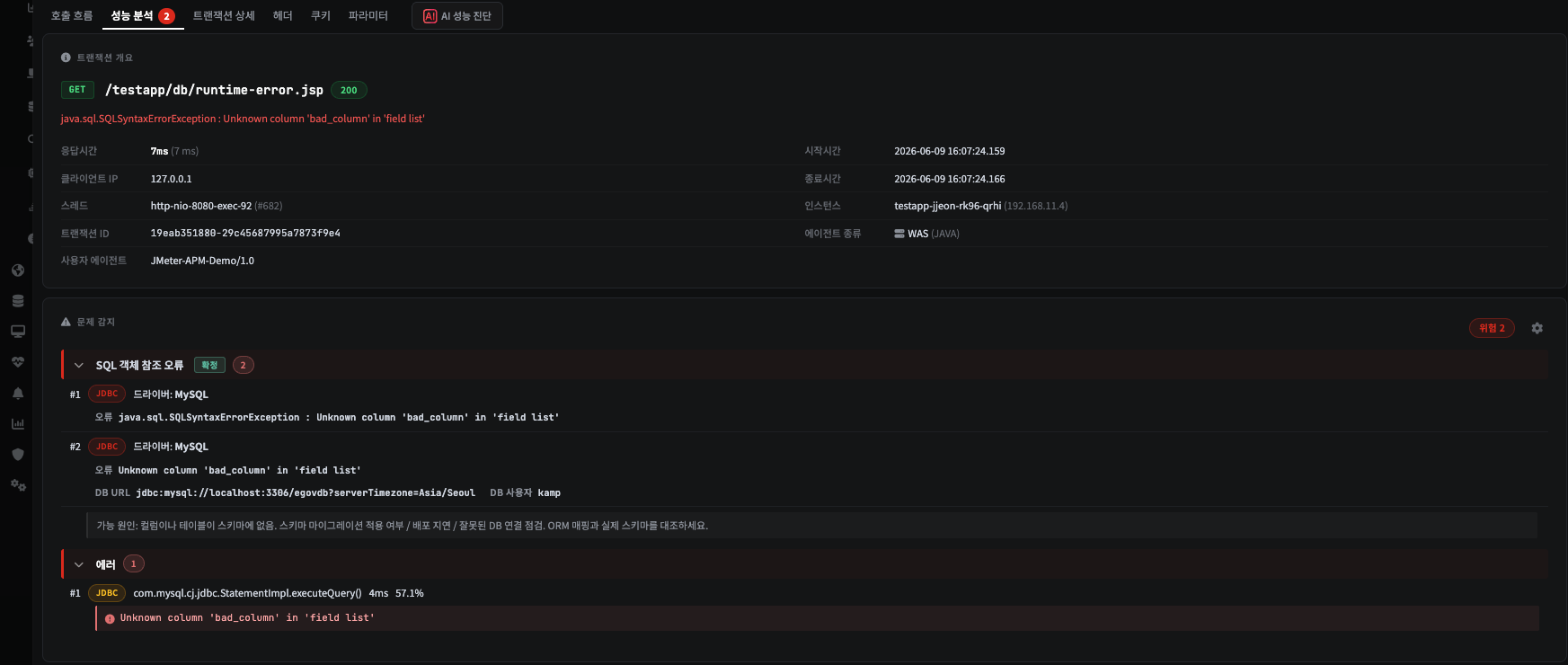
Note When monitoring, start from the severity in problem detection. Where there is a danger card, dig into that transaction even when the HTTP response is 200. The cards group SQL, external calls, and errors by type, so "what the problem is" is visible before reading the waterfall line by line.
AI If slow SQL or a SQL error has been caught, open that SQL in the waterfall and have AI Query Diagnosis analyse the execution plan and indexes straight away → T3 part 2. Slow SQL → AI Query Diagnosis.
When the Call Flow Looks Cut Off -- the Agent's Collection Limit
Sometimes a warning icon and a message follow the last line of the call flow (waterfall).
Within the T-Map display limit (max N lines) everything collected is shown, but the agent stopped collecting at this point due to the transaction.trace.max.line setting.
The screen was not truncated -- the agent only collected that far. It shows up on transactions whose calls are very deep or heavily repeated. The later calls were never recorded, so no amount of paging or "show more" will bring them back.
- To see further, an administrator has to raise the agent's
transaction.trace.max.line. Note that a larger value increases both collection volume and storage. - When it is the display limit instead, this message does not appear -- you get a Show more button or paging controls and can read the rest. That is how the two situations differ on screen.
Result -- starting from the red on the dashboard, you have followed it through to the inside of one slow transaction (its patterns and problems). That is the conclusion of the trace.
Note When the T-Map dot with a detected pattern blinks, you can also press the dot's AI button (CogentAI Analysis) to get a detailed diagnosis of that pattern straight away → T3. Analysing a Cause with AI.
Done — What You Can Now Do
- Judge a problem immediately from the colour (red) of the Request Viewer and Request Velocity widgets at the top of the dashboard
- Know how the active user count is calculated and compare it with usual
- Pick out what is slow and what has errored in the T-Map, and open the transaction detail (the patterns) by dragging
Next Steps
| What you want to know more about | Guide |
|---|---|
| Analysing the cause of the slowdown with AI (CogentAI diagnosis, AI Query Diagnosis, thread dumps) | T3. Analysing a Cause with AI |
| The meaning of the 20 problem patterns and what to do | H6. Finding the Cause of a Slow Transaction |
| Diagnosing with the 16 T-Map patterns | H5. Diagnosing with T-Map Patterns |
| The meaning of the chart colours and metrics (APDEX, Frustrating) | E3. What the Metrics Mean |