4.2. Correlation analysis
Whether two metrics move together — 11 scenarios
This is the family you use to ask "why did it get slow?". It finds the metrics that moved with response time during the window where it spiked. Correlation has the most scenarios of the three (11) and the most to choose from.
What it answers
It puts two metrics side by side and quantifies whether they moved together.
- How much they moved together — the correlation coefficient
- Which one moved first — the lead/lag relationship
- Whether one can be said to have affected the other — a causality test
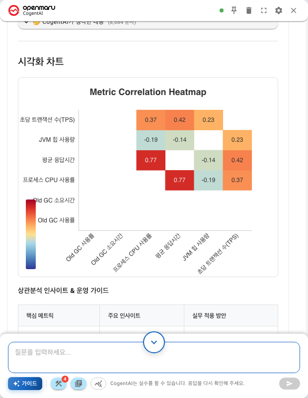
Ask about several metrics at once and the result comes back as a table of every pair. Each cell holds a coefficient, and the darker the colour the more strongly the pair moved together. In the figure above, average latency and process CPU usage are the highest pair at 0.77.
"Moved together" is not "caused"
A high correlation does not make one metric the cause of the other. Both may have been driven by a third factor.
When traffic rises, CPU rises and latency rises with it. CPU and latency correlate strongly, but adding CPU will not fix latency if traffic stays the same. The real cause is the traffic.
So read a correlation result as a narrowed list of candidates, not a confirmed cause. Once it is narrowed, look at that metric more closely.
How to read the coefficient, and from what value it starts to mean something, is covered in Appendix: How to read the results.
The order you choose in — situation first, metrics second
Most correlation scenarios ask twice.

Step ② comes first because it changes which targets are needed. Within an application you choose one; between applications you choose two.
Step ③ usually has a recommended combination selected automatically. Touch it only when you want to choose for yourself.
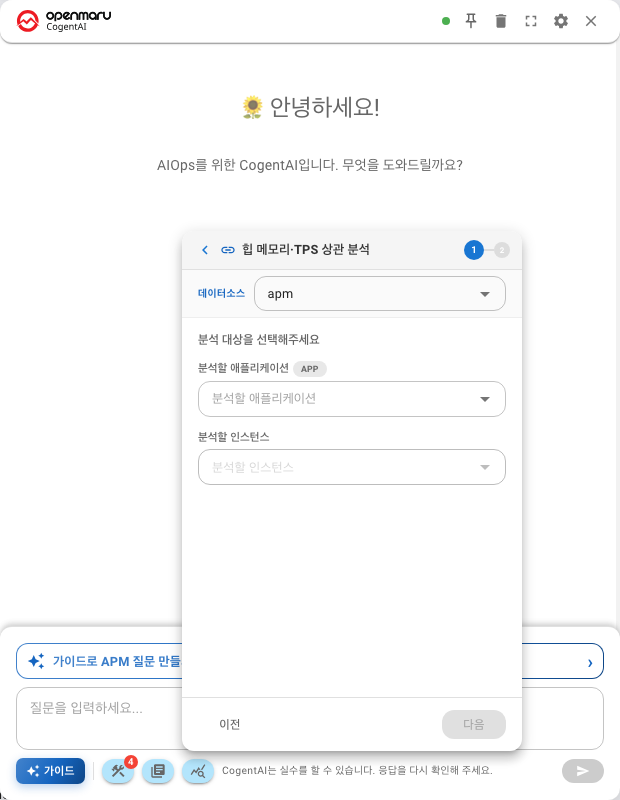
Some scenarios skip ② and ask for the targets straight away. Below is Heap Memory & TPS Correlation, which asks for the targets in the first of its two steps.
What the arrows mean
Metric combinations mix → and ↔, and they mean different things.
| Notation | Meaning | Example |
|---|---|---|
A → B | Direction matters. Did A move first and B follow | CPU → Latency |
A ↔ B | Co-movement only. Which came first is not asked | Threads ↔ Traffic |
Choose → when you are looking for a cause, and ↔ when you want to see whether two metrics move together.
The apm datasource — 6 scenarios
| Scenario | Situations you can choose |
|---|---|
| Response Latency Analysis | Internal App Analysis → which of traffic, JVM CPU, heap and GC affects latency |
| DB Performance Impact | Same Service Analysis / Cross-Service Comparison — SQL response time, SQL TPS, connection pool |
| JVM Memory Analysis | Heap Forecast · Heap Trend Analysis · Heap ↔ GC · Cross-Instance Heap |
| Traffic ↔ Error Rate | Within Single Application — traffic → error rate, traffic → 5xx |
| Heap Memory & TPS Correlation | Heap, GC, TPS and latency in one pass |
| MSA Failure Propagation Correlation | Same App Failure Propagation — latency → error rate |
Two things worth noting
JVM Memory Analysis does more than correlation. Its situations include Heap Forecast and Heap Trend Analysis. Because heap only makes sense when you look at all three angles, the one scenario covers forecasting, trend and correlation together.
MSA Failure Propagation Correlation uses every method. Its description says so:
"…analyses with all methods (Pearson, Spearman, CCF, DTW, Granger) to trace the latency → error failure propagation path."
What each of the five methods looks at is covered in Appendix: How correlation is measured. For now it is enough to know that measuring from several angles reduces the misjudgements you get from using only one.
The observ datasource — 5 scenarios
| Scenario | Situations you can choose |
|---|---|
| Response Latency Analysis (container) | Within an app / between apps — CPU, memory, GC → latency; traffic → resources |
| Response Latency Analysis (Web/WAS) | Same Host Analysis — traffic, CPU, memory → latency; error rate ↔ latency |
| DB Performance Impact | Same Service Analysis / Cross-Service Comparison — query count, latency → response time; query → CPU |
| Thread Pool Load Analysis | Within WAS — threads ↔ traffic, threads → latency, threads ↔ heap |
| Golden Signals Analysis | Latency, traffic, error rate and CPU in one pass |
For why Response Latency Analysis appears twice, see "The same name appears twice" in Chapter 401. "Container" in the description means the first one; "Web server" means the second.
Which to choose when
| What you are seeing | What to choose |
|---|---|
| Responses are slow and you do not know where it starts | Response Latency Analysis — start inside the app |
| It is slow only at certain times of day | Response Latency Analysis → Traffic → Latency |
| You suspect the database | DB Performance Impact |
| Memory keeps filling up | JVM Memory Analysis (apm) — forecast and trend together |
| Errors only appear under bursts of traffic | Traffic ↔ Error Rate (apm) |
| Threads look insufficient | Thread Pool Load Analysis (observ) |
| One service stopped and the ones next to it slowed down | MSA Failure Propagation Correlation (apm) |
| You do not know where to start | Golden Signals Analysis — checks all four at once |
When you compare two applications rather than one
Scenarios whose situations include "between apps" or "between services" take two targets. Use them to see how a metric in the upstream service propagated to the downstream one.
Choose the caller first and the callee second, and the → direction comes out the natural way round.
Next
- Reading the numbers — Appendix: How to read the results
- How the five methods differ — Appendix: How correlation is measured
- The other families — Predictive analysis · Anomaly detection
- The screen after you choose — Wizard mode